19 review sheet for r code and data transformation
Mengchen Xu
19.0.1 Contribution Explaination
As a student with not many experiences in R, I found it difficult to write R code. In the way of learning EDVA, I spent a lot of time searching useful R code online to deal with problems such as data transformation, data cleaning, and etc. Thus, I wanted to make a review sheet for me and for everyone that included the useful functions that are helpful for learning the materials in this Course. These are the materials that I think are important for learning the course. I want to make a review sheet, not only for others but also for myself to review in the future. For this review sheet, I wrote all the R code and explanations by myself by using datasets that we did not use for Problem Set. By using a new dataset, I practiced my ability to write R code in different situations which helps me know the course material better. I also added some personal thoughts about graphs and some course concepts in this review sheet. I am glad that I chose to make a review sheet for the Class Contribution assignment because I learned some new knowledge on the way of writing this review sheet. For example, there are some R functions that I think I have a good command of them, however, when I was writing this review sheet, I found that the same R functions can be used differently in different situations (Pivot_longer and pivot_wider are better to use for variables with categorical data). The use of the R functions really depends on the features of the dataset (“str_detect” are for variables with string types, so different functions should be chose when filtering out rows of string type variables, and integer type variables). Some R functions are better for categorical data, and some functions are better for numerical data.
Also, I reviewed all the lecture slides from the first one to the most recent one for this assignment. On the way of reviewing all the lectures notes, I reflected on what I have learned and tried to find out a way to present some important concepts in this assignment. For example, I decided to compare graphs created by using different R functions in this sheet so that others and myself can understand exactly how the functions work.
I had a better command on the types of graphs we learned, such as mosaic plot, and alluvial plot, by doing this assignment. I might choose to do a review sheet or cheatsheet next time as well since I found that I can learn much from doing a review sheet. However, I probably will focus more on course concepts instead of on R code next time. (All the code in this review sheet are written by myself, and the datasets used are R built-in datasets “mtcars” and “Titanic”)
19.0.2 Section one: Important types of graphs we learned in EDVA.
(use mtcars dataset for example)
19.0.2.1 (a) Histograms:
- When creating a frequency Histograms in R by using ggplot2 package, the function we need to use is “geom_histogram()”, we only need to specify the variable used for X-axis, R will figure out the frequency on Y-axis. We can specify the binwidth and the center for histogram. I highly encouraged everyone to use “color” and “fill” parameters when drawing histograms, because it will makes the graph clear. “Color” specifies the outline color, and “fill” specifies the actual color of the histgram bins. For example: (Note, the “0” on X-axis disappears in this case, thus, avoid situations like this example in the real practice)
mtcars %>%
    ggplot(aes(x = disp)) +
    geom_histogram(color = "black", fill = "lightblue",
                   binwidth = 100, center = 100)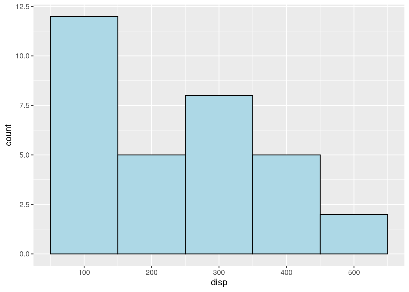
(2)“binwidth” means the width of the bins in histgram, and the parameter “center” means which values you want the center of the bins to lay in the graph. For the exmaple above, the center is 100, and the values 100,200,300, and etc. are on the center of the bins on the X-axis. For the example below, when “center” is 50, the values 50,150,250, and etc. are on the center of the bins on the X-axis. These two parameters help locate the position of the histgram graph on the canvas.
mtcars %>%
    ggplot(aes(x = disp)) +
    geom_histogram(color = "black", fill = "lightblue",
                   binwidth = 100, center = 50)
- “scale_x_continuous(breaks = seq(start, end, step)) and”scale_y_continuous(breaks = seq(start, end, step))" are two useful functions as well. For example, “scale_x_continuous(breaks = seq(0, 500,50))” will set the X limits with breaks 0,50, 100, … 500. However, R will show a x_tick on X=25 with no x label as well. If you do not want the x_tick = 100 to show up, you can add the line “theme(panel.grid.minor = element_blank())” to eliminate the minor x_ticks lines in the graph.
mtcars %>%
    ggplot(aes(x = disp)) +
    geom_histogram(color = "black", fill = "lightblue",
                   binwidth = 100, center = 50) +
  scale_x_continuous(breaks = seq(0, 500, 50))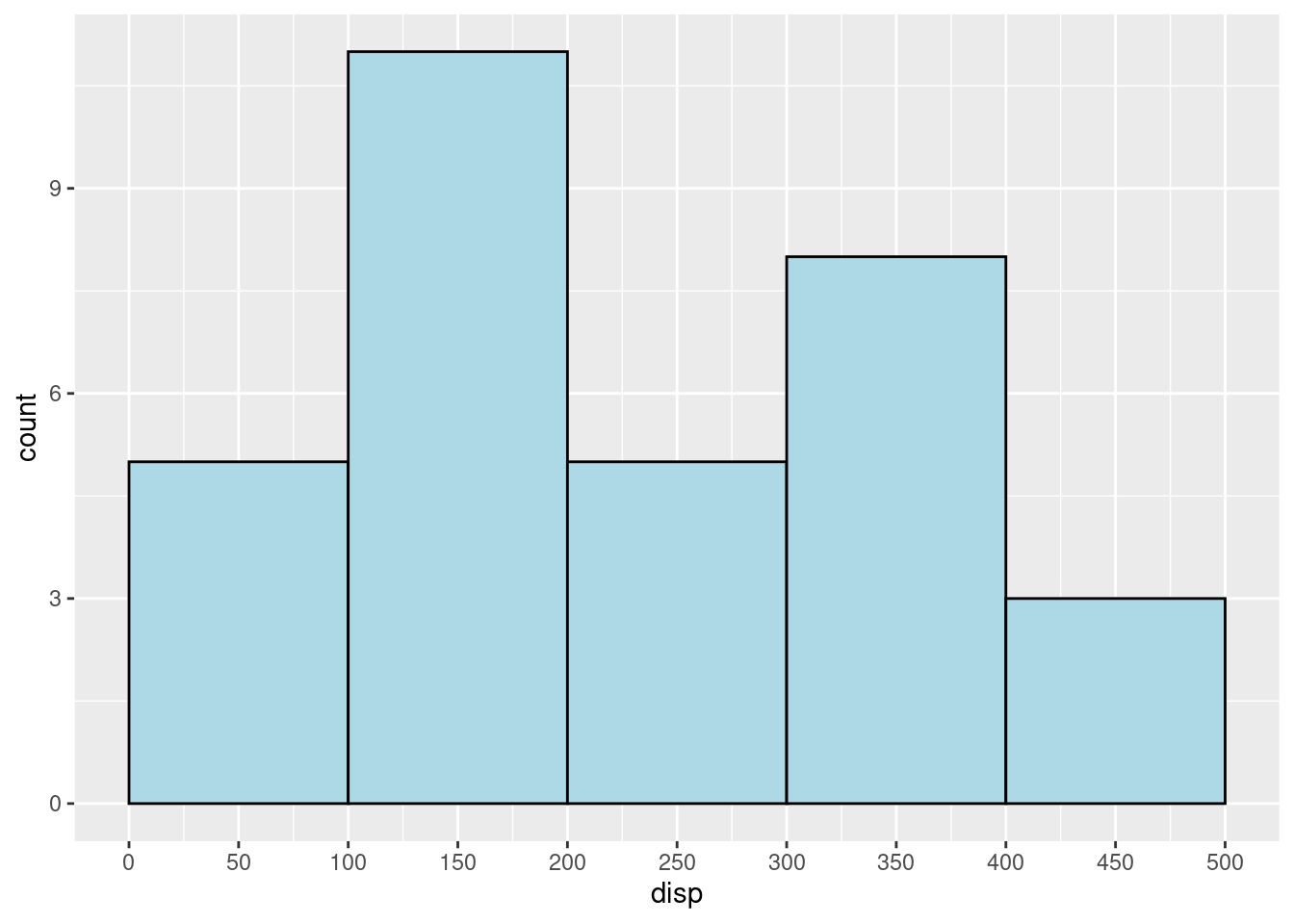
(4)However, R will show a x_tick on X=100 with no x label as well. If you do not want the x_tick = 100 to show up, you can add the line “theme(panel.grid.minor = element_blank())” to eliminate the minor x_ticks lines in the graph. For example:
mtcars %>%
    ggplot(aes(x = disp)) +
    geom_histogram(color = "black", fill = "lightblue",
                   binwidth = 100, center = 50) +
  scale_x_continuous(breaks = seq(0, 500, 50)) +
  theme(panel.grid.minor = element_blank())
19.0.2.2 (b) boxplot:
(use mtcars dataset for example) (1) When drawing a boxplot, we need to specify the x-axis and the y-axis. We can add x,y and cubtitles by using “labs()”. Also, we can adjust the positions of the labs by using “theme()”. “hjust = 0.5” will move the subtitle to the center. For example:
mtcars %>%
ggplot(aes(x=as.factor(cyl), y=mpg)) +
    geom_boxplot() +
    labs(x = "CYL", y = "MPG",
    subtitle = "Boxplots of MPG vs CYL")+
    theme(axis.text.x   = element_text(size = 12),
        axis.text.y   = element_text(size = 12),
        plot.subtitle = element_text(size = 15, face = "bold", hjust = 0.5))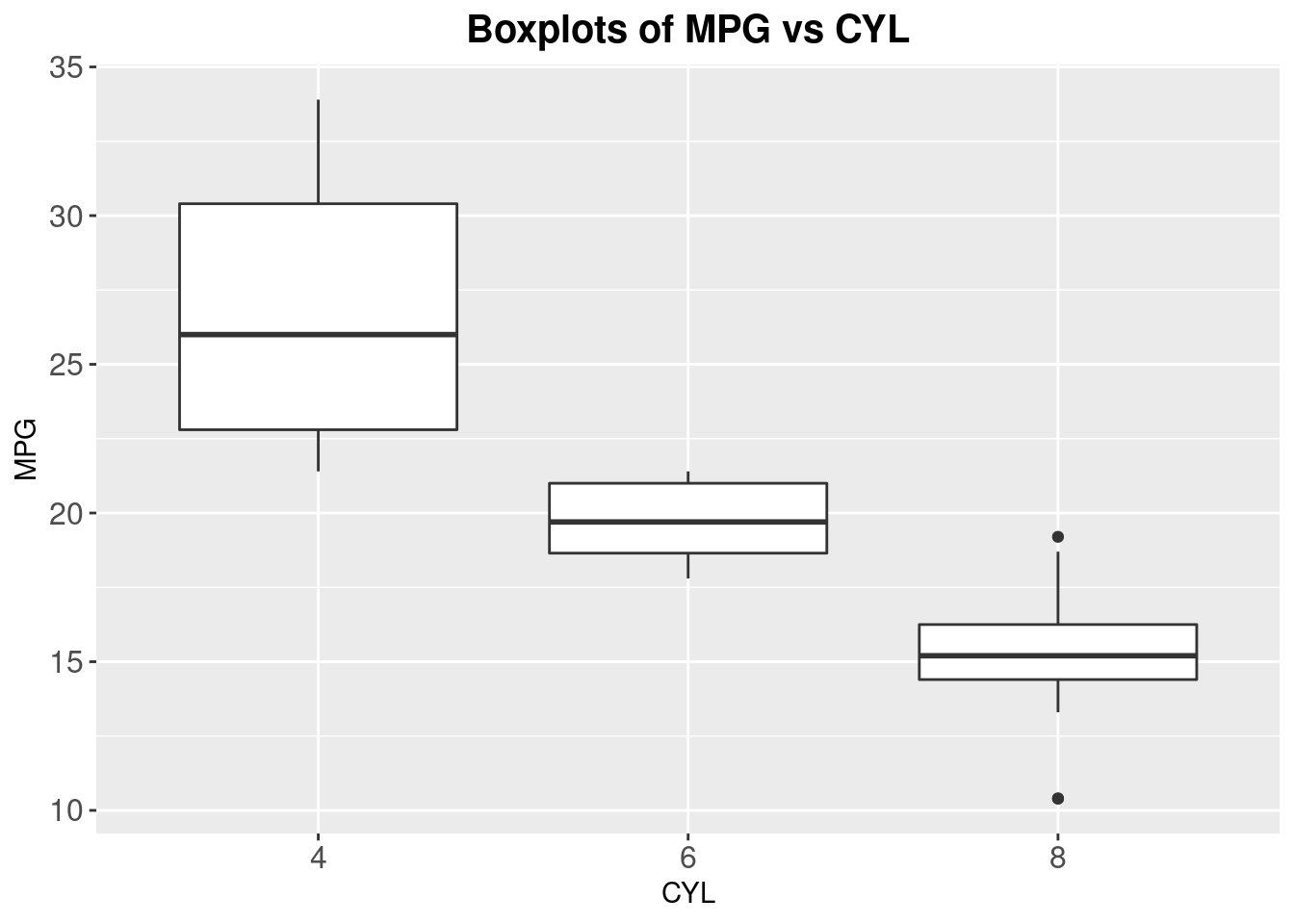
- We can reorder the boxplots by specific conditions. For example, we can reorder the above graph by the median of each CYL level by the median value of MPG. We can reorder the graph by mean, or other values as well.
mtcars %>%
ggplot(aes(x=reorder(as.factor(cyl),mpg,median), y=mpg)) +
    geom_boxplot() +
    labs(x = "CYL", y = "MPG",
    subtitle = "Boxplots of MPG vs CYL")+
    theme(axis.text.x   = element_text(size = 12),
        axis.text.y   = element_text(size = 12),
        plot.subtitle = element_text(size = 15, face = "bold", hjust = 0.5))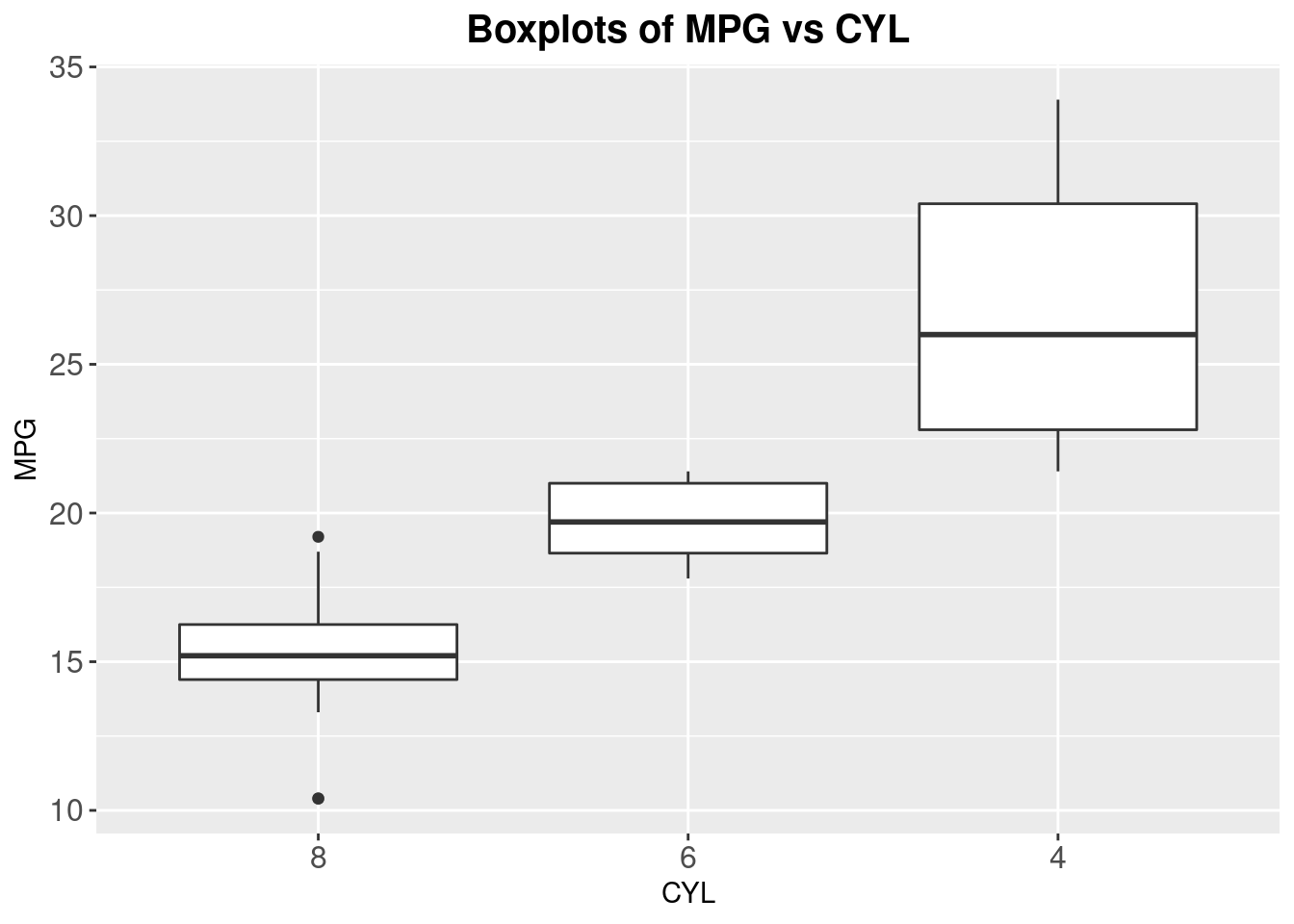
- An easy way to flip the coordinates is to use “coord_flip()”. For example:
mtcars %>%
ggplot(aes(x=reorder(as.factor(cyl),mpg,median), y=mpg)) +
    geom_boxplot() +
    labs(x = "CYL", y = "MPG",
    subtitle = "Boxplots of CYL vs MPG")+
    theme(axis.text.x   = element_text(size = 11),
        axis.text.y   = element_text(size = 11),
        plot.subtitle = element_text(size = 15, face = "bold", hjust = 0.5)) +
        coord_flip()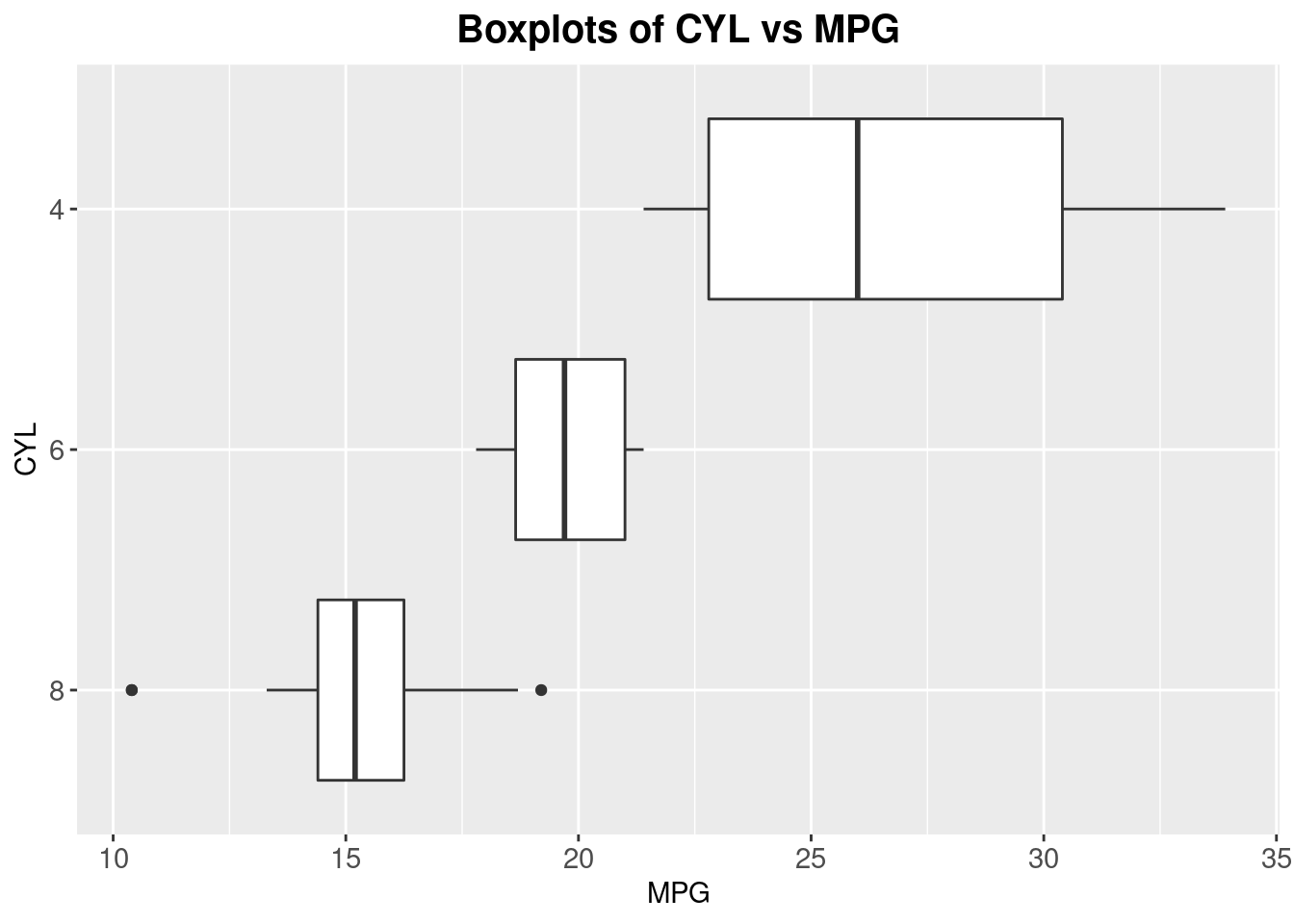
19.0.2.3 (c) Bar Plot
- When drawing a frequency bar plot in ggplot2, we only need to specify the dataset, and the x-axis.
mtcars %>%
ggplot(aes(x=as.factor(cyl))) +
  labs(x = "Number of Cylinders") +
  geom_bar(fill="lightblue",color="black")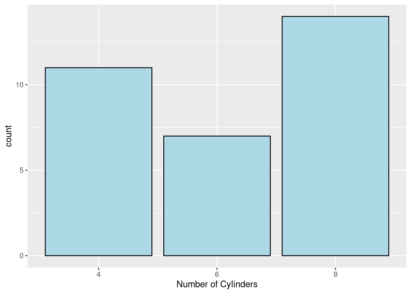
(2)Sometimes, the meaning of the values in X-axis are not very clear (see the example above, 4,6,8 could not make much sense when we look at them), therefore, we need to rename the values into something understandable, but not leave the category names as numbers. We can use the “fct_recode” to solve the problem. See the example below:
mtcars_new <- mtcars
mtcars_new$cyl <- factor(mtcars_new$cyl, levels = c(4,6,8))
mtcars_new$cyl <- fct_recode(mtcars_new$cyl,"Car Models with 4 Cylinders" = "4", "Car Models with 6 Cylinders" = "6","Car Models with 8 Cylinders" = "8")
mtcars_new %>%
ggplot(aes(x=as.factor(cyl))) +
  labs(x = "Number of Cylinders") +
  geom_bar(fill="lightblue",color="black")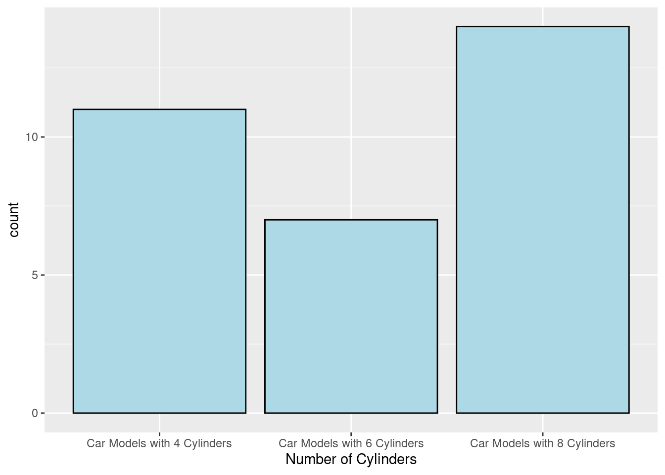
19.0.2.4 (d) Parallel Coordinates Plot
(Use the moderndive dataset for examples)
- We can use the mtcars dataset to draw a parallel coordinate graph. When drawing the graph, we can modify the parameters to create the best graph for analyzing. The lines direction can show the corelation bewteen variables. For example, if the lines between two variables have twists, the two variables are negatively correlated. If the lines between two variables are parallel, no matter the slope of the lines are negative or positive, the two variables are positively correlated (In the graph below, cyl and disp are positively correlated.)
mtcars_new_1 <- mtcars
ggparcoord(mtcars_new_1,columns=1:5,scale='globalminmax')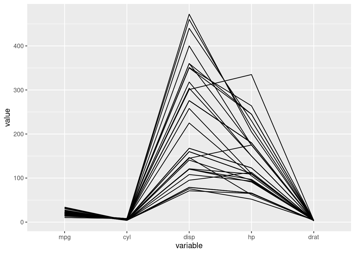
- We can make changes to the parallel coordinates plot, to make the graph more clear. We can use “scale” to rescale the graph “globalminmax” or “uniminmax”. When the data for different variable varies too much, rescaling can help us by see the lines in the graph more clearly. Also, we can see a more smmoth graph by changing “splineFactor” to different numbers. We can also add a title to the graph by simply add “title = …” in the function.
ggparcoord(mtcars_new_1,columns=1:5,scale='uniminmax',alphaLines=.3, splineFactor=10,title='mtcars parallel coordinates')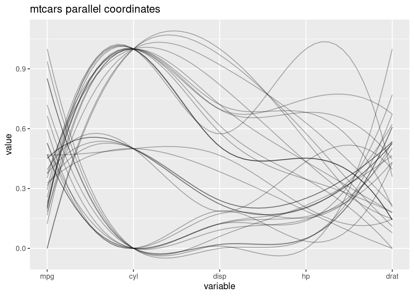
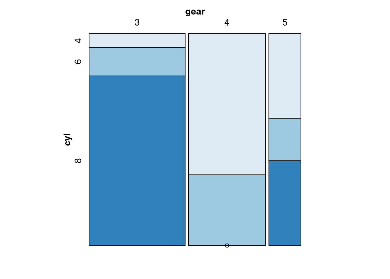
19.0.2.5 (e) Mosaic Plot
- For the mosaic plot, we can find the correlation of different variables as well. If the proportion of one variable distributed evenly on different levels of the other varaible, we say these two variables are nor correlated, since the change of levels of one variable do not influence the other variable. Note, we need to put the dependent variable to the leftside of “~”, and independent variables on the right side. Also, we need to split the dependent variable horizontally.
19.0.2.6 (f) Alluvial
- We can draw an alluvial to find the data flow. Take the Titanic dataset as an example, We can found out people’s personal identity, and the result that they are survived or not. It is a good way to track the data. I think this data is good when the data size is not large, and when we want to know the data flow.I personally think Alluvial is very interesting. It is fun that the graph can track the flow of the data.
ggplot(as.data.frame(Titanic),
       aes(axis1 = Class,axis3 = Age,axis2 = Sex, axis4 = Survived)) +
  geom_alluvium(aes(fill = Class),color='blue') +
  geom_stratum() +
  geom_text(stat = "stratum", aes(label = after_stat(stratum))) +
  scale_x_continuous(breaks = 1:4, labels = c("Class", "Sex", "Age","Survived")) +
  ggtitle("Titanic Alluvial")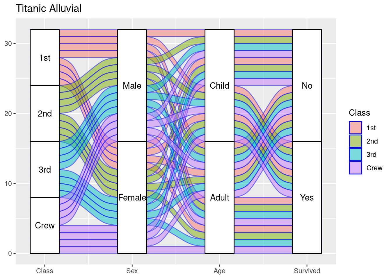
19.0.3 Section Two: Data Transformation Skills
Data transformation is important when doing data visualization. In the reality, the dataset is always too messy for us to visualize. Almost all the times, we need to change the data in order for us to visualize it easily. Here are some useful method that I think is useful when doing data transformation. It is good for us to remember all these method in the mind. (I will use the “mtcars” dataset and the “Titanic” dataset for the examples below.)
19.0.3.1 (a) mutate
(a)“mutate” works as adding a new column in the dataset. We can add a column to the dateset by using some conditions for it to do data visualization later.We can also add a column to the data set by using filter and mutate, I will talk about it later.
##                      mpg cyl  disp  hp drat    wt  qsec vs am gear carb
## Mazda RX4           21.0   6 160.0 110 3.90 2.620 16.46  0  1    4    4
## Mazda RX4 Wag       21.0   6 160.0 110 3.90 2.875 17.02  0  1    4    4
## Datsun 710          22.8   4 108.0  93 3.85 2.320 18.61  1  1    4    1
## Hornet 4 Drive      21.4   6 258.0 110 3.08 3.215 19.44  1  0    3    1
## Hornet Sportabout   18.7   8 360.0 175 3.15 3.440 17.02  0  0    3    2
## Valiant             18.1   6 225.0 105 2.76 3.460 20.22  1  0    3    1
## Duster 360          14.3   8 360.0 245 3.21 3.570 15.84  0  0    3    4
## Merc 240D           24.4   4 146.7  62 3.69 3.190 20.00  1  0    4    2
## Merc 230            22.8   4 140.8  95 3.92 3.150 22.90  1  0    4    2
## Merc 280            19.2   6 167.6 123 3.92 3.440 18.30  1  0    4    4
## Merc 280C           17.8   6 167.6 123 3.92 3.440 18.90  1  0    4    4
## Merc 450SE          16.4   8 275.8 180 3.07 4.070 17.40  0  0    3    3
## Merc 450SL          17.3   8 275.8 180 3.07 3.730 17.60  0  0    3    3
## Merc 450SLC         15.2   8 275.8 180 3.07 3.780 18.00  0  0    3    3
## Cadillac Fleetwood  10.4   8 472.0 205 2.93 5.250 17.98  0  0    3    4
## Lincoln Continental 10.4   8 460.0 215 3.00 5.424 17.82  0  0    3    4
## Chrysler Imperial   14.7   8 440.0 230 3.23 5.345 17.42  0  0    3    4
## Fiat 128            32.4   4  78.7  66 4.08 2.200 19.47  1  1    4    1
## Honda Civic         30.4   4  75.7  52 4.93 1.615 18.52  1  1    4    2
## Toyota Corolla      33.9   4  71.1  65 4.22 1.835 19.90  1  1    4    1
## Toyota Corona       21.5   4 120.1  97 3.70 2.465 20.01  1  0    3    1
## Dodge Challenger    15.5   8 318.0 150 2.76 3.520 16.87  0  0    3    2
## AMC Javelin         15.2   8 304.0 150 3.15 3.435 17.30  0  0    3    2
## Camaro Z28          13.3   8 350.0 245 3.73 3.840 15.41  0  0    3    4
## Pontiac Firebird    19.2   8 400.0 175 3.08 3.845 17.05  0  0    3    2
## Fiat X1-9           27.3   4  79.0  66 4.08 1.935 18.90  1  1    4    1
## Porsche 914-2       26.0   4 120.3  91 4.43 2.140 16.70  0  1    5    2
## Lotus Europa        30.4   4  95.1 113 3.77 1.513 16.90  1  1    5    2
## Ford Pantera L      15.8   8 351.0 264 4.22 3.170 14.50  0  1    5    4
## Ferrari Dino        19.7   6 145.0 175 3.62 2.770 15.50  0  1    5    6
## Maserati Bora       15.0   8 301.0 335 3.54 3.570 14.60  0  1    5    8
## Volvo 142E          21.4   4 121.0 109 4.11 2.780 18.60  1  1    4    2
##                     disAndCyl
## Mazda RX4            26.66667
## Mazda RX4 Wag        26.66667
## Datsun 710           27.00000
## Hornet 4 Drive       43.00000
## Hornet Sportabout    45.00000
## Valiant              37.50000
## Duster 360           45.00000
## Merc 240D            36.67500
## Merc 230             35.20000
## Merc 280             27.93333
## Merc 280C            27.93333
## Merc 450SE           34.47500
## Merc 450SL           34.47500
## Merc 450SLC          34.47500
## Cadillac Fleetwood   59.00000
## Lincoln Continental  57.50000
## Chrysler Imperial    55.00000
## Fiat 128             19.67500
## Honda Civic          18.92500
## Toyota Corolla       17.77500
## Toyota Corona        30.02500
## Dodge Challenger     39.75000
## AMC Javelin          38.00000
## Camaro Z28           43.75000
## Pontiac Firebird     50.00000
## Fiat X1-9            19.75000
## Porsche 914-2        30.07500
## Lotus Europa         23.77500
## Ford Pantera L       43.87500
## Ferrari Dino         24.16667
## Maserati Bora        37.62500
## Volvo 142E           30.25000
You can see a column called “disAndCyl” has been added to the dataset.
19.0.3.2 (b) filter
Filter means select with conditions. For example, if we only want some rows of a dataset, we can use “filter”. We can use boolean expressions, such as “XOR” to select the data we want. After filtering out the data we want, we can create a new column to store the filtered data. For example:
mtcars_modified <- mtcars %>%
  filter(xor(cyl==6,mpg==21.0)) %>%
  mutate(carType = "new type")

mtcars_modified
## mpg cyl disp hp drat wt qsec vs am gear carb carType
## Hornet 4 Drive 21.4 6 258.0 110 3.08 3.215 19.44 1 0 3 1 new type
## Valiant 18.1 6 225.0 105 2.76 3.460 20.22 1 0 3 1 new type
## Merc 280 19.2 6 167.6 123 3.92 3.440 18.30 1 0 4 4 new type
## Merc 280C 17.8 6 167.6 123 3.92 3.440 18.90 1 0 4 4 new type
## Ferrari Dino 19.7 6 145.0 175 3.62 2.770 15.50 0 1 5 6 new type19.0.3.3 (c) fct_grid
“fct_grid” is useful when we need to create plots for a variable by its different levels so that we can compare if different levels of a variable have different data features.
mtcars %>%
  ggplot(aes(x = mpg)) +
  geom_histogram(color = "black", fill = "lightblue") +
  facet_grid(~ cyl)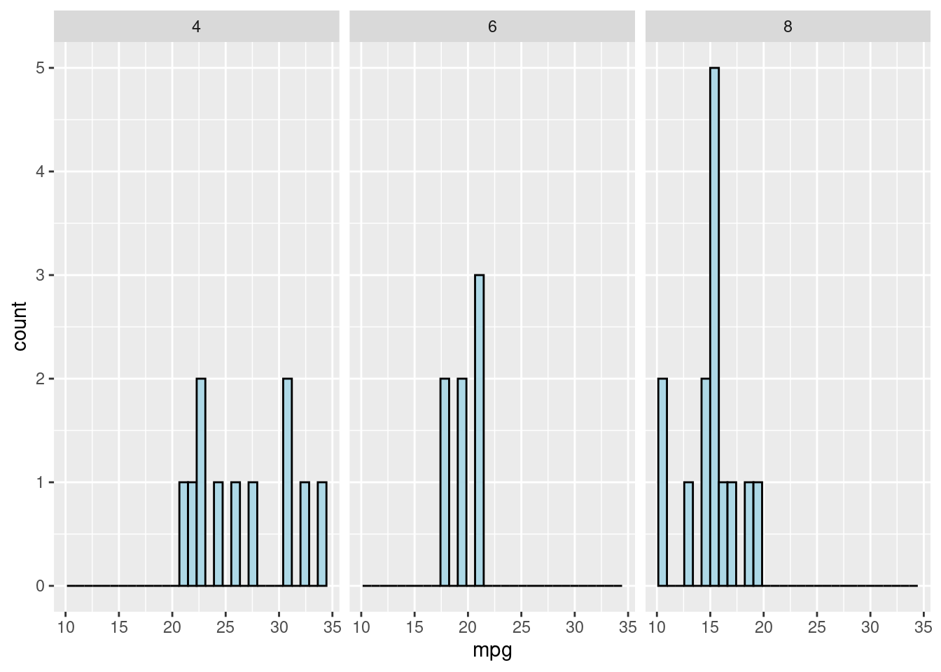
19.0.3.4 (d) sapply
Sapply is commonly used by myself. When it comes to data visualization, we always need to check the data type of the variables. “sapply” can list all the variables names and all the levels within a variable in a dataset. It is very useful.
titanic <-as.data.frame(Titanic)
titanic %>%
     sapply(levels)
## $Class
## [1] "1st" "2nd" "3rd" "Crew"
##
## $Sex
## [1] "Male" "Female"
##
## $Age
## [1] "Child" "Adult"
##
## $Survived
## [1] "No" "Yes"
##
## $Freq
## NULL19.0.3.5 (e)pivot_wider
Pivot_wider is useful when we need to transform a dataset into a “wider” form. For example, for the Titanic dataset, pivot_wider can extract the levels in a variable, such as Sex, and turns all the levels into the columns of the dataset. If is extremely useful when visualize the frequency of different levels of a vriable in a dataset.
titanic## Class Sex Age Survived Freq
## 1 1st Male Child No 0
## 2 2nd Male Child No 0
## 3 3rd Male Child No 35
## 4 Crew Male Child No 0
## 5 1st Female Child No 0
## 6 2nd Female Child No 0
## 7 3rd Female Child No 17
## 8 Crew Female Child No 0
## 9 1st Male Adult No 118
## 10 2nd Male Adult No 154
## 11 3rd Male Adult No 387
## 12 Crew Male Adult No 670
## 13 1st Female Adult No 4
## 14 2nd Female Adult No 13
## 15 3rd Female Adult No 89
## 16 Crew Female Adult No 3
## 17 1st Male Child Yes 5
## 18 2nd Male Child Yes 11
## 19 3rd Male Child Yes 13
## 20 Crew Male Child Yes 0
## 21 1st Female Child Yes 1
## 22 2nd Female Child Yes 13
## 23 3rd Female Child Yes 14
## 24 Crew Female Child Yes 0
## 25 1st Male Adult Yes 57
## 26 2nd Male Adult Yes 14
## 27 3rd Male Adult Yes 75
## 28 Crew Male Adult Yes 192
## 29 1st Female Adult Yes 140
## 30 2nd Female Adult Yes 80
## 31 3rd Female Adult Yes 76
## 32 Crew Female Adult Yes 20
titanic_new <- titanic %>%
  count(Class,Sex,sort = TRUE,name ="Freq") %>%
  pivot_wider(id_cols = Class, names_from = Sex,values_from = Freq) %>%
  rowwise()

titanic_new
## # A tibble: 4 × 3
## # Rowwise:
## Class Male Female
## <fct> <int> <int>
## 1 1st 4 4
## 2 2nd 4 4
## 3 3rd 4 4
## 4 Crew 4 419.0.3.6 (f)pivot_longer
Similar to pivot_wider, pivot_longer can transform a dataset into a “longer” form. For example, for the Titanic dataset, pivot_longer can combine several columns of the dataset together into one column, which makes the dateset “longer”. You can compare the dataset of the original Titanic, titanic_new, and titanic_new_1 to see how pivot_longer and pivot_wider work.
titanic_new_1<-titanic_new %>%
    pivot_longer(cols = !Class,names_to = "Sex",values_to = "frequency")
titanic_new_1
## # A tibble: 8 × 3
## Class Sex frequency
## <fct> <chr> <int>
## 1 1st Male 4
## 2 1st Female 4
## 3 2nd Male 4
## 4 2nd Female 4
## 5 3rd Male 4
## 6 3rd Female 4
## 7 Crew Male 4
## 8 Crew Female 4