57 Hive plots with the ggraph and hiver packages
Ben Zimnick
library('ggraph')
library('igraph')
library('ggplot2')
library('tidygraph')
library('dplyr')
library('HiveR')
library('grid')
57.1 Networks
57.1.1 Network Definition
A network is a collection of connected objects. Networks are often called graphs.
57.1.4 Directed Graph
The edges have directions. If a and b are nodes, they can be connected by an edge from a to b and/or an edge from b to a. Directed edges are often represented with arrows pointing from one node to another.
57.1.5 Undirected Graph
The edges do not have directions; the relationship goes both ways. If a and b are connected nodes, the edge goes from a to b and from b to a.
57.1.6 Degree
The degree of a node is the number of edges that are incident to the node. In directed graphs, the in-degree is the number of edges going into the node; the out-degree is the number of edges exiting the node.
57.1.7 General Graph Example
The New York City subway system is a network. The stations (nodes) are connected by tunnels (edges). If all of the trains run in both directions, the subway would be an undirected graph. Otherwise, it would be a directed graph.
57.2 Hive Plots
57.2.1 Hive Plot Definition
A hive plot is a method for visualizing networks. The nodes are located on lines that are distributed radially around the center of the plot (like hands on a clock). Edges are represented as curved lines between nodes.
57.2.2 Creating Hive Plots
There is not a clear method for organizing the nodes. It is up to the person creating the graph to decide what works best for the data. But the nodes are typically ordered by degree on the axes.
57.2.3 ggraph
ggraph is the most recent method for creating hive plots in R. The cran documentation was updated on February 23, 2021.
There are two main ways to create hive plots using ggraph. The first relies on the igraph package; the second relies on the dplyr and tidygraph packages.
The first example (which I needed to adjust slightly–I included an explanation in the ‘note’ section below) is from r-bloggers.com. The second example is from rdocumentation.org. The sources are in the ‘sources’ section.
Both examples use the highschool data set, which is built into the ggraph package. The data set shows friendships among high school boys. In 1957 and again in 1958, the boys were asked which other boys they were friends with. In the hive plots, the nodes are boys, and the edges are friendships.
I used the highschool data set because it is what most resources explaining network plots, including the ggraph cran documentation, use. Additionally, as one of the three data sets built into the ggraph package (the other two are the flare and whigs data sets), the highschool data set is convenient to work with.
57.2.4 igraph method
This method usses the ggraph and igraph packages.
The graph_from_data_frame function in the igraph package creates an igraph graph from a data frame.
graph <- graph_from_data_frame(highschool)The degree degree of a node (or vertex) is its number of adjacent edges. For each node, the degree function gives the number of edges going into the node (‘in’), the number of edges going out of the node (‘out’), or the total degree (‘all’).
The nodes are going to be located on three axes–few, many, medium–corresponding to the number of edges going into the node. In this example, the nodes are kids; the edges are friendships.
V(graph)$friends <- ifelse(V(graph)$friends < 5, 'few',
                           ifelse(V(graph)$friends >= 15, 'many', 'medium'))
ggraph is an extension of ggplot2 that deals with graphs. ggraph sets the type of plot (hive) and the axis variable (friends). ggraph also sorts the nodes by degree.
geom_edge_hive draws edges between the nodes. colour is one of the many adjustable parameters.
geom_axis_hive edits the axes.
ggraph(graph, 'hive', axis = friends, sort.by = 'degree') +
  geom_edge_hive(aes(colour = factor(year))) +
  geom_axis_hive(aes(colour = friends), size = 3, label = FALSE) +
  coord_fixed()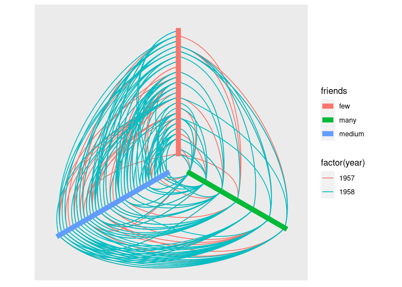
57.2.5 tidygraph method
This step uses the ggraph, ggplot2, tidygraph, and dplyr packages.
as_tbl_graph converts a data set to a tbl_graph, a wrapper that makes it possible to manipulate igraph objects in a tidy API.
centrality_degree gives the degree of the degree of the node.
graph <- as_tbl_graph(highschool) %>%
  mutate(degree = centrality_degree())
Create a friends column that divides the nodes (kids) by their degrees (number of friends).
graph <- graph %>%
  mutate(friends = ifelse(
    centrality_degree(mode = 'in') < 5, 'few',
    ifelse(centrality_degree(mode = 'in') >= 15, 'many', 'medium')
  ))
ggraph is an extension of ggplot2 that deals with graphs. ggraph sets the type of plot (hive) and the axis variable (friends). ggraph also sorts the nodes by degree. Unlike in the previous example, degree is not in quotes.
ggraph(graph, 'hive', axis = friends, sort.by = degree) +
  geom_edge_hive(aes(colour = factor(year))) +
  geom_axis_hive(aes(colour = friends), size = 3, label = FALSE) +
  coord_fixed()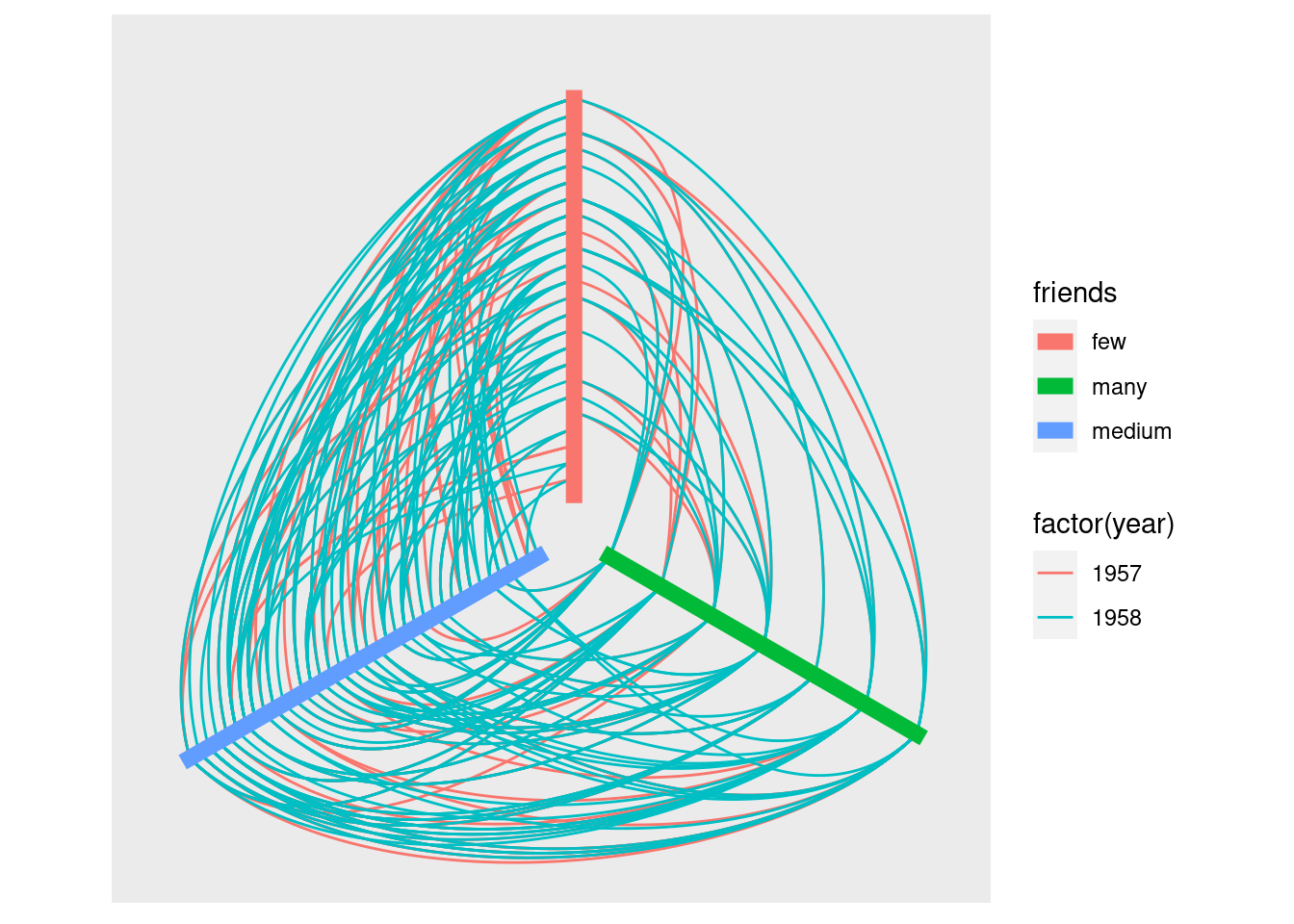
57.2.6 Faceting
facet_edges allows you to split the plots based on edge attributes. The nodes are repeated in every subplot. facet_edges is equivalent to facet_wrap in ggplot.
facet_nodes allows you to create subplots based on node attributes.
ggraph(graph, 'hive', axis = friends, sort.by = degree) +
  geom_edge_hive(aes(colour = factor(year))) +
  geom_axis_hive(aes(colour = friends), size = 3, label = FALSE) +
  coord_fixed() +
  facet_edges(~year)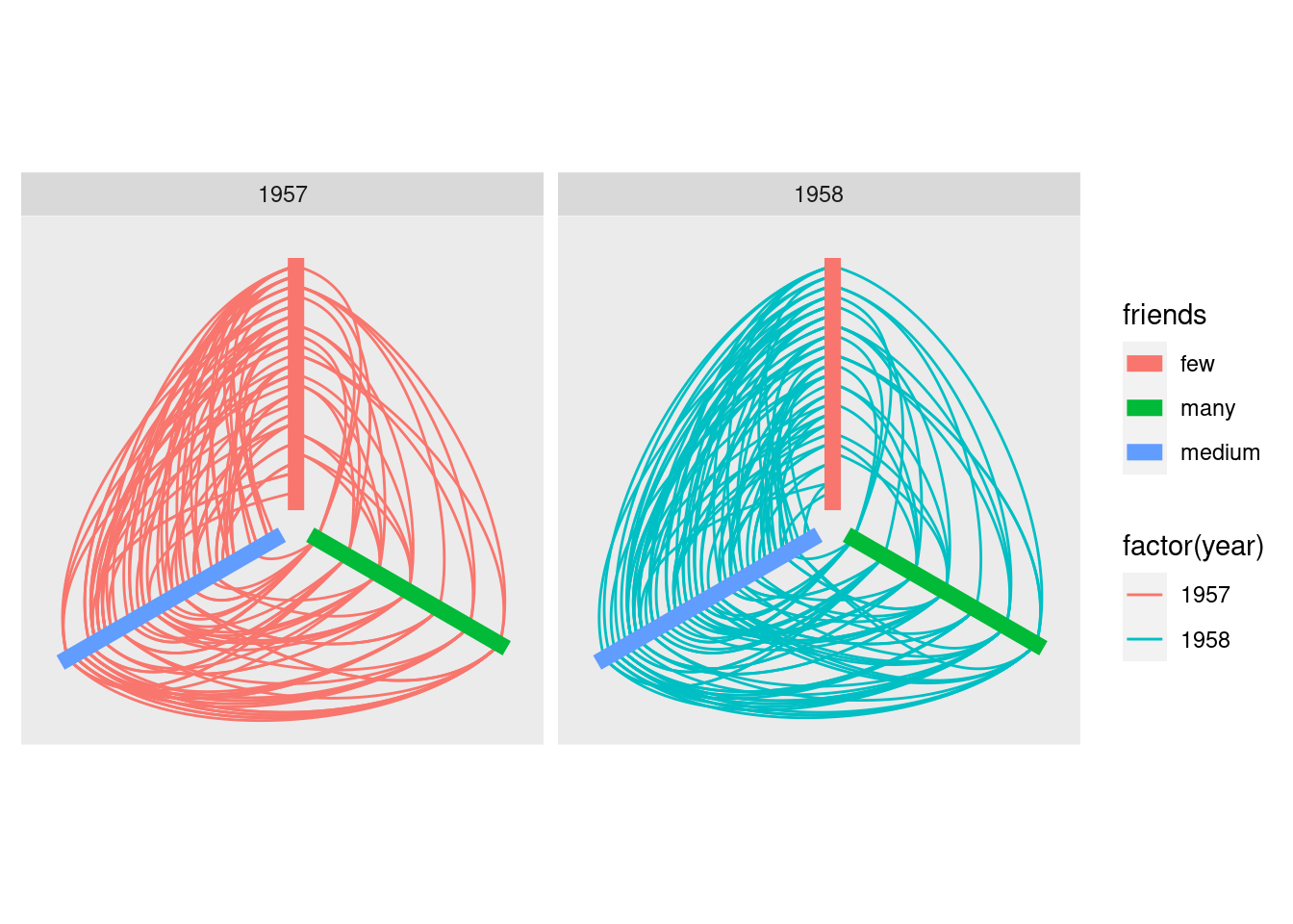
57.3 HiveR
HiveR is another package for creating hive plots. HiveR does not seem as popular as ggraph. HiveR was first published in 2011; it was updated in 2020.
HiveR contains two plant-pollinator data sets–Arroyo and Safari– that give the number of visits for each plant-pollinator pair. The data sets were taken from a 2003 paper by Vazquez and Simberloff. The Safari data were taken from an undisturbed area; the Arroyo data were collected in an area that was grazed by cattle.
I used the Arroyo data for the example.
This step uses the HiveR and grid packages.
Load the Arroyo data.
data("Arroyo")plotHive creates a hive plot from a HivePlotData object.
The rank method orders the nodes by degree. bkgnd sets the background color. axLabs sets the axis labels. axLab.pos sets the axis label positions. And axLab.gpar sets features (color, size, etc.) of the labels.
plotHive(Arroyo,
         method = 'rank', bkgnd = 'white',
         axLabs = c('pollinators','plants'),
         axLab.pos = c(10,7),
         axLab.gpar = gpar(col = "black"))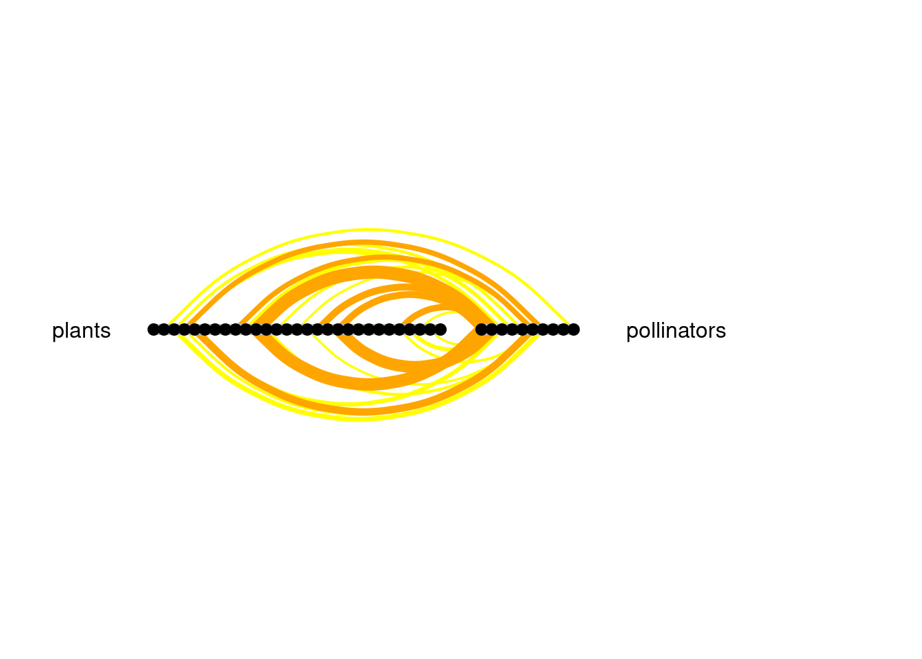
57.4 Sources
57.4.1 Networks
“Math Insight.” An Introduction to Networks - Math Insight, https://mathinsight.org/network_introduction.
Networks and Graphs. Columbia University, https://kc.columbiasc.edu/ICS/icsfs/Networks.pdf?target=a96539a9-4cfd-44a5-baf2-fd798e1772ea.
57.4.2 Hive Plots
- Krzywinski, Martin. Hive Plots: Rational Network Visualization - A Simple, Informative and Pretty Linear Layout for Network Analytics. http://www.hiveplot.com/.
57.4.3 ggraph
“GGRAPH.” RDocumentation, https://www.rdocumentation.org/packages/ggraph/versions/2.0.5.
Pedersen, Thomas L. Package ‘Ggraph’. CRAN, 23 Feb. 2021, https://cran.r-project.org/web/packages/ggraph/ggraph.pdf.
“Introduction to Ggraph: Layouts.” Data Imaginist, 6 Feb. 2017, https://www.data-imaginist.com/2017/ggraph-introduction-layouts/.
“Introduction to Ggraph: Layouts: R-Bloggers.” R-Bloggers, 18 Feb. 2017, https://www.r-bloggers.com/2017/02/introduction-to-ggraph-layouts/.
57.4.4 HiveR
Hanson, Bryan A. Package ‘HiveR’. Depauw University, 15 Feb. 2013, http://www2.uaem.mx/r-mirror/web/packages/HiveR/HiveR.pdf.
Hanson, Bryan A. The HiveR Package. Depauw University, 25 June 2012, http://www2.uaem.mx/r-mirror/web/packages/HiveR/vignettes/HiveR.pdf.