48 Tutorial on lattice package in R
Yunxiao Wang
Install the lattice package
#install.packages("lattice")load lattice
48.1 Overview
The lattice package is a very powerful high-level graphing package written by Deepayan Sarkar.The lattice package provides a complete system for visualizing univariate and multivariable data. Many users turn to learn the lattice package because it will makes it easier to generate grid graphics. Grid graphics can show the distribution of variables or relationships between variables clearly
The lattice package provides many useful functions, which can generate single factor graphs (dot plot, histogram, bar plot, and box plot), bivariate graphs (scatter plots, strip graphs and parallel boxplot) and multivariate graphs (three-dimensional graphs and scatter plot matrixes).
48.2 Introduction
The overall format is :
graph_function(formula, data=, options)
formula:specifies the variables to be displayed and any adjustment variables; Data: specify data frame options:are comma separated parameters used to adjust the content, arrangement and annotation of graphics.
48.2.1 Common graph_function:
xyplot(): Scatter plot
splom(): Scatter plot matrix
cloud(): 3D scatter plot
stripplot(): strip plots (1-D scatter plots)
bwplot(): Box plot
dotplot(): Dot plot
barchart(): bar chart
histogram(): Histogram
densityplot(): Kernel density plot
qqmath(): Theoretical quantile plot
qq(): Two-sample quantile plot
contourplot(): 3D contour plot of surfaces
levelplot(): False color level plot of surfaces
parallel(): Parallel coordinates plot
48.2.2 common formula format
Let lowercase be numeric variable, capital letter be factor variable
The format is:
y ~ x | A * B
Variable on left side are primary variable, variables are right side are conditioning variable.
y ~ x : y for y axis and x for x axis
If only have one variable use ~x instead of y~x.
For 3D plot,use z ~ x*y instead of y~x
For Multivariate graph, like scatter matrix and parallel corrdinate plot, use data.frame instead of y~x.
~x|A represent plot x with each level of factor A.
y~x|A*B represent given levels of A and B, plot the relationship of y and x
For convenience, I use mtcars dataset in this tutorial to make examples.
attach(mtcars)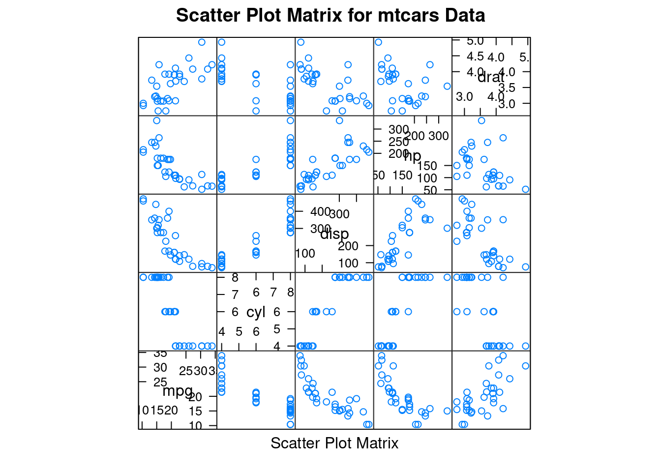
48.2.5 Density Plot by transmission
#create new variable
mtcars$transmission <- factor(mtcars$am, levels=c(0, 1),
 labels=c("Automatic", "Manual"))
#Density Plot by transmission
densityplot(~mpg |transmission , data=mtcars,
 main="MPG Distribution by Transmission Type",
xlab="Miles per Gallon") 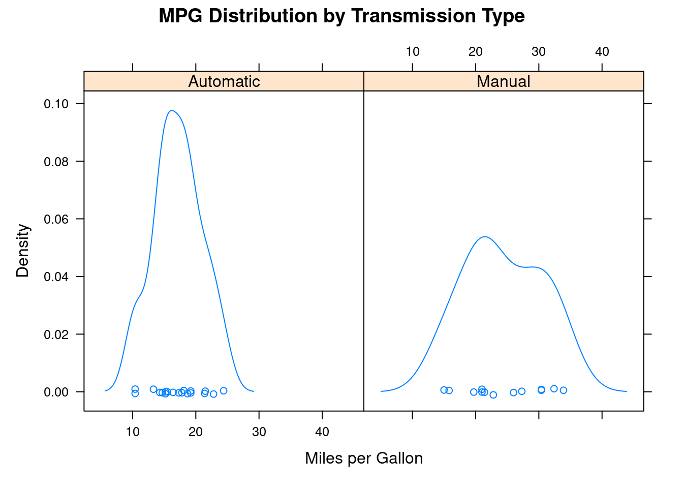
48.2.6 xyplot
xyplot is also a type of scatterplot.
xyplot(mpg ~ wt | transmission, data=mtcars,
 main="Scatter Plots by transmission ",
 xlab="Car Weight", ylab="Miles per Gallon")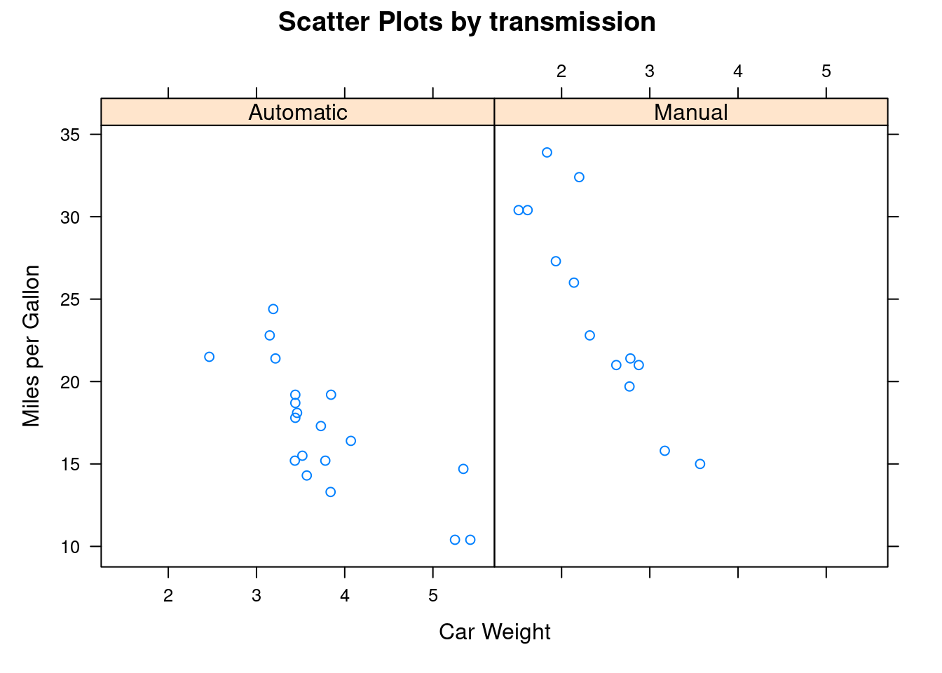
48.2.7 boxplot
#group by transmission

bwplot(~mpg | transmission, data=mtcars,
 main="Box Plots by transmission",
 xlab="Miles per Gallon")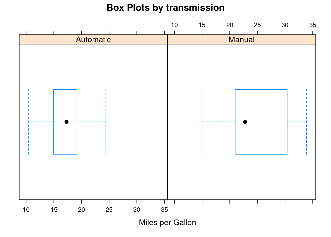
48.2.8 Kernel density estimation with grouped variables and custom legend
I put many comments here to describe things that each line of the code does.
#create new variable
mtcars$transmission <- factor(mtcars$am, levels=c(0, 1),
 labels=c("Automatic", "Manual"))
#set color
colors <- c("red", "green")
#set line type
lines <- c(1,3)
#set point type
points <- c(16,18)

#customize legend
key.trans <- list(title="Transmission",
 space="bottom", columns=2,
 text=list(levels(mtcars$transmission)),
 points=list(pch=points, col=colors),
 lines=list(col=colors, lty=lines),
 cex.title=1, cex=.95)


#kernel density plot
densityplot(~mpg, data=mtcars,
#set group by variable
 group=transmission,
 #give title
 main="MPG Distribution by Transmission Type",

 xlab="Miles per Gallon",
 #set type of point and line and set color
 pch=points, lty=lines, col=colors,
 #size
 lwd=2, jitter=.005,
 #draw legend as we customized above
 key=key.trans)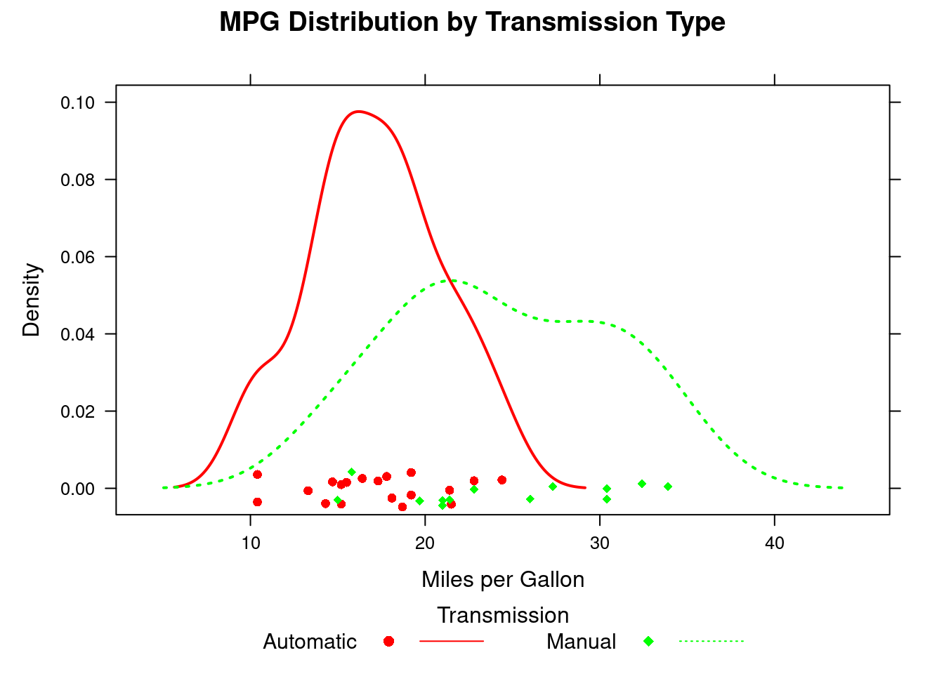
48.2.9 Adjust variable
The regulatory variable usually is a factor variable. But what should we do if we only have continuous variables but still interested in their relationship?
One way is use the cut() function converts continuous variables into discrete variables. Alternatively, the functions provided by the lattice package can also do this efficiently.
The variable of is transformed into a data structure named shingle. Specifically, continuous variables are divided into a series of (possibly) overlapping ranges.
disp is original a continious variable,we divided it to three group as factor variable
displace <- equal.count(mtcars$disp, number=3, overlap=0)
xyplot(mpg~wt|displace, data=mtcars,
 main = "Miles per Gallon vs. Weight by Engine Displace",
 xlab = "Weight", ylab = "Miles per Gallon",
 layout=c(3, 1), aspect=1.5)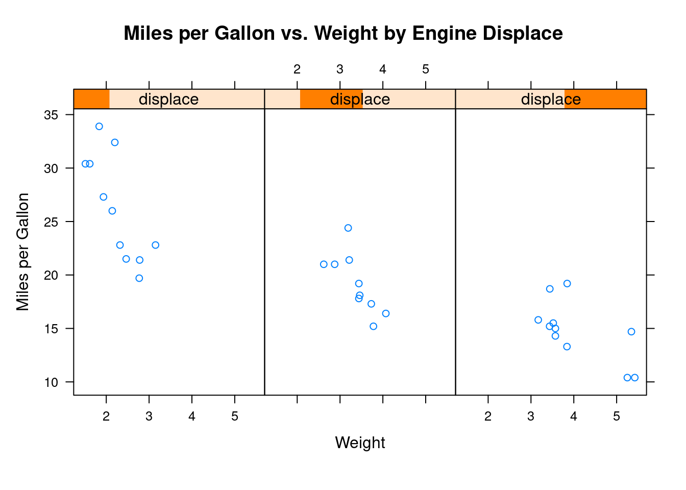
48.2.10 Panel function
We can create our own panel functions to draw the plot in 7
displacement <- equal.count(mtcars$disp, number=3, overlap=0)
#customize panel function, including plottype, layout, line color..etc.
mypanel <- function(x, y) {
 panel.xyplot(x, y, pch=15)
 panel.rug(x, y)
 panel.grid(h=-1, v=-1)
 panel.lmline(x, y, col="blue", lwd=1, lty=2)
}
#draw grouped scatterplot
xyplot(mpg~wt|displacement, data=mtcars,
 layout=c(3, 1),
 aspect=1.5,
 main = "Miles per Gallon vs. Weight by Engine Displacement",
 xlab = "Weight",
 ylab = "Miles per Gallon",
 panel = mypanel)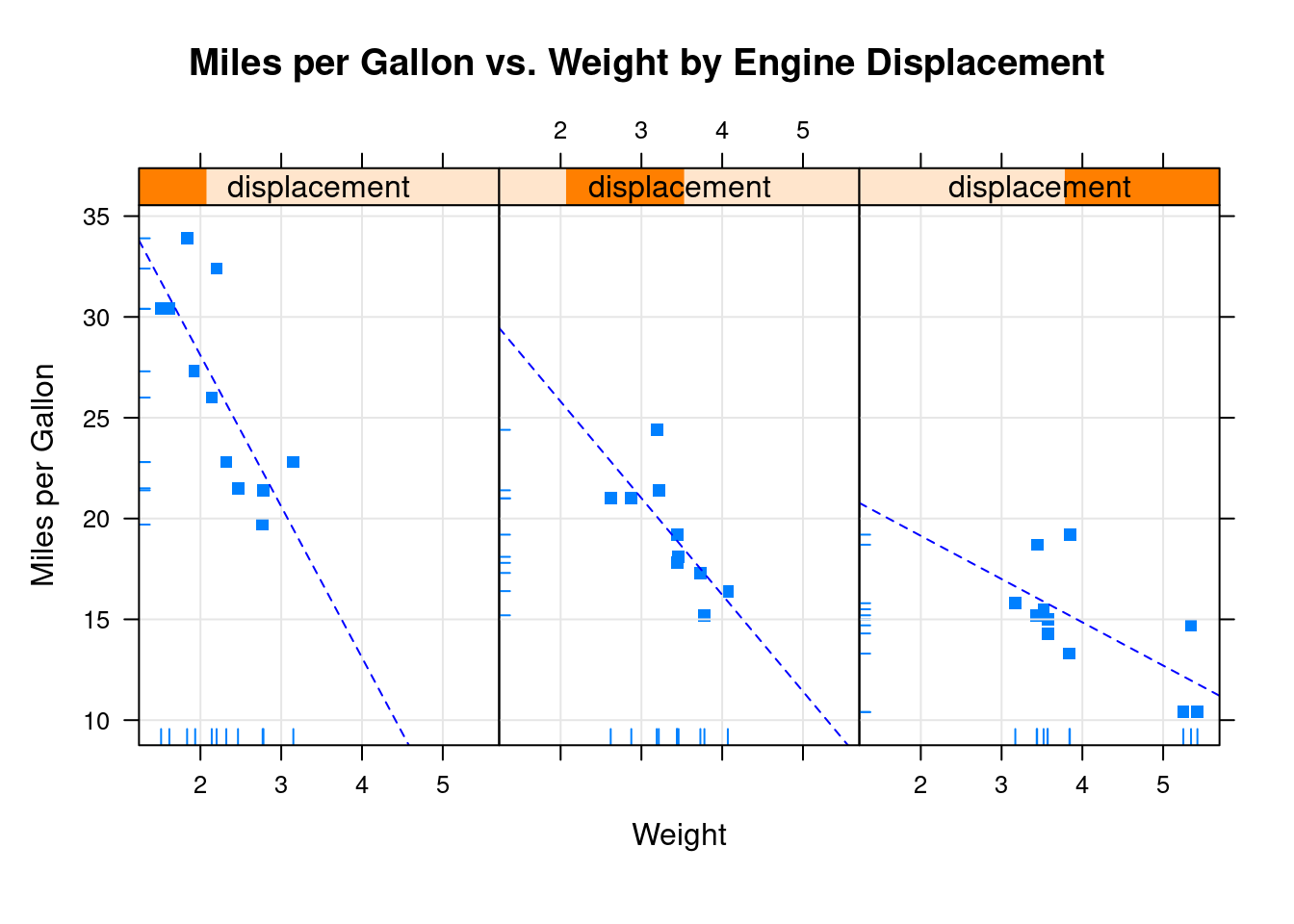
48.2.11 xyplot for customizing panel functions and additional options
mtcars$transmission <- factor(mtcars$am, levels=c(0,1),
 labels=c("Automatic", "Manual"))
panel.smoother <- function(x, y) {
 panel.grid(h=-1, v=-1)
 panel.xyplot(x, y)
 #panel. loess() give the nonparameter fitting line
 panel.loess(x, y)
 panel.abline(h=mean(y), lwd=2, lty=2, col="red")
 }
xyplot(mpg~disp|transmission,data=mtcars,
 scales=list(cex=.8, col="blue"),
 panel=panel.smoother,
 xlab="Displacement", ylab="Miles per Gallon",
 main="MPG vs Displacement by Transmission Type",
 sub = "Dotted lines are Group Means", aspect=1)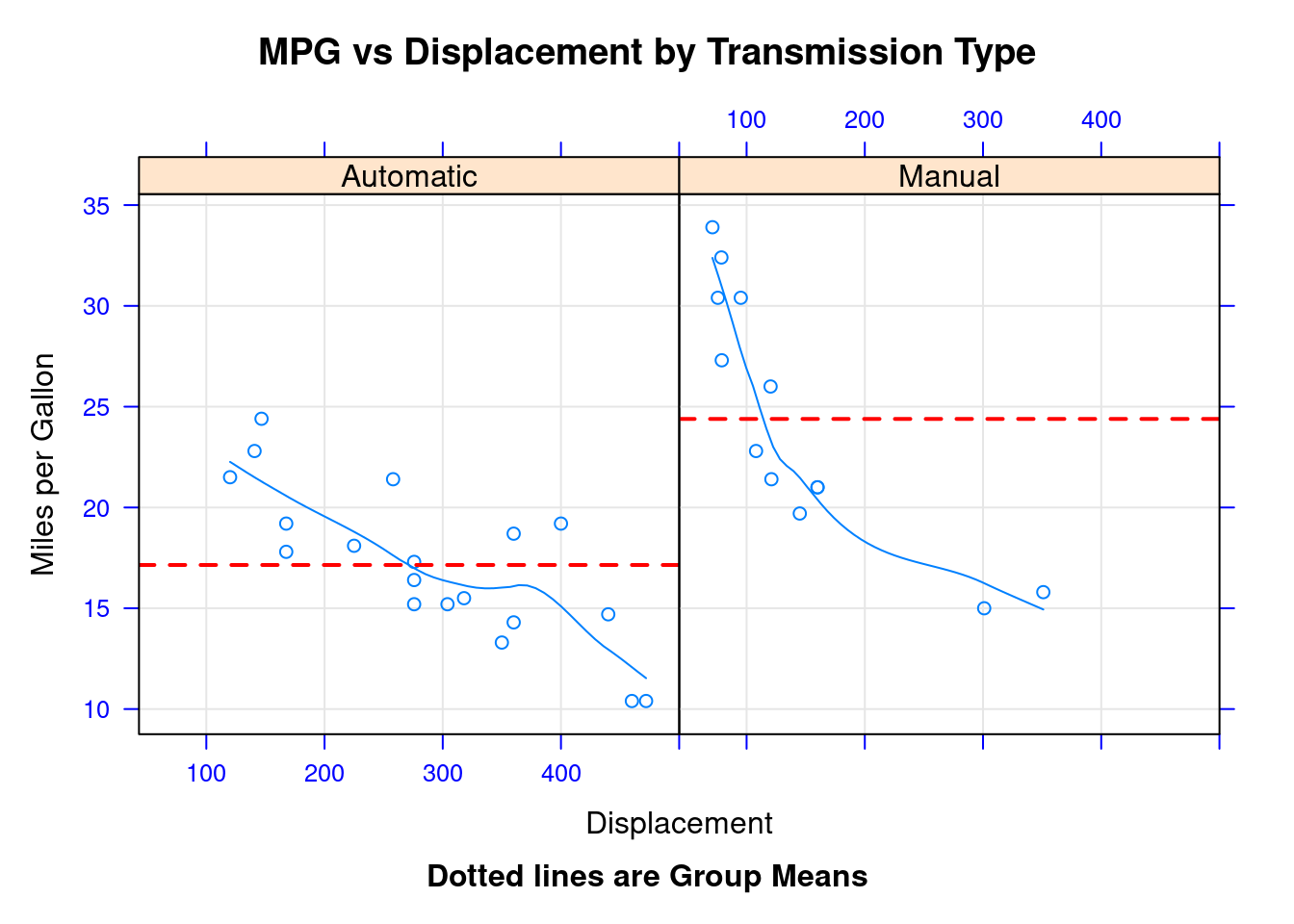
48.2.12 Page layout
48.2.12.1 split
We can put more than 1 plot in 1 page if we want. split function can split one page to specify number of rows and columns, then put plot to each specified cell. The format of split is: split=c(x, y, nx, ny) Put current plot at the xth row yth column cell in a nx*ny 2D array. origin is top left corner.
#draw a histogram
graph1 <- histogram(~height | voice.part, data = singer,
 main = "Heights of Choral Singers by Voice Part" )
#draw a density plot
graph2 <- densityplot(~height|voice.part, data = singer)
#whoe page is 1*2 matrix
#plot graph 2 at (1,1)
plot(graph1, split = c(1, 1, 1, 2))
#plot graph 2 at (1,2)
plot(graph2, split = c(1, 2, 1, 2), newpage = FALSE)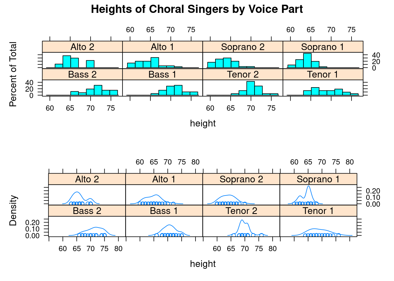
48.2.12.2 position
Another way is use postion function:
position=c(xmin, ymin, xmax, ymax)
The whole page is a 2D coordinate. x and y have a range(0,1).
(0,0) origin point at bottom left.
We can arrage each plot size more precisely now.
graph1 <- histogram(~height, data = singer )

graph2 <- densityplot(~height, data = singer)
plot(graph1, position=c(0.3, 0, 1, 1))
plot(graph2, position=c(0, 0, 0.3, 1), newpage=FALSE)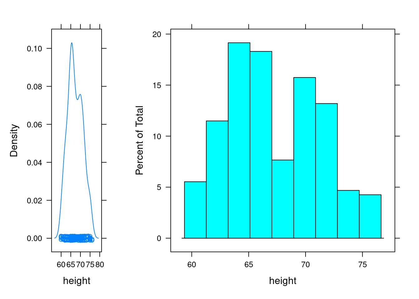
48.3 Sources
- http://mng.bz/jXUG
- http://www.sthda.com/english/wiki/lattice-graphs
- R in action(second edition) Chapter 23