63 Base R Tutorial
Siqin Shen
63.1 Overview
This is a Base R Cheatsheet/Tutorial, and it includes the most common Base R graphic functions and parameters.
I will use data SleepStudy from Lock5withR package.
SleepStudy <- Lock5withR::SleepStudy63.2 Section 1 - Functions
63.2.2 Barplot
Make sure the data is a matrix or vector before plot barplot.
The most easy way is to use the table() function to transform the data.
LarkOwl <- table(SleepStudy$LarkOwl)
barplot(LarkOwl, names.arg = "Lark-Owl", border = "blue" , col = "grey", horiz = FALSE)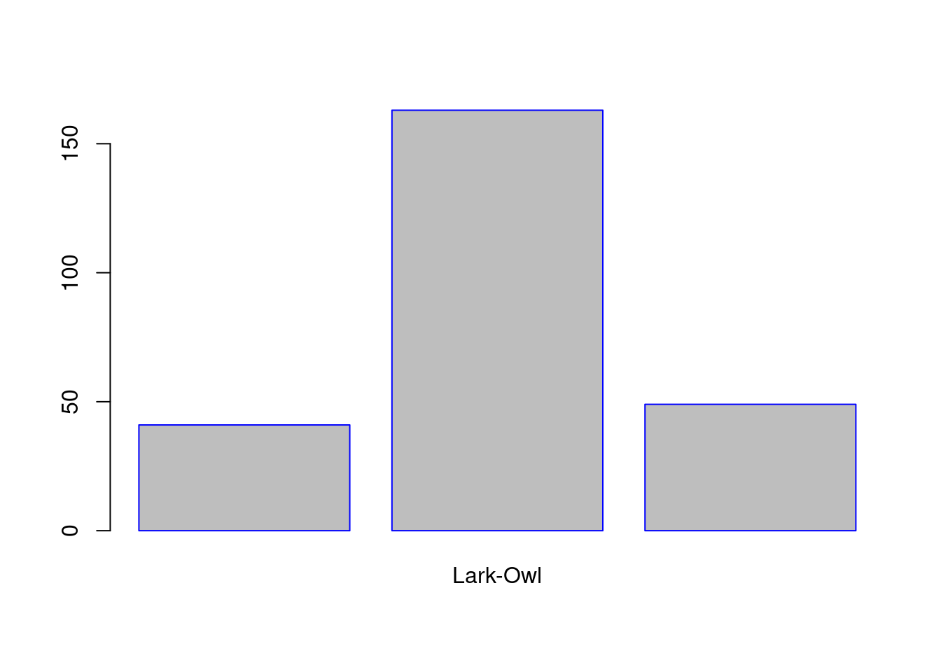
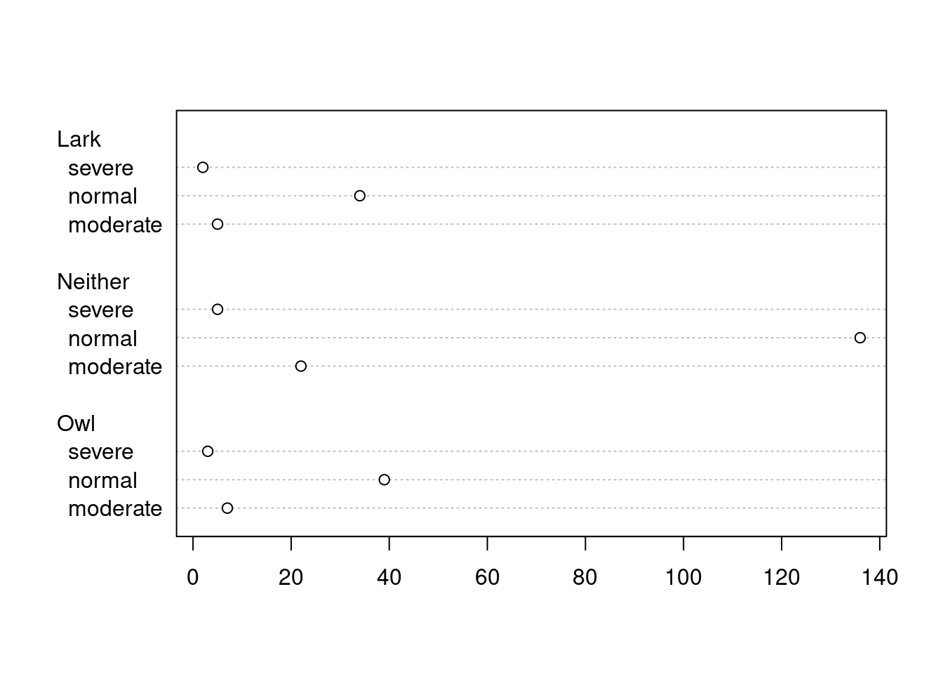
63.2.4 Dot Plot
A dot plot is just a bar chart that uses dots to represent individual quanta.
source: https://www.mvorganizing.org/is-a-dot-plot-the-same-as-a-scatter-plot/#:~:text=A%20dot%20plot%20is%20just,height%20and%20one%20represented%20weight.
63.2.5 Box Plot
boxplot(PoorSleepQuality ~ DepressionStatus, data = SleepStudy, horizontal = FALSE, names = c("moderate", "normal", "severe"), col = "gold")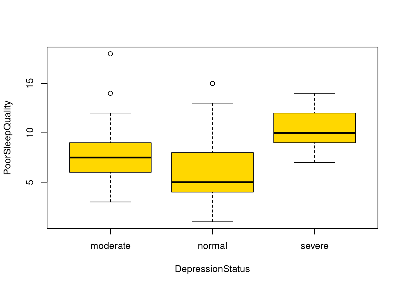
63.2.6 Mosaic Plot
Make sure the data is a matrix or vector before plot mosaic plot.
The most easy way is to use the table() function to transform the data.
table_data <- table(SleepStudy$ClassYear, SleepStudy$NumEarlyClass)
mosaicplot(table_data, color = TRUE)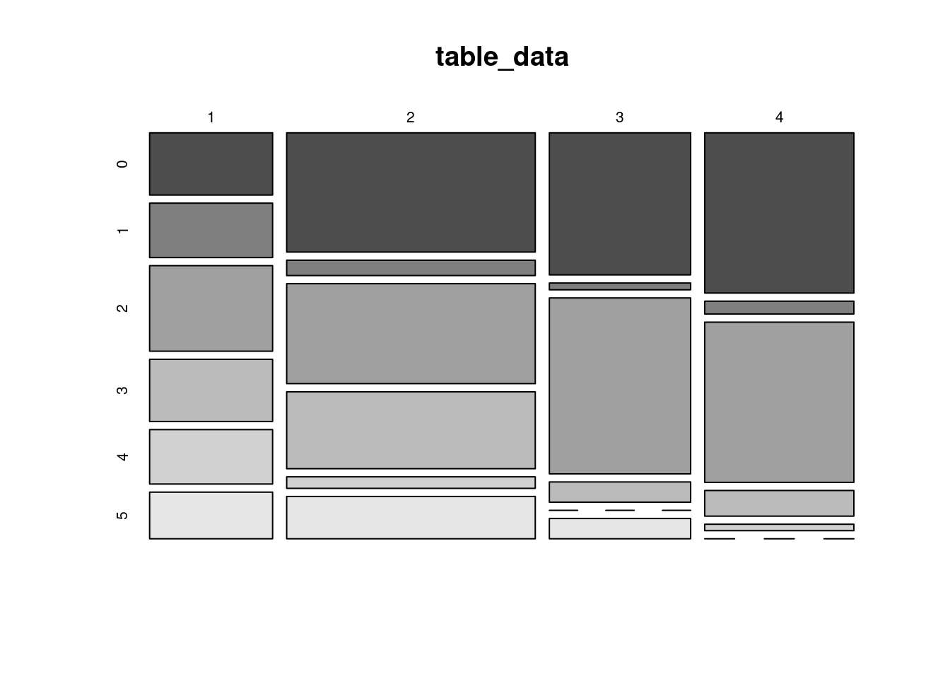
63.3 Section 2 - Parameters
63.3.1 Main
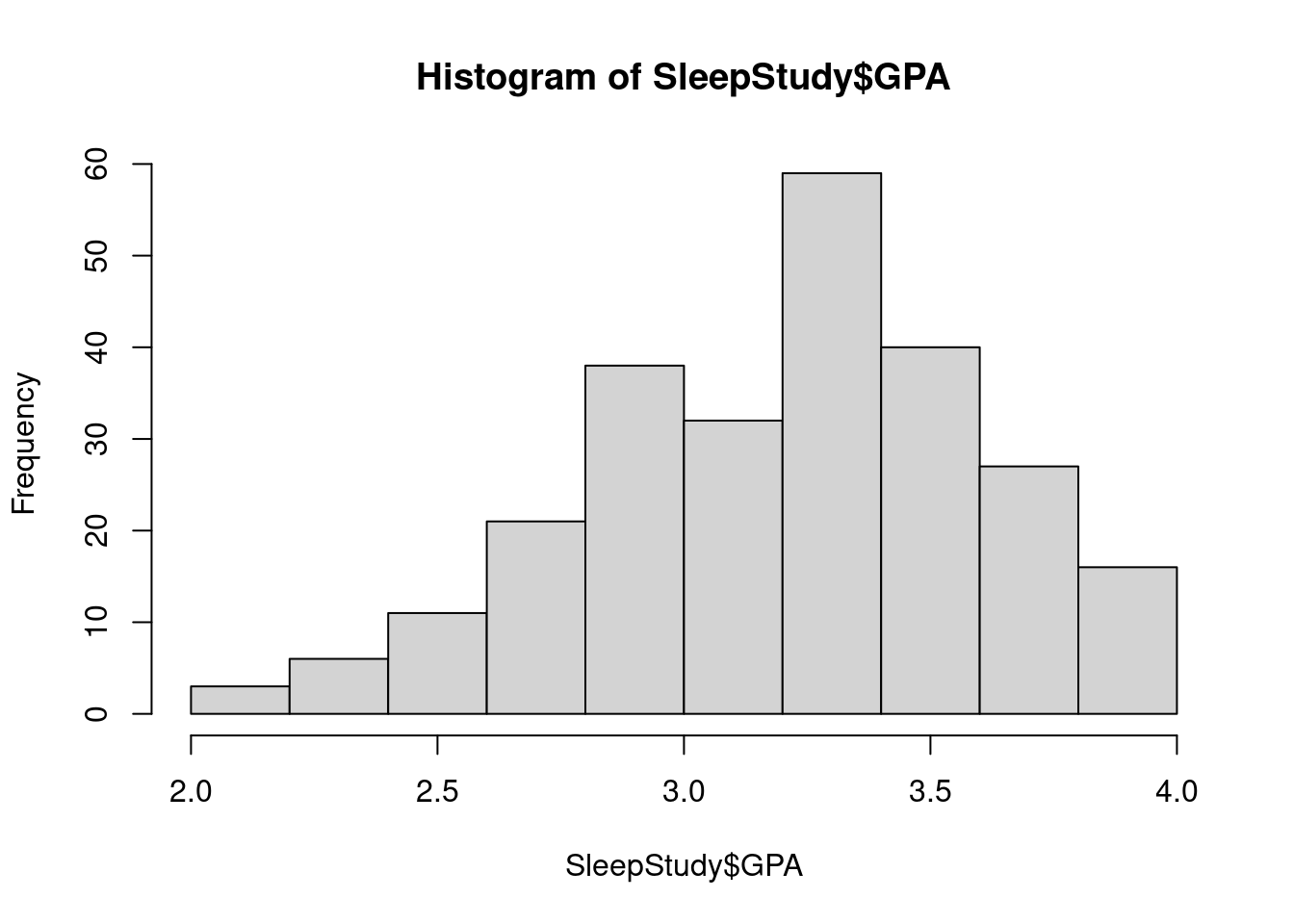
It adds the title to a graph.
hist(SleepStudy$GPA, breaks = 10, main = "GPA distribution")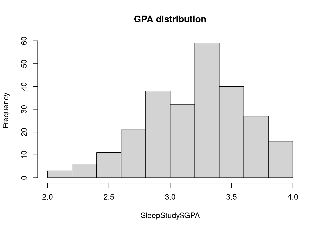
63.3.2 Labels
It adds the x-axis and y-axis labels to the graph.
hist(SleepStudy$GPA, breaks = 10, main = "GPA distribution", xlab = "GPA", ylab = "Number of Students")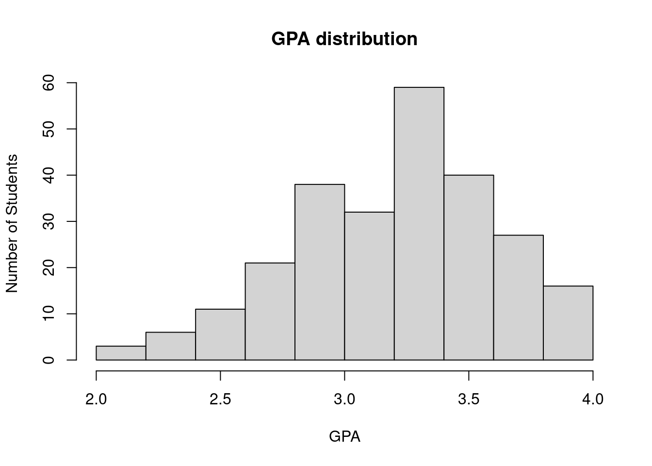
63.3.3 Add Color
hist(SleepStudy$GPA, breaks = 10, main = "GPA distribution", xlab = "GPA", ylab = "Number of Students",col.lab = "light blue", col = "gold")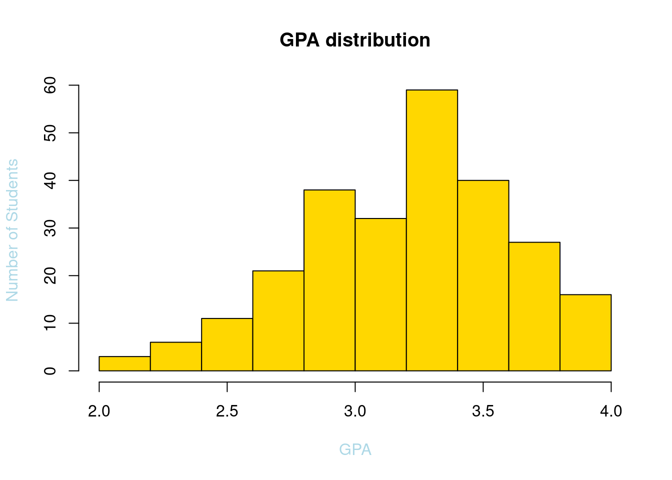
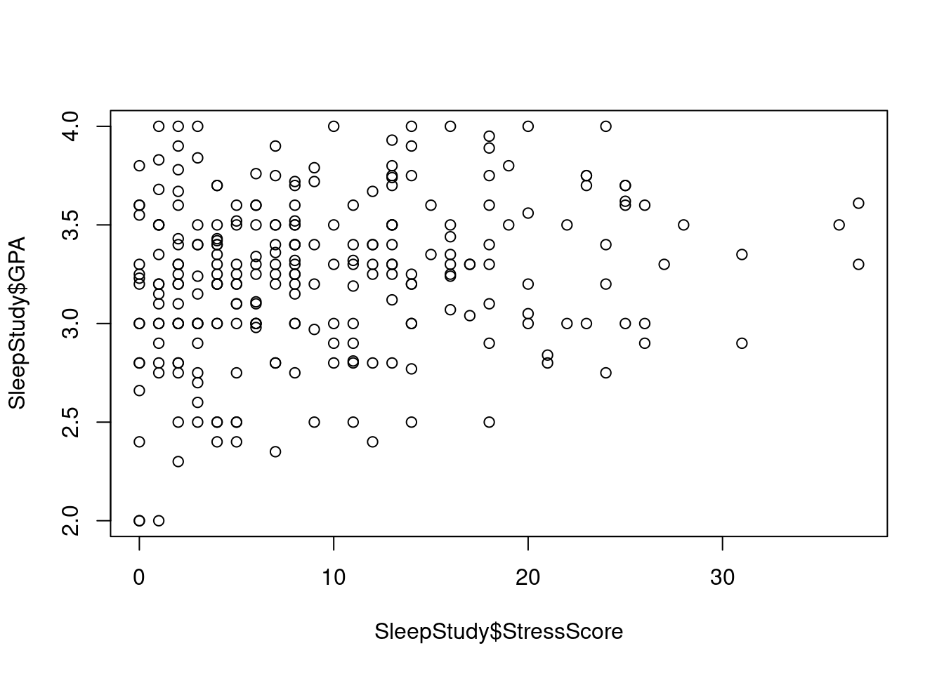
63.3.4 Point Shape
plot(SleepStudy$StressScore, SleepStudy$GPA, main = "Stress Score vs GPA", pch = 6, xlab = "StressScore", ylab = "GPA",col.lab = "light blue")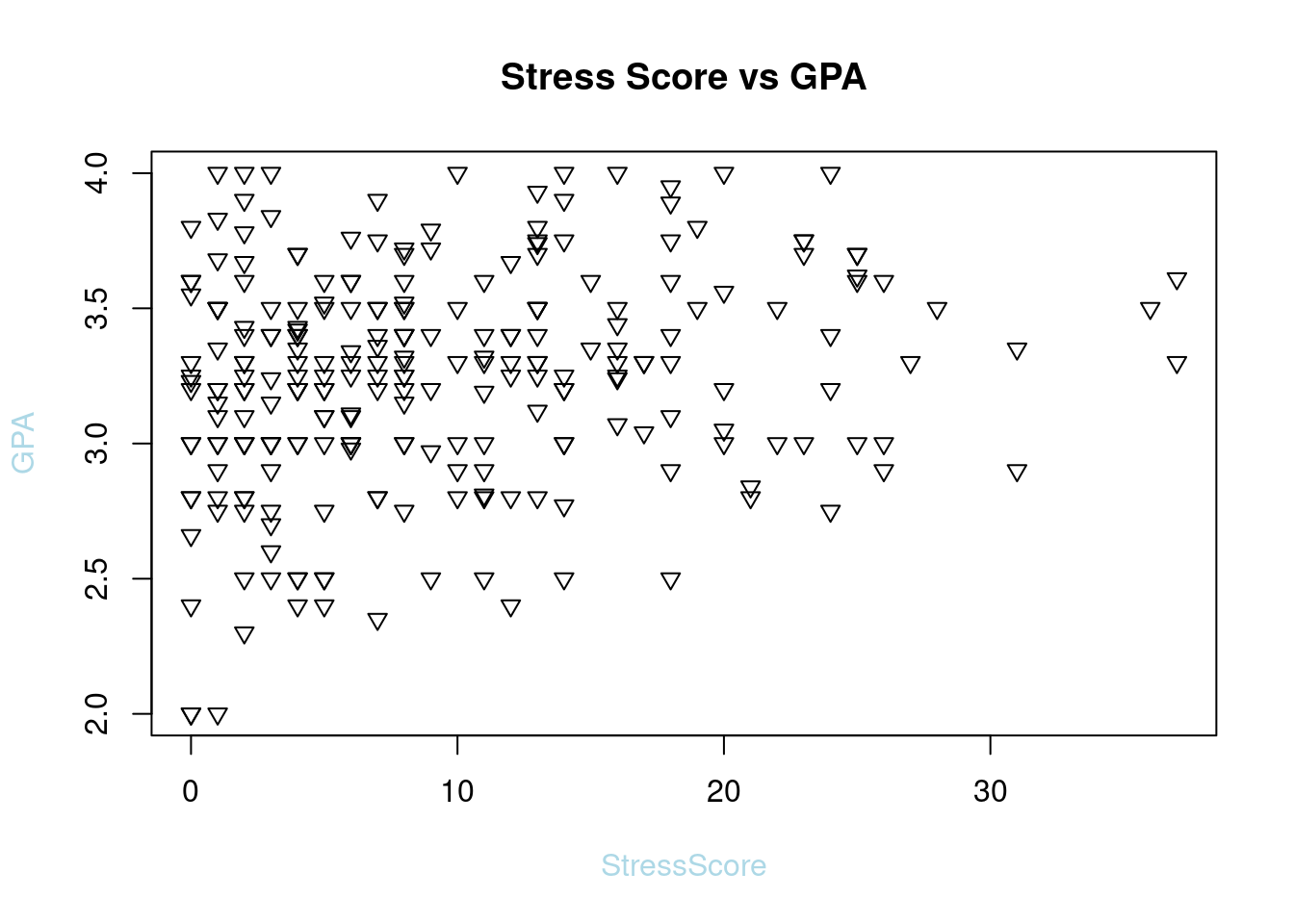
63.3.5 Legend
plot(SleepStudy$StressScore, SleepStudy$GPA, main = "Stress Score vs GPA", col = SleepStudy$LarkOwl, pch = 6, xlab = "StressScore", ylab = "GPA",col.lab = "light blue")
legend("topleft", legend = levels(SleepStudy$LarkOwl), col = 1:nlevels(SleepStudy$LarkOwl), pch = 6, title = "LarkOwl")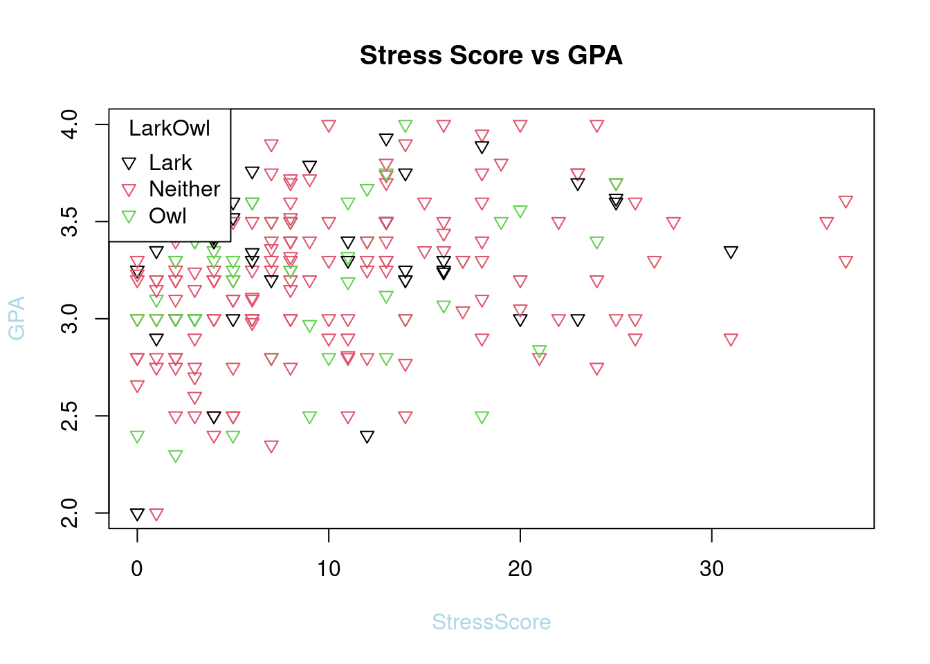
63.3.6 Point/label Size
plot(SleepStudy$StressScore, SleepStudy$GPA, main = "Stress Score vs GPA", col = SleepStudy$LarkOwl, pch = 6, xlab = "StressScore", ylab = "GPA",col.lab = "light blue", cex.lab = 1.5, cex = 0.75)
legend("topleft", legend = levels(SleepStudy$LarkOwl), col = 1:nlevels(SleepStudy$LarkOwl), pch = 6, title = "LarkOwl")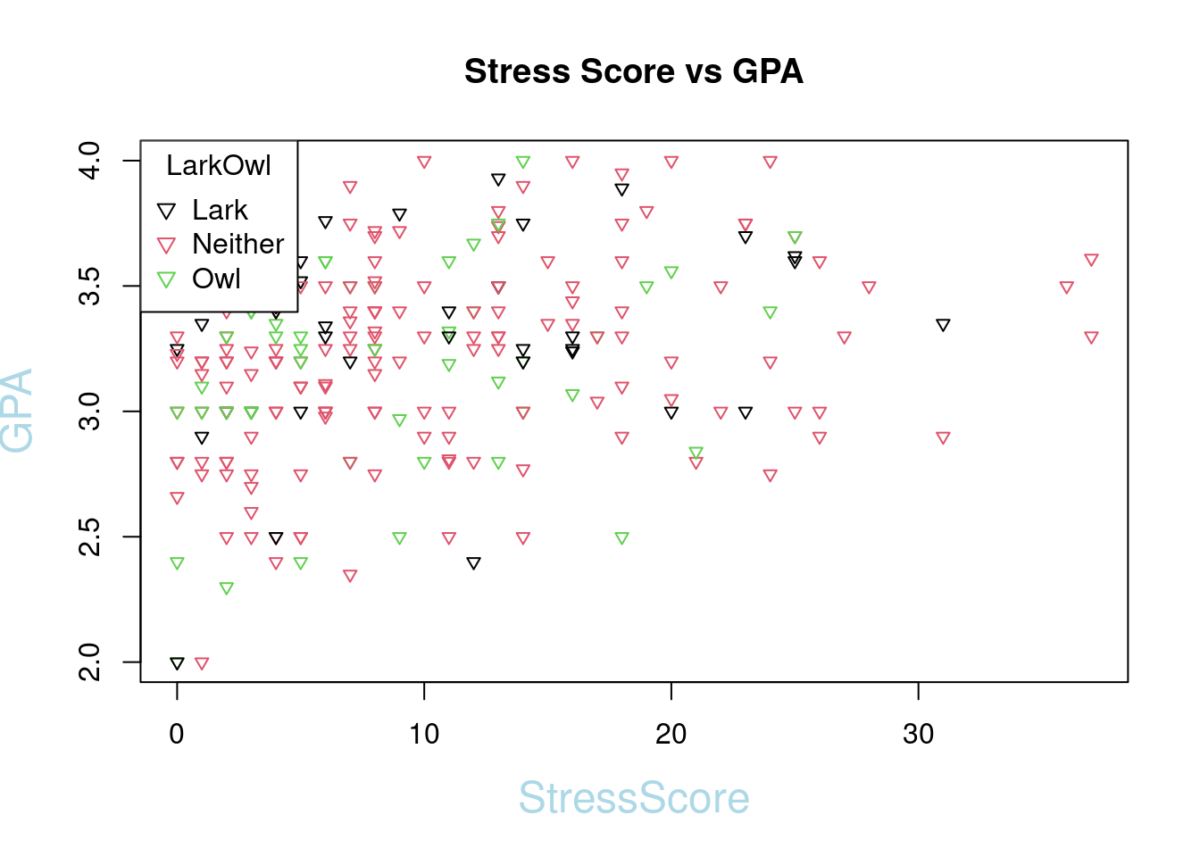
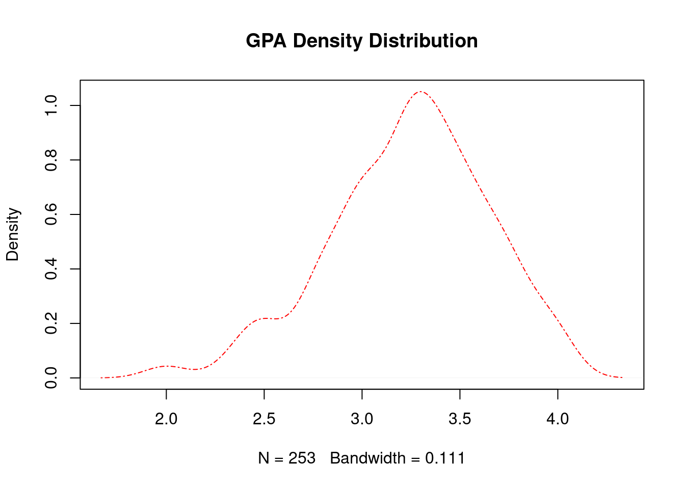
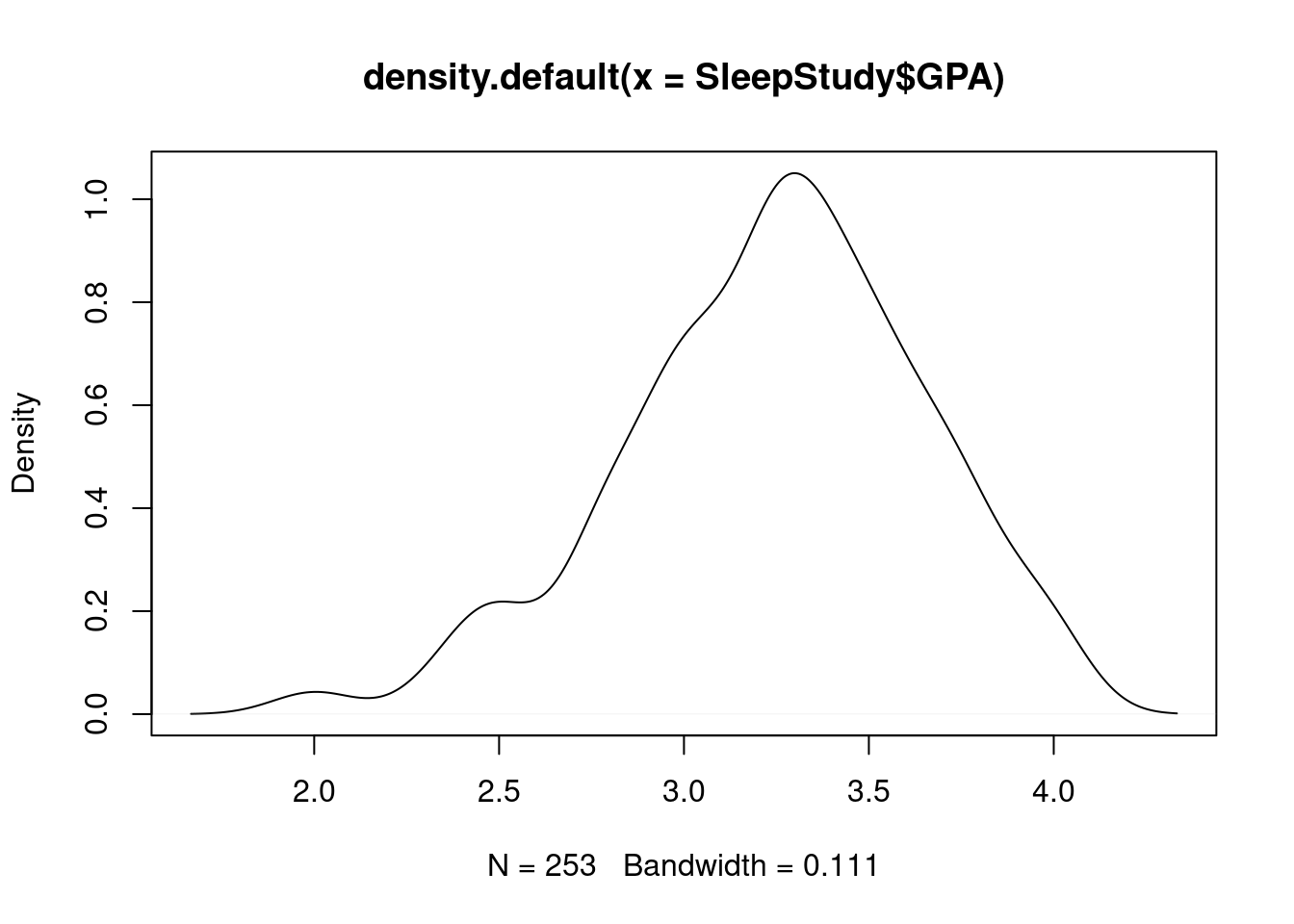
63.3.8 Line Width
plot(density_gpa, main = "GPA Density Distribution", lty = 4, col = "red", lwd = 2)
63.4 Section 3 - Others
- Add best fit Lines to a scatter plot
We need to get the function of line first. We can use Loess smoother loess() to simulate the line.
source: https://dcgerard.github.io/stat234/base_r_cheatsheet.html
loess_fit <- loess(GPA ~ StressScore, data = SleepStudy)
xnew <- seq(min(SleepStudy$StressScore), max(SleepStudy$StressScore), length = 100)
ynew <- predict(object = loess_fit, newdata = data.frame(StressScore = xnew))

plot(SleepStudy$StressScore, SleepStudy$GPA, main = "Stress Score vs GPA", col = SleepStudy$LarkOwl, pch = 6, xlab = "StressScore", ylab = "GPA",col.lab = "light blue", cex.lab = 1.5, cex = 0.75)
legend("topleft", legend = levels(SleepStudy$LarkOwl), col = 1:nlevels(SleepStudy$LarkOwl), pch = 6, title = "LarkOwl")
lines(xnew, ynew, col = "blue", lty = 1, lwd = 2)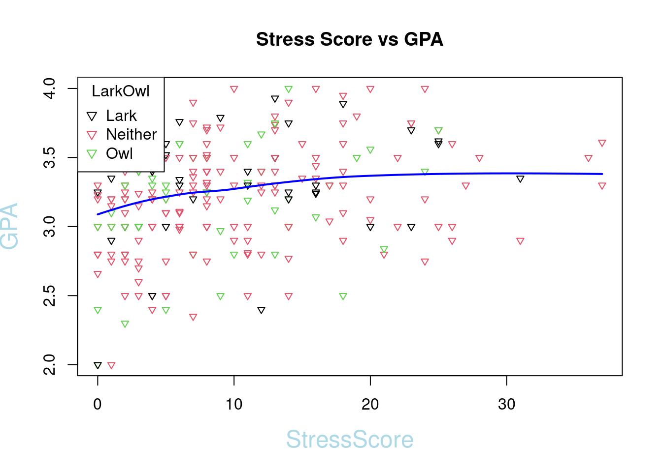
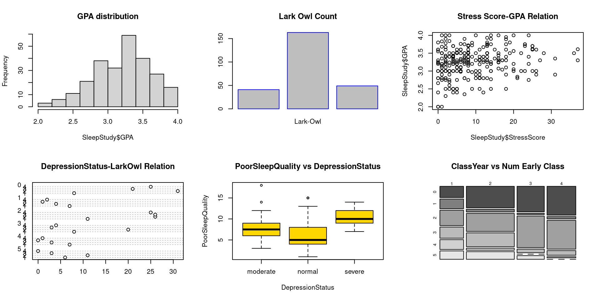
63.4.1 Facet Wrap
wrap <- par(mfrow = c(2, 3))

hist(SleepStudy$GPA, breaks = 10, main = "GPA distribution")
barplot(LarkOwl, names.arg = "Lark-Owl", border = "blue" , col = "grey", horiz = FALSE, main = "Lark Owl Count")
plot(SleepStudy$StressScore, SleepStudy$GPA, main = "Stress Score-GPA Relation")
dotchart(table_data, main = "DepressionStatus-LarkOwl Relation")
boxplot(PoorSleepQuality ~ DepressionStatus, data = SleepStudy, horizontal = FALSE, names = c("moderate", "normal", "severe"), col = "gold", main = "PoorSleepQuality vs DepressionStatus")
mosaicplot(table_data, color = TRUE, main = "ClassYear vs Num Early Class")