35 Base R, ggplot2, & Python Graphing Performances
Yan Gong, Ziyan Liu
35.1 Preface
One of the most powerful reason that data scientists consider R as an efficient tool is its ability to produce a wide range of plots quickly and easily for data visualizations. However, as Python being introduced more and more in data science projects, the combination of several data processing, ploting, and exploration packages, including numpy, pandas, matplotlib, and seaborn, has become another option for data visualizations and further, data explorations. In the meantime, both base R and the most well-known R plotting package, ggplot2, also received multiple updates and improved their data visualization performances. The goal of this cheatsheet is to introduce several functions, for each one of base R, ggplot2, and Python data science packages, and compare their results in five general type of plots in data analysis: basic histogram, line graph with regression, scatterplot with legend, boxplot with reordered/formatted axes, and boxplot with error bars.
In order to represent the use of packages in Python libraries and compare it with regular approaches in R (base R and ggplot2 package), the Python session would be embedded within a basic R session and achieve its functionality on a R-based platform, RStudio. Thanks to the openness and diversity of the R libraries, there is a R package called reticulate, which enabling seamless, high-performance interoperability between R and Python. According to the documentation of reticulate, this package has the functionality of:
Calling Python from R in a variety of ways including R Markdown, sourcing Python scripts, importing Python modules, and using Python interactively within an R session;
Translation between R and Python objects (for example, between R and Pandas data frames, or between R matrices and NumPy arrays);
Flexible binding to different versions of Python including virtual environments and Conda environments.
Similar as in base R and ggplot2, functions in numpy, pandas, matplotlib, and seaborn are called to generate the five main kinds of plots.
35.3 Python Environment Setup
Before running Python code chunks in R markdown, RStudio requires the installation of miniconda, a small, bootstrap version of Anaconda with only conda, Python, the packages they depend on, and a small number of other useful packages. In default settings, installation of Miniconda and making it as the default environment is forced, unless the user has explicitly requested a particular version of Python with one of the use_*() helpers.
To install miniconda in RStudio, check the meta path (working directory of miniconda) by reticulate:::miniconda_meta_path():
> library(reticulate)
> reticulate:::miniconda_meta_path()
[1] "C:\\Users\\Shiro\\AppData\\Local/r-reticulate/r-reticulate/miniconda.json"
Then install miniconda by reticulate::install_miniconda():
> reticulate::install_miniconda()
* Downloading "https://repo.anaconda.com/miniconda/Miniconda3-latest-Windows-x86_64.exe" ...
trying URL 'https://repo.anaconda.com/miniconda/Miniconda3-latest-Windows-x86_64.exe'
Content type 'application/octet-stream' length 60924672 bytes (58.1 MB)
downloaded 58.1 MB

* Installing Miniconda -- please wait a moment ...
Collecting package metadata (current_repodata.json): ...working... done
Solving environment: ...working... done

## Package Plan ##

  environment location: C:\Users\Shiro\AppData\Local\R-MINI~1

  added / updated specs:
    - conda


The following packages will be downloaded:

    package                    |            build
    ---------------------------|-----------------
    ca-certificates-2021.10.26 |       haa95532_2         115 KB
    certifi-2021.10.8          |   py39haa95532_0         152 KB
    charset-normalizer-2.0.4   |     pyhd3eb1b0_0          35 KB
    cryptography-35.0.0        |   py39h71e12ea_0         991 KB
    idna-3.2                   |     pyhd3eb1b0_0          48 KB
    openssl-1.1.1l             |       h2bbff1b_0         4.8 MB
    pip-21.2.4                 |   py39haa95532_0         1.8 MB
    pyopenssl-21.0.0           |     pyhd3eb1b0_1          49 KB
    pywin32-228                |   py39hbaba5e8_1         5.6 MB
    requests-2.26.0            |     pyhd3eb1b0_0          59 KB
    setuptools-58.0.4          |   py39haa95532_0         778 KB
    tqdm-4.62.3                |     pyhd3eb1b0_1          83 KB
    tzdata-2021e               |       hda174b7_0         112 KB
    urllib3-1.26.7             |     pyhd3eb1b0_0         111 KB
    wheel-0.37.0               |     pyhd3eb1b0_1          33 KB
    wincertstore-0.2           |   py39haa95532_2          15 KB
    ------------------------------------------------------------
                                           Total:        14.8 MB

The following NEW packages will be INSTALLED:

  charset-normalizer pkgs/main/noarch::charset-normalizer-2.0.4-pyhd3eb1b0_0

The following packages will be REMOVED:

  chardet-4.0.0-py39haa95532_1003

The following packages will be UPDATED:

  ca-certificates                       2021.7.5-haa95532_1 --> 2021.10.26-haa95532_2
  certifi                          2021.5.30-py39haa95532_0 --> 2021.10.8-py39haa95532_0
  cryptography                         3.4.7-py39h71e12ea_0 --> 35.0.0-py39h71e12ea_0
  idna                                    2.10-pyhd3eb1b0_0 --> 3.2-pyhd3eb1b0_0
  openssl                                 1.1.1k-h2bbff1b_0 --> 1.1.1l-h2bbff1b_0
  pip                                 21.1.3-py39haa95532_0 --> 21.2.4-py39haa95532_0
  pyopenssl                             20.0.1-pyhd3eb1b0_1 --> 21.0.0-pyhd3eb1b0_1
  pywin32                                228-py39he774522_0 --> 228-py39hbaba5e8_1
  requests                              2.25.1-pyhd3eb1b0_0 --> 2.26.0-pyhd3eb1b0_0
  setuptools                          52.0.0-py39haa95532_0 --> 58.0.4-py39haa95532_0
  tqdm                                  4.61.2-pyhd3eb1b0_1 --> 4.62.3-pyhd3eb1b0_1
  tzdata                                   2021a-h52ac0ba_0 --> 2021e-hda174b7_0
  urllib3                               1.26.6-pyhd3eb1b0_1 --> 1.26.7-pyhd3eb1b0_0
  wheel                                 0.36.2-pyhd3eb1b0_0 --> 0.37.0-pyhd3eb1b0_1
  wincertstore                           0.2-py39h2bbff1b_0 --> 0.2-py39haa95532_2


Downloading and Extracting Packages
certifi-2021.10.8    | 152 KB    | ########## | 100%
pip-21.2.4           | 1.8 MB    | ########## | 100%
pywin32-228          | 5.6 MB    | ########## | 100%
urllib3-1.26.7       | 111 KB    | ########## | 100%
openssl-1.1.1l       | 4.8 MB    | ########## | 100%
requests-2.26.0      | 59 KB     | ########## | 100%
tqdm-4.62.3          | 83 KB     | ########## | 100%
wincertstore-0.2     | 15 KB     | ########## | 100%
idna-3.2             | 48 KB     | ########## | 100%
tzdata-2021e         | 112 KB    | ########## | 100%
cryptography-35.0.0  | 991 KB    | ########## | 100%
setuptools-58.0.4    | 778 KB    | ########## | 100%
pyopenssl-21.0.0     | 49 KB     | ########## | 100%
charset-normalizer-2 | 35 KB     | ########## | 100%
wheel-0.37.0         | 33 KB     | ########## | 100%
ca-certificates-2021 | 115 KB    | ########## | 100%
Preparing transaction: ...working... done
Verifying transaction: ...working... done
Executing transaction: ...working... done
Collecting package metadata (current_repodata.json): ...working... done
Solving environment: ...working... done

## Package Plan ##

  environment location: C:\Users\Shiro\AppData\Local\R-MINI~1\envs\r-reticulate

  added / updated specs:
    - numpy
    - python=3.6


The following packages will be downloaded:

    package                    |            build
    ---------------------------|-----------------
    certifi-2020.12.5          |   py36haa95532_0         140 KB
    intel-openmp-2021.4.0      |    h57928b3_3556         3.2 MB  conda-forge
    libblas-3.9.0              |     12_win64_mkl         4.5 MB  conda-forge
    libcblas-3.9.0             |     12_win64_mkl         4.5 MB  conda-forge
    liblapack-3.9.0            |     12_win64_mkl         4.5 MB  conda-forge
    mkl-2021.4.0               |     h0e2418a_729       181.7 MB  conda-forge
    numpy-1.19.5               |   py36h4b40d73_2         4.9 MB  conda-forge
    pip-21.3.1                 |     pyhd8ed1ab_0         1.2 MB  conda-forge
    python-3.6.13              |h39d44d4_2_cpython        18.9 MB  conda-forge
    python_abi-3.6             |          2_cp36m           4 KB  conda-forge
    setuptools-49.6.0          |   py36ha15d459_3         921 KB  conda-forge
    tbb-2021.4.0               |       h2d74725_0         149 KB  conda-forge
    ucrt-10.0.20348.0          |       h57928b3_0         1.2 MB  conda-forge
    vc-14.2                    |       hb210afc_5          13 KB  conda-forge
    vs2015_runtime-14.29.30037 |       h902a5da_5         1.3 MB  conda-forge
    wheel-0.37.0               |     pyhd8ed1ab_1          31 KB  conda-forge
    wincertstore-0.2           |py36ha15d459_1006          15 KB  conda-forge
    ------------------------------------------------------------
                                           Total:       227.0 MB

The following NEW packages will be INSTALLED:

  certifi            pkgs/main/win-64::certifi-2020.12.5-py36haa95532_0
  intel-openmp       conda-forge/win-64::intel-openmp-2021.4.0-h57928b3_3556
  libblas            conda-forge/win-64::libblas-3.9.0-12_win64_mkl
  libcblas           conda-forge/win-64::libcblas-3.9.0-12_win64_mkl
  liblapack          conda-forge/win-64::liblapack-3.9.0-12_win64_mkl
  mkl                conda-forge/win-64::mkl-2021.4.0-h0e2418a_729
  numpy              conda-forge/win-64::numpy-1.19.5-py36h4b40d73_2
  pip                conda-forge/noarch::pip-21.3.1-pyhd8ed1ab_0
  python             conda-forge/win-64::python-3.6.13-h39d44d4_2_cpython
  python_abi         conda-forge/win-64::python_abi-3.6-2_cp36m
  setuptools         conda-forge/win-64::setuptools-49.6.0-py36ha15d459_3
  tbb                conda-forge/win-64::tbb-2021.4.0-h2d74725_0
  ucrt               conda-forge/win-64::ucrt-10.0.20348.0-h57928b3_0
  vc                 conda-forge/win-64::vc-14.2-hb210afc_5
  vs2015_runtime     conda-forge/win-64::vs2015_runtime-14.29.30037-h902a5da_5
  wheel              conda-forge/noarch::wheel-0.37.0-pyhd8ed1ab_1
  wincertstore       conda-forge/win-64::wincertstore-0.2-py36ha15d459_1006


Downloading and Extracting Packages
python-3.6.13        | 18.9 MB   | ########## | 100%
libcblas-3.9.0       | 4.5 MB    | ########## | 100%
vs2015_runtime-14.29 | 1.3 MB    | ########## | 100%
mkl-2021.4.0         | 181.7 MB  | ########## | 100%
wincertstore-0.2     | 15 KB     | ########## | 100%
tbb-2021.4.0         | 149 KB    | ########## | 100%
numpy-1.19.5         | 4.9 MB    | ########## | 100%
setuptools-49.6.0    | 921 KB    | ########## | 100%
wheel-0.37.0         | 31 KB     | ########## | 100%
ucrt-10.0.20348.0    | 1.2 MB    | ########## | 100%
python_abi-3.6       | 4 KB      | ########## | 100%
certifi-2020.12.5    | 140 KB    | ########## | 100%
pip-21.3.1           | 1.2 MB    | ########## | 100%
vc-14.2              | 13 KB     | ########## | 100%
intel-openmp-2021.4. | 3.2 MB    | ########## | 100%
libblas-3.9.0        | 4.5 MB    | ########## | 100%
liblapack-3.9.0      | 4.5 MB    | ########## | 100%
Preparing transaction: ...working... done
Verifying transaction: ...working... done
Executing transaction: ...working... done
#
# To activate this environment, use
#
#     $ conda activate r-reticulate
#
# To deactivate an active environment, use
#
#     $ conda deactivate

* Miniconda has been successfully installed at "C:/Users/Shiro/AppData/Local/r-miniconda".
[1] "C:/Users/Shiro/AppData/Local/r-miniconda"
Import all Python packages as neeeded:
# numpy was automatically installed with miniconda
import numpy as np

# install pandas by py_install('pandas')
import pandas as pd

# install matplotlib by py_install('matplotlib')
import matplotlib.pyplot as plt  # interactive plot: use `plotly` package

# install seaborn by py_install('seaborn')
import seaborn as sns

# Set style globally
sns.set_style('darkgrid')
Basically, with the magic funtion (%) applied globally in Python, all plots in figures which generated by matplotlib could be shown automatically in notebooks:
%matplotlib inlineHowever, it seems like the magic functions only work on Python environments and platforms. matplotlib.pyplot.show() would be used for each figure as alternatives.
35.4 Base R Plot Function
X <- 1:20
Y <- X*X
par(mfrow=c(3,3), mar=c(2,3,1,0)+.5, mgp=c(1.5,.6,0))
# a window that can show 3 * 3 plots at the same time
plot(X, Y, type = "p") # "p" for points
plot(X, Y, type = "l") # "l" for lines
plot(X, Y, type = "b") # "b" for both points and lines
plot(X, Y, type = "o") # "o" for both overplotted
plot(X, Y, type = "c") # "c" for empty points joined by lines
plot(X, Y, type = "s") # "s" for stair steps
plot(X, Y, type = "h") # "h" for histogram-like vertical lines
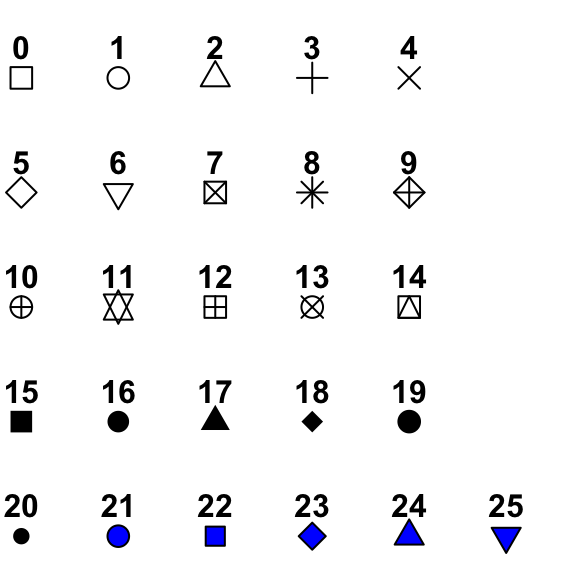
plot(X, Y, type = "n") # "n" for no plottingThere are many parameters that you can change within plot function to adjust the appearance of a plot. For example, different pch values give different shapes of points as shown in the figure.
plot(X, Y, type = "p",
     las = 1,                  # orient y-axis label
     pch = 15,                 # shape of point
     cex=1.5,                  # size of point
     col = 2,                  # color of point
     xlab = "x",               # x axis label
     ylab = "y",               # y axis label
     main = "f(x) = x^2",      # title of plot
     cex.lab = 1.5,            # size of axis labels
     cex.axis = 1.2,           # size of tick mark labels
     cex.main = 2)             # size of main title
35.4.1 ggplot2
ggplot(data.frame(X,Y), aes(x=X,y=Y)) + geom_point()
ggplot(data.frame(X,Y), aes(x=X,y=Y)) + geom_line()
ggplot(data.frame(X,Y), aes(x=X,y=Y)) + geom_point() + geom_line()
ggplot(data.frame(X,Y), aes(x=X,y=Y)) + geom_step()
35.5 Basic Histogram
35.5.1 base R
Base R provides the function hist, with which we can easily create histograms. Notice that the parameter break is not the same as bins in ggplot2. When we give an integer to break, hist only takes it as a suggestion number of breaks to use in the histogram.
set.seed(123)
x <- rpois(n=50, lambda = 15)
par(mfrow=c(1,2))
hist(x,
     breaks = 12,                          # number of cells, suggestion only
     xlab = "x", ylab = "frequency")       # axis labels


hist(x,
     breaks = c(7:21),                     # vector of breakpoints
     xlab = "x", ylab = "frequency",       # axis labels
     las = 1)                              #rotate the y-axis label direction
35.5.2 ggplot2
ggplot(data.frame(x), aes(x=x)) +
  geom_histogram(bins = 12, color = "black", fill = "gray") +
  xlab("x") + ylab("frequency") +
  ggtitle("Histogram of 50 Randomly Generated Numbers")
35.5.3 Python
Loading the example dataset with pandas:
df = pd.read_csv('https://raw.githubusercontent.com/bryanrgibson/eods-f21/main/data/yellowcab_demo_withdaycategories.csv',
                 sep = ',',
                 header = 1,
                 parse_dates = ['pickup_datetime', 'dropoff_datetime'])
Both pandas and seaborn packages could be used to plot histograms. By using matplotlib package to construct subplots, figures, and axes, multiple histograms could be plotted within the same figure:
# Plotting with `pandas`
# Create figure with `matplotlib`
fig,ax = plt.subplots(1, 2, figsize = (16,4))
# Subset dataset for trips before the noon, plot histogram by pandas.DataFrame.plot.hist(), and place the plot in the first subplot
df[df.pickup_datetime.dt.hour < 12].fare_amount.plot.hist(bins = 100, ax = ax[0]);
# Set labels and title
ax[0].set_xlabel("fare_amount (dollars)");
ax[0].set_title("Trips before Noon");

# Subset dataset for trips after the noon, plot histogram by pandas.DataFrame.plot.hist(), and place the plot in the second subplot
df[df.pickup_datetime.dt.hour >=  12].fare_amount.plot.hist(bins = 100, ax = ax[1]);
# Set labels and title
ax[1].set_xlabel("fare_amount (dollars)");
ax[1].set_title("Trips after Noon");

# Extra step needed in R markdown; not required in Jupyter Notebook
plt.show()
# Plotting with `seaborn`
# Create figure with `matplotlib`
fig,ax = plt.subplots(1, 2, figsize = (16,4))
# Subset dataset for trips before the noon by pandas.DataFrame.query(), plot histogram by seaborn.histplot(), and place the plot in the first subplot
sns.histplot(x = 'fare_amount',
data = df.query("pickup_datetime.dt.hour < 12"),
ax = ax[0]);
# Subset dataset for trips after the noon, plot histogram by seaborn.histplot(), and place the plot in the first subplot
sns.histplot(x = df.fare_amount[df.pickup_datetime.dt.hour >= 12],
ax = ax[1]);
# Extra step needed in R markdown; not required in Jupyter Notebook
plt.show()35.6 Basic Line Graph with Regression
35.6.1 base R
With base R, we can plot line graphs with plot, and change the type, width and color of line with parameters very efficiently. We can add linear regression line by fitting a model and draw the line with abline in base R.
par(mfrow=c(2,3))
plot(X1, Y1, type="l", xlab="x", ylab="y")
plot(X1, Y1, type="l", xlab="x", ylab="y", lty="dashed")      #"lty" for line type
plot(X1, Y1, type="l", xlab="x", ylab="y", lty="dotted")
plot(X1, Y1, type="l", xlab="x", ylab="y", col="red")         #"col" for color of line
plot(X1, Y1, type="l", xlab="x", ylab="y", col="red", lwd=3)  #"lwd" for "line width"
plot(X1, Y1, type="l", xlab="x", ylab="y", col="red", lwd=2)
fit1 = lm(Y1~X1)
abline(fit1, lty = "dashed")                                  #add an abline in the last plot
35.6.2 ggplot2
To add linear model fit line in ggplot2, use geom_smooth(method = 'lm').
ggplot(data.frame(X1, Y1), aes(x=X1, y=Y1)) +
  geom_line(col = "red", lwd=0.8) +
  geom_smooth(method = "lm", se = FALSE, col="black", lty="dashed")
35.6.3 Python
Loading the example dataset with pandas:
df_wine = pd.read_csv('https://raw.githubusercontent.com/bryanrgibson/eods-f21/main/data/wine_dataset.csv',
                      usecols = ['alcohol','ash','proline','hue','class'])
Although the lm() function could generate the linear model within the R session and reticulate allows users to access datasets stored in the environment in both R and Python chunks, it is still not easy to use the model generated by R functions to plot by Python. Instead, the whole process would be done by Python, using the sklearn package:
# install scikit-learn (sklearn) by py_install('scikit-learn')
from sklearn.linear_model import LinearRegression

# Instantiate the model and set hyperparameters
lr = LinearRegression(fit_intercept = True,
                      normalize = False)     # by default

# Fit the model
# .reshape(-1, 1): scikit-learn models expect the input features to be 2 dimensional
lr.fit(X = df_wine.proline.values.reshape(-1, 1), y = df_wine.alcohol);

# Predict values and plot the model
x_predict = [df_wine.proline.min(), df_wine.proline.max()]
y_hat = lr.predict(np.array(x_predict).reshape(-1, 1))
fig,ax = plt.subplots(1, 1, figsize = (12,8))
ax = sns.scatterplot(x = df_wine.proline, y = df_wine.alcohol);
ax.plot(x_predict, y_hat);

# Extra step needed in R markdown; not required in Jupyter Notebook
plt.show()
Again, the plotting part has the pandas package involved (pandas.DataFrame.plot()).
Without constructing a linear regression model, instead, seaborn has a function called seaborn.regplot(), which could directly add a regression line:
35.7 Scatterplot with Legend
35.7.1 base R
Without specifying the type in plot, the function by default creates scatterplots.
data(iris)
plot(iris$Sepal.Length, iris$Petal.Length,        # x variable, y variable
     col = iris$Species,                          # color by species
     pch = 18,                                    # type of point to use
     cex = 1.5,                                   # size of point to use
     xlab = "Sepal Length",                       # x axis label
     ylab = "Petal Length",                       # y axis label
     main = "Flower Characteristics in Iris")     # plot title

legend ("topleft", legend = levels(iris$Species), col = c(1:3), pch = 18)35.7.3 Python
The most strightforward way to make scatterplots is to use the matplotlib.pyplot.scatter() function from matplotlib package:
# Create figure with `matplotlib`
fig,ax = plt.subplots(1, 2, figsize = (12,4))
# Plot scatterplot by matplotlib.pyplot.scatter(), and place the plot in the first subplot
ax[0].scatter(df.trip_distance,
              df.fare_amount,
              marker = 'x',
              color = 'blue');
# Plot scatterplot by matplotlib.pyplot.scatter(), and place the plot in the second subplot
ax[1].scatter(df.trip_distance,
              df.tip_amount,
              color = 'red');
# Set labels and titles
ax[0].set_xlabel('trip_distance');
ax[1].set_xlabel('trip_distance');
ax[0].set_ylabel('fare_amount'), ax[1].set_ylabel('tip_amount');
ax[0].set_title('trip_distance vs fare_amount');
ax[1].set_title('trip_distance vs tip_amount');
fig.suptitle('Yellowcab Taxi Features');

# Extra step needed in R markdown; not required in Jupyter Notebook
plt.show()
To add a legend, just simply add matplotlib.pyplot.legend():
# Create figure with `matplotlib`
fig,ax = plt.subplots(figsize = (16,4))
# Subset dataset for trips before the noon, plot scatterplot by matplotlib.pyplot.scatter(), and place the plot in the figure
ax.scatter(df[df.pickup_datetime.dt.hour < 12].trip_distance,
           df[df.pickup_datetime.dt.hour < 12].fare_amount,
           marker = 'x',
           color = 'blue',
           label = 'Before Noon');
# Subset dataset for trips after the noon, plot scatterplot by matplotlib.pyplot.scatter(), and place the plot in the figure
ax.scatter(df[df.pickup_datetime.dt.hour >= 12].trip_distance,
           df[df.pickup_datetime.dt.hour >= 12].fare_amount,
           marker = 'o',
           color = 'red',
           label = 'After Noon');
# Set labels and title
ax.set_xlabel("trip_distance");
ax.set_ylabel("fare_amount (dollars)");
ax.set_title("Yellowcab Taxi Features");
# Set legends
# Set the location of legends at the best place
ax.legend(loc = 'best')

# Extra step needed in R markdown; not required in Jupyter Notebook
plt.show()
35.8 Boxplot with Reordered and Formatted Axes
35.8.1 base R
The function boxplot is used in base R to create boxplots, and adding notches to the plot makes it easier to see the difference among the data.
35.8.2 ggplot2
ggplot(iris, aes(x=Species, y=Sepal.Length)) + geom_boxplot()35.8.3 Python
The most convenient method to draw boxplot is using seaborn. The result plots could show the first quantile, the second quantile (median), the third quantile, whiskers (usually as 1.5*IQR), and possible outliers.
For a single horizontal boxplot:
# Create figure with `matplotlib`
fig,ax = plt.subplots(1, 1, figsize = (16,4))
# Draw horizontal boxplot
sns.boxplot(x = df.fare_amount, ax = ax);

# Extra step needed in R markdown; not required in Jupyter Notebook
plt.show()
Draw a vertical/horizontal boxplot grouped by a categorical variable:
# Create figure with `matplotlib`
fig,ax = plt.subplots(1, 2, figsize = (16,4))
# Draw vertical boxplot
sns.boxplot(x = df.payment_type, y = df.fare_amount, ax = ax[0]);
# Draw horizontal boxplot for each numeric variable in the DataFrame
sns.boxplot(data = df, orient = "h", ax = ax[1]);

# Extra step needed in R markdown; not required in Jupyter Notebook
plt.show()
Adding hue to the boxplot:
35.9 Barplot with Error Bars
dragons <- data.frame(
  TalonLength = c(20.9, 58.3, 35.5),
  SE = c(4.5, 6.3, 5.5),
  Population = c("England", "Scotland", "Wales"))
35.9.1 base R
barplot(dragons$TalonLength, names = dragons$Population)Note that plotCI requires use the gplots package.
dragons$Population <- factor(dragons$Population,
                             levels=c("Scotland","Wales","England"))

barplot(dragons$TalonLength, names = dragons$Population,
        ylim=c(0,70),xlim=c(0,4),yaxs='i', xaxs='i',
        main="Dragon Talon Length in the UK",
        ylab="Mean Talon Length",
        xlab="Country")
par(new=T)
plotCI (dragons$TalonLength,
        uiw = dragons$SE, liw = dragons$SE,
        gap=0,sfrac=0.01,pch="",
        ylim=c(0,70),
        xlim=c(0.4,3.7),
yaxs='i', xaxs='i',axes=F,ylab="",xlab="")35.9.3 Python
The seaborn package also gives the optimal approach to generate barplots. The function name is seaborn.boxplot(). Unlike R, barplots generated by seaborn has error bars in default.
For simply plotting numeric and categorical variables:
# Create figure with `matplotlib`
fig,ax = plt.subplots(1, 1, figsize = (16,4))
# Draw barplot for mean of df.fare_amount
sns.barplot(x = df.payment_type,
            y = df.fare_amount,
            estimator = np.mean,
            ci = 95);
# Set label
ax.set_label("Mean of fare_amount");

# Extra step needed in R markdown; not required in Jupyter Notebook
plt.show()
Add hue to the barplot:
# Create figure with `matplotlib`
fig,ax = plt.subplots(1, 1, figsize = (12,6))
# Add df.payment_type as the hue
sns.barplot(x = 'day_of_week',
            y = 'fare_amount',
            hue = 'payment_type',
            data = df);
# Set legend location
ax.legend(loc = 'best')

# Extra step needed in R markdown; not required in Jupyter Notebook
plt.show()
35.9.4 Conclusion
With the success of achieving data visualization by Python in R sessions, comparing all generated plots with those by base R and ggplot2 package, it is not hard to find that, given a processed dataset, both R and Python have well-developed, professional, and powerful packages to visualize and explore the dataset.
35.9.5 References
R Base Graphics: An Idiot’s Guide https://rstudio-pubs-static.s3.amazonaws.com/7953_4e3efd5b9415444ca065b1167862c349.html
EODS-F21: Elements of Data Science, Fall 2021 https://github.com/bryanrgibson/eods-f21
R Interface to Python https://rstudio.github.io/reticulate/
Numpy and Scipy Documentation https://docs.scipy.org/doc/
pandas documentation https://pandas.pydata.org/docs/
Matplotlib: Visualization with Python - matplotlib.pyplot https://matplotlib.org/stable/api/pyplot_summary.html
seaborn: statistical data visualization - User guide and tutorial https://seaborn.pydata.org/tutorial.html