61 Readable Plots
Jiawen Zhou
61.0.1 Introduction
ggplot2 already has a lot of beautiful and comprehensive cheat sheets. I will focus on a collection of tricks that make plots more readable, which is sizing, arrangement and positioning of the plots, axis, labels, and legends. I also include ways to customize the plots to be unique. I hope this would be helpful for R users to find it easier to fix plot issues and make beautiful and meaningful visualizations.
61.0.2 Axis
- Axis Labels
First part, we consider label text sizes. This would be a helpful way to make faceted plots and label-rich plots less crowded.
Here we have an example from HW2, where we are utilizing ames dataset from openintro package. We observe that after faceting on Neighborhood, the plot labels on x axis is crowded and overlap. The solution to make it easier for readers to read the plot, is to shrink the size of labels. We change it in theme() function by setting axis.text.x to be text size 5.
library(openintro)
ames %>%
  group_by(Neighborhood) %>%
  ggplot(aes(x = area , y = price))  +
  geom_point()  +
  facet_wrap(~Neighborhood) +
  theme(axis.text.x = element_text(size = 5))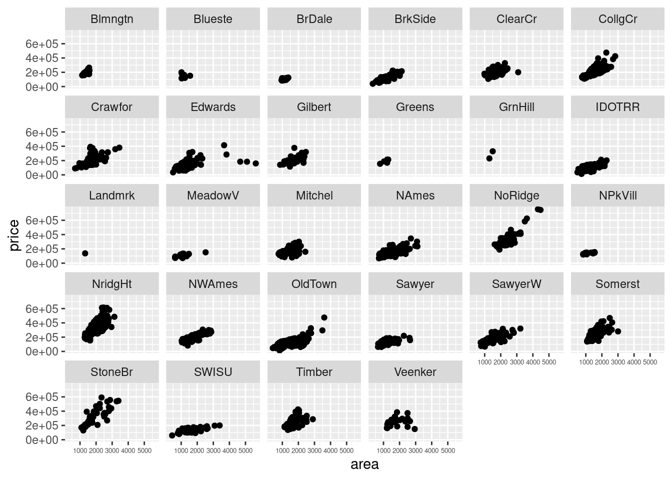
Another example from HW2 is Dog name plots. With 30 names on y axis, it is better to shrink text size to leave readable gaps between labels. There is another approach to have labels with unchanged size but different arrangements.
# 30 most popular dog names
dogname <- seattlepets %>%
  select(animal_name,species) %>%
  filter(species == "Dog")  %>%
  count(animal_name) %>%
  arrange(desc(n)) %>%
  filter(!is.na(animal_name))
ggplot(dogname[1:50,], aes(x = n, y = fct_reorder(animal_name, n))) +
  geom_point(color = "blue") +
  scale_y_discrete(guide = guide_axis(n.dodge=2)) +
  ggtitle("50 most popular dog names") +
  ylab("") +
  xlab("count")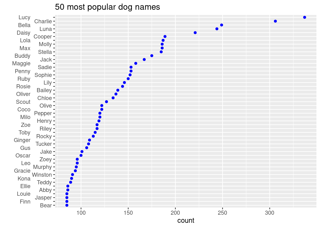
In this way, font size is unchanged, but each name can be read clearly.
Another way make axis labels more readable is to change the rotation of labels. For example, we want to draw bar plot of popular dog names.
ggplot(dogname[1:50,], aes(x = fct_rev(fct_reorder(animal_name, n)), y = n)) +
  geom_col() +
  xlab('Dog Names') +
  ggtitle('Top 50 most common dog names with number of counts') +
  theme(axis.text.x = element_text(angle = 90))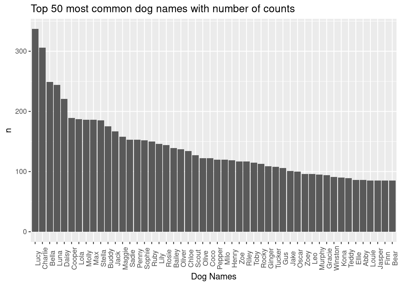
All names are in readable text size and the gaps in between is unchanged. By turning the labels by 90 degrees, we have x axis with readable name labels.
- Axis contents
Sometimes default axis labels fail to present appropriate information, so we will need a way to change axis contents with our specific needs.
Example from HW1 on histogram. We change x axis labels of age and y axis labels of count.
ggplot(mtl, aes(age)) +
  geom_histogram(color = "blue", fill = "lightblue", binwidth = 5,
                 boundary = 52.5) +
  scale_x_continuous(breaks = seq(42.5, 77.5, 5)) +
  scale_y_continuous(limits = c(0, 12), breaks = seq(0, 12, 2))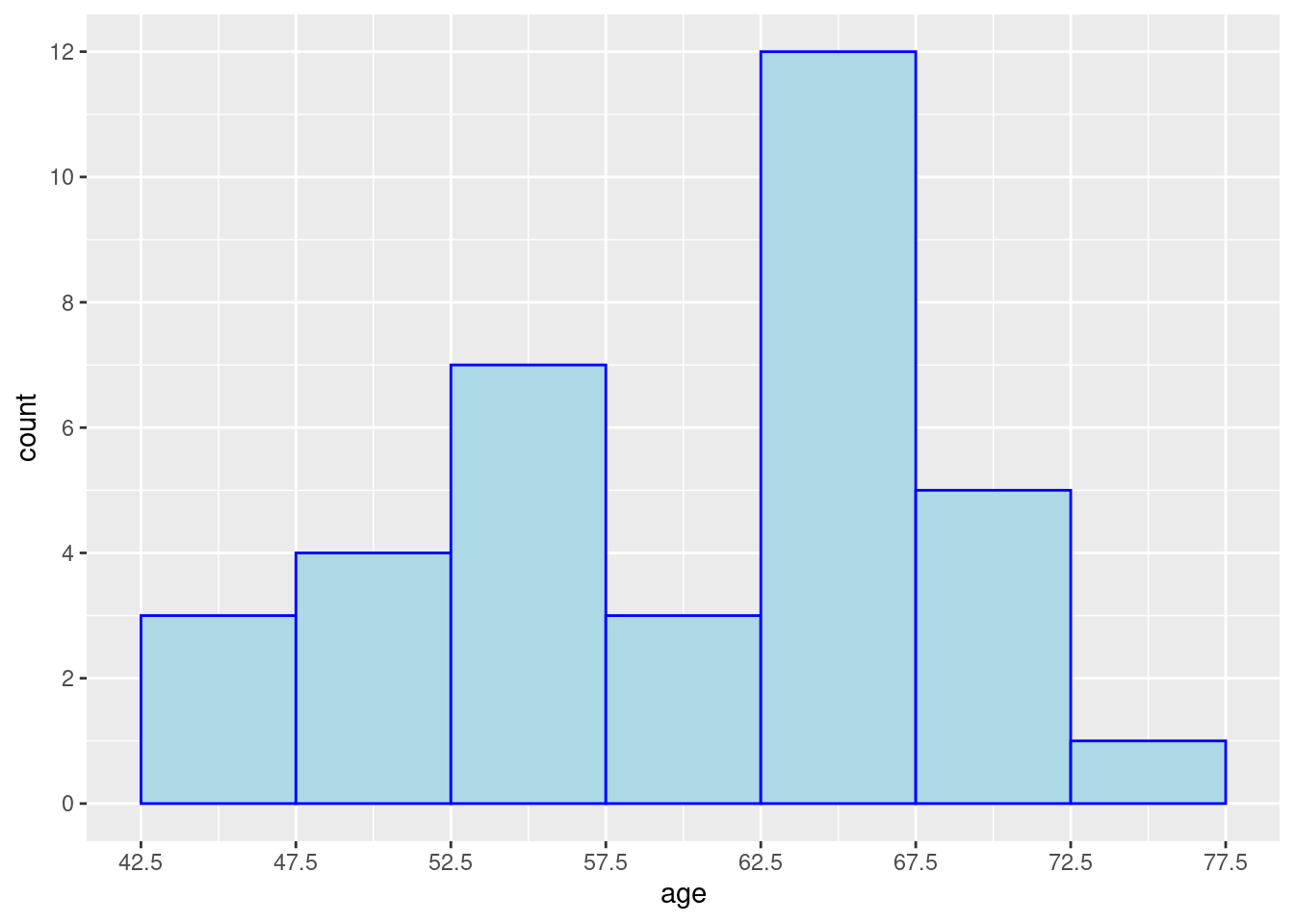
If we want no axis labels, we can do that in theme(). Although labels would be necessary in most cases as it is important information for readers to have.
ggplot(mtcars, aes(am)) +
  geom_bar() +
  theme(axis.text.x = element_blank())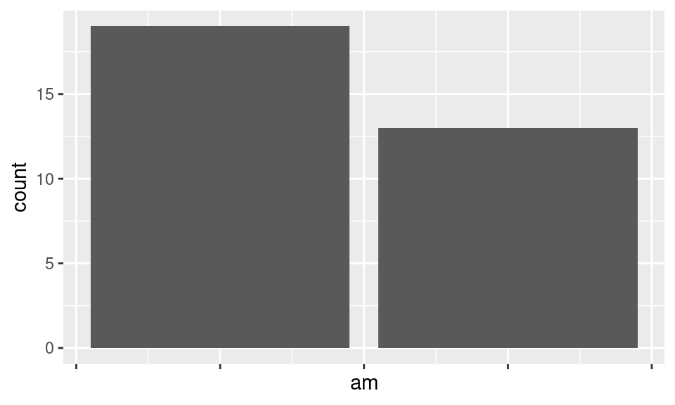
If we want x and y axis to be have the same range. We could use coor_equal()
ggplot(mtcars, aes(disp, disp+rnorm(nrow(mtcars), sd=20)))+geom_point()+
  xlim(c(70,500))+ylim(c(70,500))+
  coord_equal() +
  ylab('Noisy disp')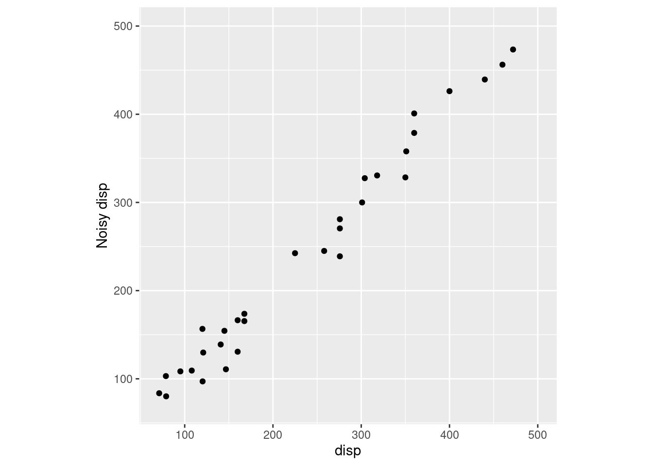
- Axis styles
If under some circumstances, your graph needs some different styles on axis and its labels, you could check out the below examples. Data is fastfood from openintro package. We have this example in HW.
ggplot(fastfood, aes(x = calories, y = restaurant))+geom_boxplot() +
  theme(axis.text.x = element_text(face="bold", color="pink",
                           size=10, angle=45),
          axis.text.y = element_text(face="italic", color="green",
                           size=7),
        axis.line = element_line(colour = "blue",
                      size = 1, linetype = "solid"))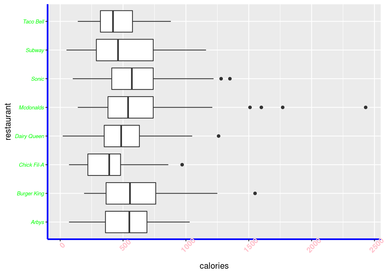
Here we changed x labels to be bold, pink color, angled at 45 degrees. Y labels are italic, green color, and smaller sized. Axis lines are colored with blue to be a solid line.
61.0.3 Title
Start with adding title in ggplot2.

g + labs(title="Barplot of Transmission of Cars")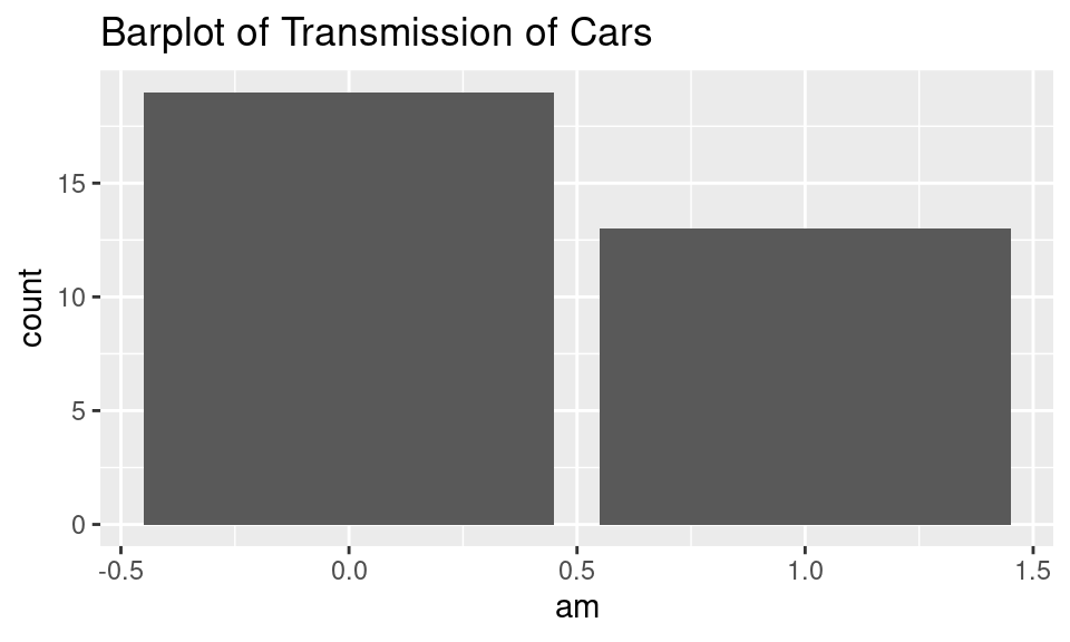
Two ways produce the same title.
Like axis labels, we can customize how title looks like. Change text size, to bold or italic, and its horizontal and vertical positions.
g + ggtitle("Barplot of Transmission of Cars") +
  theme(plot.title = element_text(size=18, face='italic',
                                  hjust=0.5))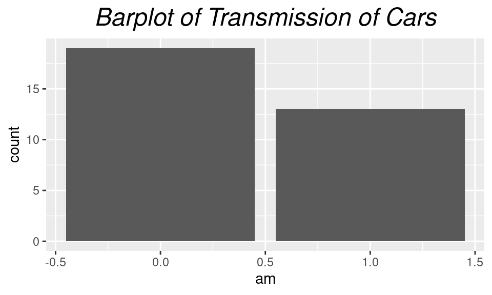
61.0.4 Legend
Legend is used in many cases. Sometimes it is annoying to see legend takes too much space or has unneccesary information. Here are some examples you might want to check out.
Here is the default plot on mtcars.
g = ggplot(mtcars, aes(mpg,disp,color=factor(cyl))) +
  geom_point()
g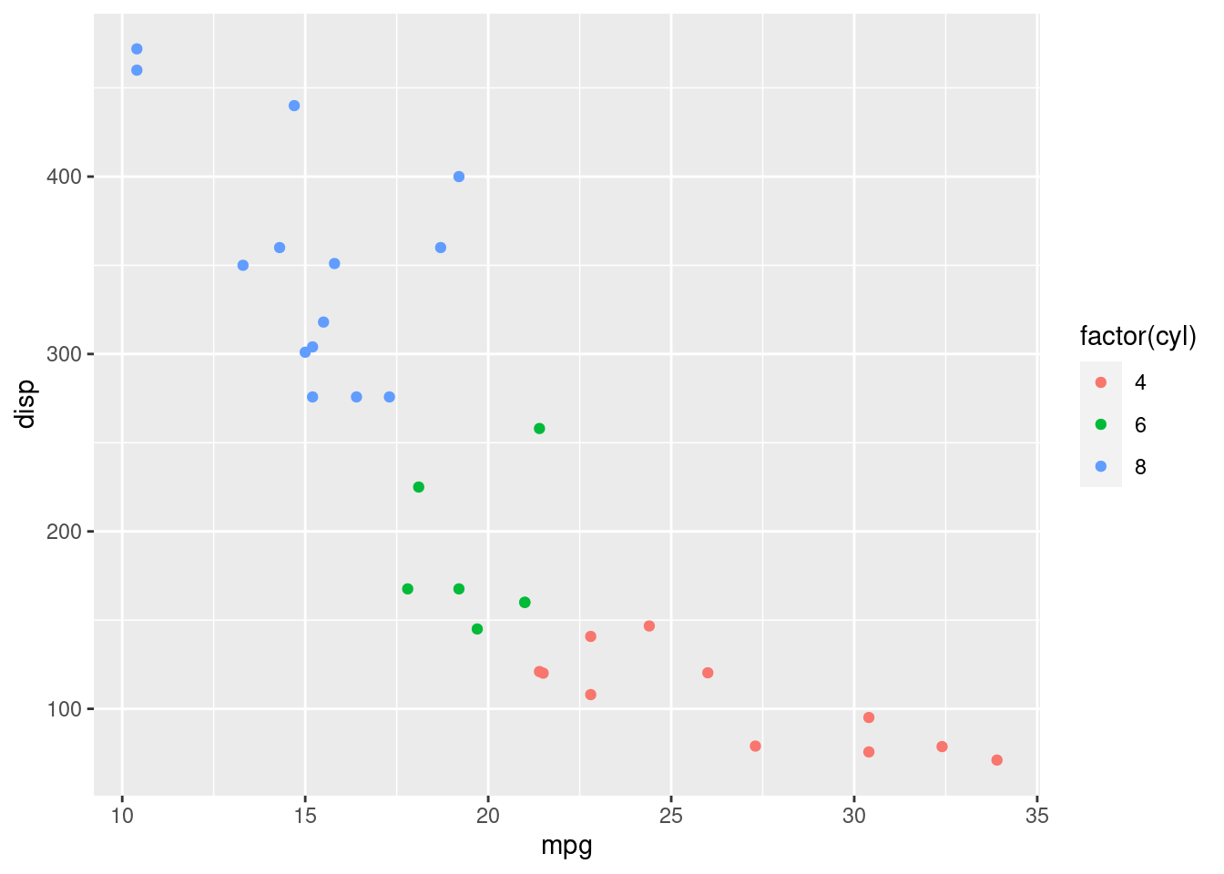
g + theme(legend.title = element_text(colour="Red", size=16, face="bold"),
          legend.background = element_rect(color = 'steelblue'),
          legend.title.align = 1,
          legend.position =  'bottom',
          legend.direction = 'horizontal',
          legend.key = element_rect(fill='pink')) +
  scale_color_discrete(name = "Cyl")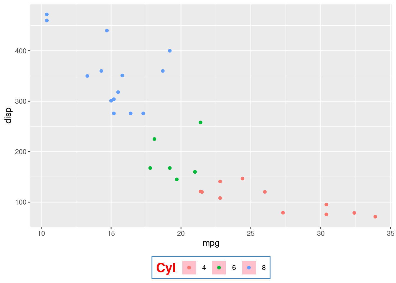
Here we changed several variables in legend. We changed its title, style, background edge color, alignment, position, keys’ filling.
61.0.5 Background
There are times that panel colors, grid lines, and plot colors could be customized to your styles or needs.
g + theme(panel.background = element_rect(fill = 'grey40'),
          panel.grid.major = element_line(color = 'light yellow', size=2),
          panel.grid.minor = element_line(color = 'green', size = 0.5),
          plot.background = element_rect(fill = 'slategray3'))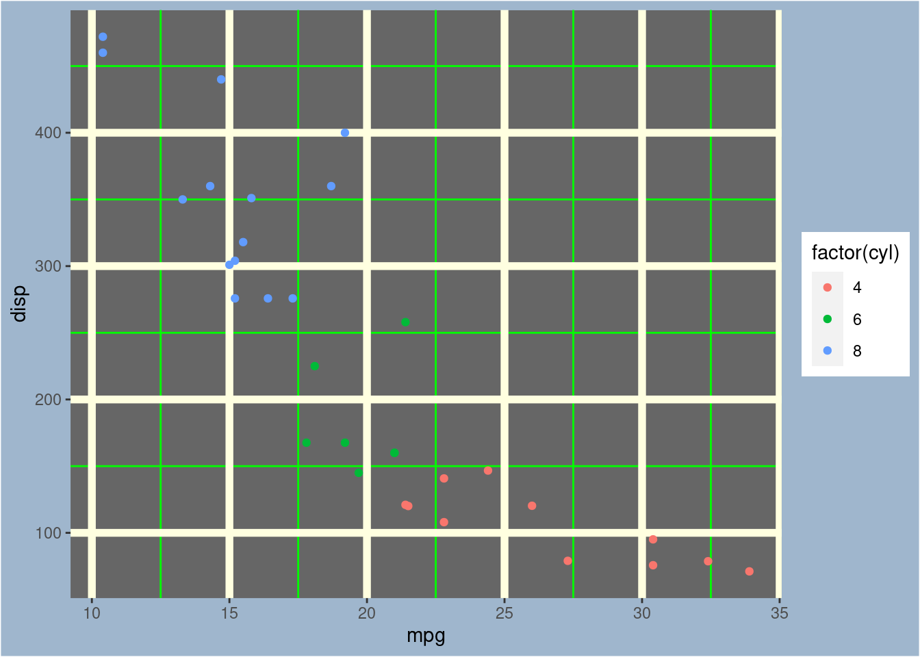
61.0.6 Theme
Apart from existing themes in ggplot2, we can get some great built-in themes from ggthemes package.
library(ggthemes)

cyls <- as.factor(mtcars$cyl)
ggplot(mtcars, aes(x = mpg, fill = cyls)) +
  geom_density(alpha = 0.7) +
  theme_economist() +
  scale_fill_economist() +
  theme(legend.position = "top")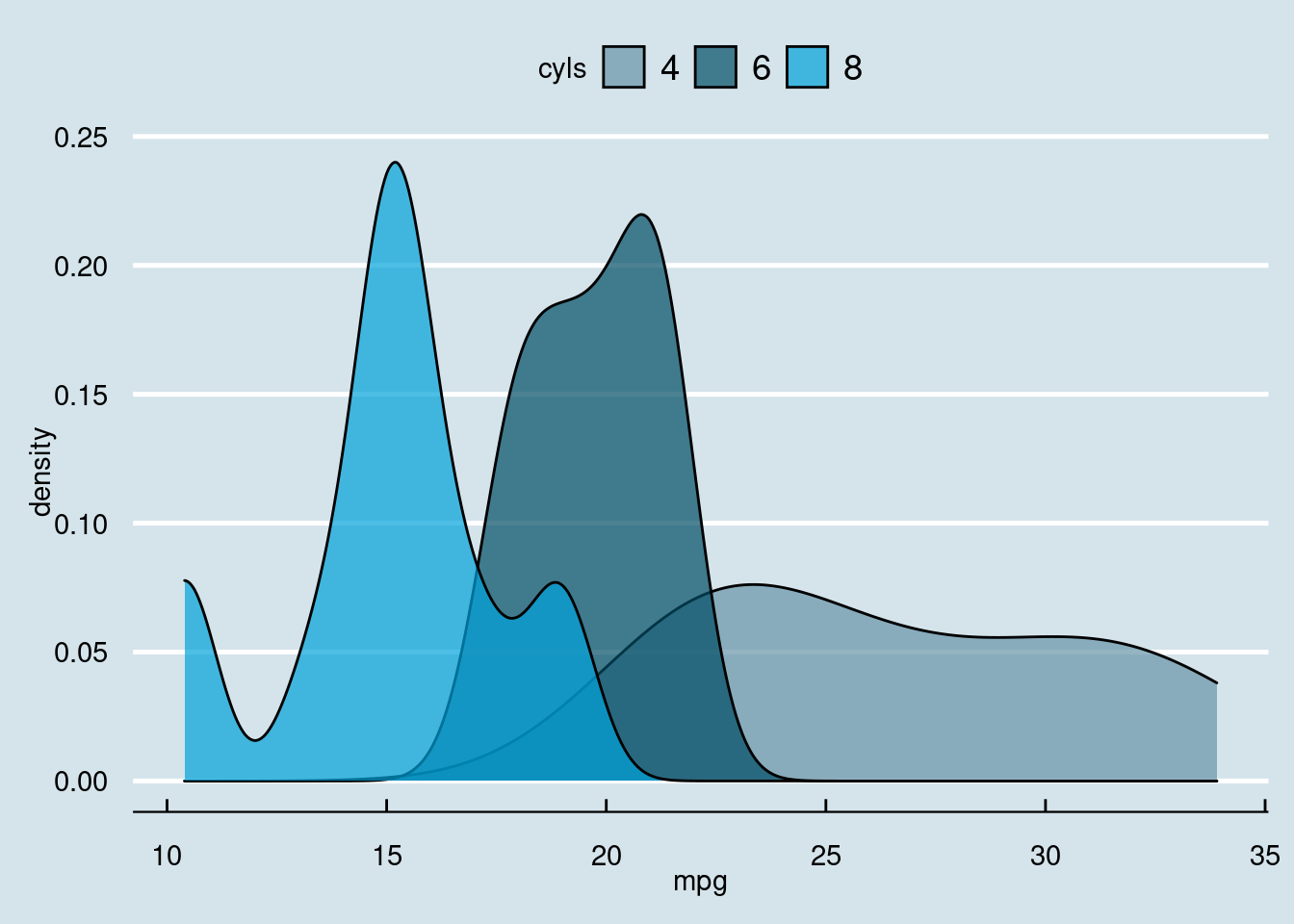
Other themes in ggthemes packages are theme_base, theme_calc, theme_clean, theme_excel, theme_excel_new, theme_few, theme_fivethirtyeight, theme_foundation, theme_gdocs, theme_hc, theme_igray, theme_map, theme_pander, theme_par, theme_solarized, theme_solid, theme_stata.
There are also other R packages with designed themes for use. Such packages include hrbrthemes, ggthemr, ggtech, ggdark.
61.0.7 Reference
- HW from STAT 5702
- http://zevross.com/blog/2014/08/04/beautiful-plotting-in-r-a-ggplot2-cheatsheet-3/
- http://www.sthda.com/english/wiki/ggplot2-axis-ticks-a-guide-to-customize-tick-marks-and-labels
- https://ggplot2.tidyverse.org/reference
- http://sape.inf.usi.ch/quick-reference/ggplot2/colour
- https://r-charts.com/ggplot2/themes/