52 Video introduction to maps with ggmap
Ryan Rogers
# install.packages("ggmap")
library(ggmap)
# You will also need to activate an API key! Use a line like the following:
# register_google("<API KEY>")52.2 Getting Started
This demonstration will show you how to make static maps within the tidyverse framework using ggmap. Before we get started, make sure you have ggmap installed and ready to go, since you may not have it installed by default.
One thing that can be somewhat pesky when working with ggmap is Google maps. As of 2018, this service requires an API key to use. To access the full features of this demonstration, you will have to register a Google API key. Details on how to do this can be found in the help file for ‘register_google’.
Note: If you wish to run the code found in this file, you will need to register a Google API key!
52.3 Why ggmap?
ggmap is useful for our demonstration, since it will use syntax that you may be familiar with already! ggmap is designed to be quite compatible with ggplot2 (in fact, Hadley Wickham, one of the authors of ggplot2, is a co-author!). In fact, much of ggmap is, under the hood, largely comprised of ggplot2 components. ggmap, however, features the added benefit of abstracting away from many of the more involved components of setting up a ggplot2 visual with maps, and will doubtless prove easier to use than base ggplot2 alone. ggmap also has many options for customizing its resulting visuals, though we will not explore many of these options in depth.
It should be noted that ggmap is an excellent tool for static maps. If you are looking more dynamic maps that provide more potential for user interaction, you may find other libraries, such as leaflet, that better suit your needs.
52.4 Dataset for Demonstration
For our demonstration, we will utilize data on public WiFi locations in New York City. The dataset can be found here: https://data.cityofnewyork.us/City-Government/NYC-Wi-Fi-Hotspot-Locations/yjub-udmw . We will save this dataset to ‘wifi_data’:
wifi_data <- read.csv("https://data.cityofnewyork.us/api/views/yjub-udmw/rows.csv?accessType=DOWNLOAD")
head(wifi_data)
## OBJECTID Borough Type Provider Name
## 1 10604 4 Limited Free SPECTRUM Baisley Pond Park
## 2 10555 4 Limited Free SPECTRUM Kissena Park
## 3 12370 3 Free Transit Wireless Grand St (L)
## 4 9893 3 Free Downtown Brooklyn
## 5 10169 1 Free Transit Wireless Lexington Av-63 St (F)
## 6 10880 4 Limited Free SPECTRUM Kissena Park
## Location Latitude Longitude X Y
## 1 Park Perimeter 40.67486 -73.78412 1044131.9 185219.9
## 2 Park Perimeter 40.74756 -73.81815 1034637.5 211685.2
## 3 Grand St (L) 40.71193 -73.94067 1000698.1 198655.9
## 4 125 Court St. 40.68999 -73.99200 986470.0 190656.7
## 5 Lexington Av-63 St (F) 40.76463 -73.96612 993636.6 217853.9
## 6 Park Perimeter 40.74243 -73.81151 1036481.4 209820.1
## Location_T Remarks City SSID
## 1 Outdoor TWC Aerial 3 free 10 min sessions Queens GuestWiFi
## 2 Outdoor TWC Aerial 3 free 10 min sessions Queens GuestWiFi
## 3 Subway Station SN 123 Brooklyn TransitWirelessWiFi
## 4 Outdoor Brooklyn Downtown Brooklyn WiFi
## 5 Subway Station SN 223 New York TransitWirelessWiFi
## 6 Outdoor TWC Aerial 3 free 10 min sessions Queens GuestWiFi
## SourceID Activated BoroCode Borough.Name
## 1 0 09/09/9999 4 Queens
## 2 0 09/09/9999 4 Queens
## 3 09/09/9999 3 Brooklyn
## 4 09/09/9999 3 Brooklyn
## 5 09/09/9999 1 Manhattan
## 6 0 09/09/9999 4 Queens
## Neighborhood.Tabulation.Area.Code..NTACODE.
## 1 QN02
## 2 QN22
## 3 BK90
## 4 BK09
## 5 MN40
## 6 QN62
## Neighborhood.Tabulation.Area..NTA. Council.Distrcit Postcode BoroCD
## 1 Springfield Gardens North 28 11434 412
## 2 Flushing 20 11355 407
## 3 East Williamsburg 34 11206 301
## 4 Brooklyn Heights-Cobble Hill 33 11201 302
## 5 Upper East Side-Carnegie Hill 4 10065 108
## 6 Queensboro Hill 20 11355 407
## Census.Tract BCTCB2010 BIN BBL DOITT_ID
## 1 294 294 0 0 1408
## 2 845 845 0 0 1359
## 3 495 495 0 0 1699
## 4 9 9 3388736 3002777501 298
## 5 120 120 0 0 599
## 6 1215 1215 0 0 1347
## Location..Lat..Long.
## 1 (40.6748599999, -73.7841200005)
## 2 (40.7475599996, -73.8181499997)
## 3 (40.7119259997, -73.9406699994)
## 4 (40.6899850001, -73.9919950004)
## 5 (40.7646300002, -73.9661150001)
## 6 (40.7424300003, -73.8115100003)52.5 Creating Maps (No plotting)
Before we dive into how to overlay datapoints and other visuals over our graphs, we’ll start by going over how to create maps in the first place.
52.5.1 By location name
The first, and perhaps more approachable way we can plot a map is by simply specifying the name of the location we’d like to see. This works through the geocode function. Here is an example with the city of Paris, France:
geocode("Paris")## # A tibble: 1 × 2
## lon lat
## <dbl> <dbl>
## 1 2.35 48.9If you want to verify these coordinates, you can try for yourself! Simply plug 48.85661, 2.352222 into Google Maps, and you will see that this is indeed the location of Paris, France (or, a location roughly in the center of Paris). revgeocode and mapdist are two other useful functions to do the inverse of geocode and calculate distances, respectively.
To generate a map using a location name, we run two steps. First we use get_map(), specifying the location name. This gives a ggmap object. Second, we generate a ggplot2-compatible plot, using ggmap() and providing our ggmap object from step 1 as the input. To demonstrate our location lookup works with more abstract names, let us try finding the Parthenon, in Athens:
parthenon <- get_map(location = "parthenon, athens")

parthenon_map <- ggmap(parthenon)

parthenon_map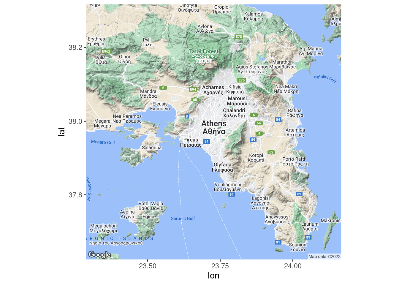
Clearly the Parthenon cannot be viewed from space. Let us adjust some variables to give us a clearer view. First, we will adjust the ‘zoom’ parameter. By default, get_map will select this for us, but we can specify it manually. Here, it is initially set to 10, which is about right for a city. Let us try 16 instead:
parthenon <- get_map(location = "parthenon, athens", zoom = 16)

parthenon_map <- ggmap(parthenon)

parthenon_map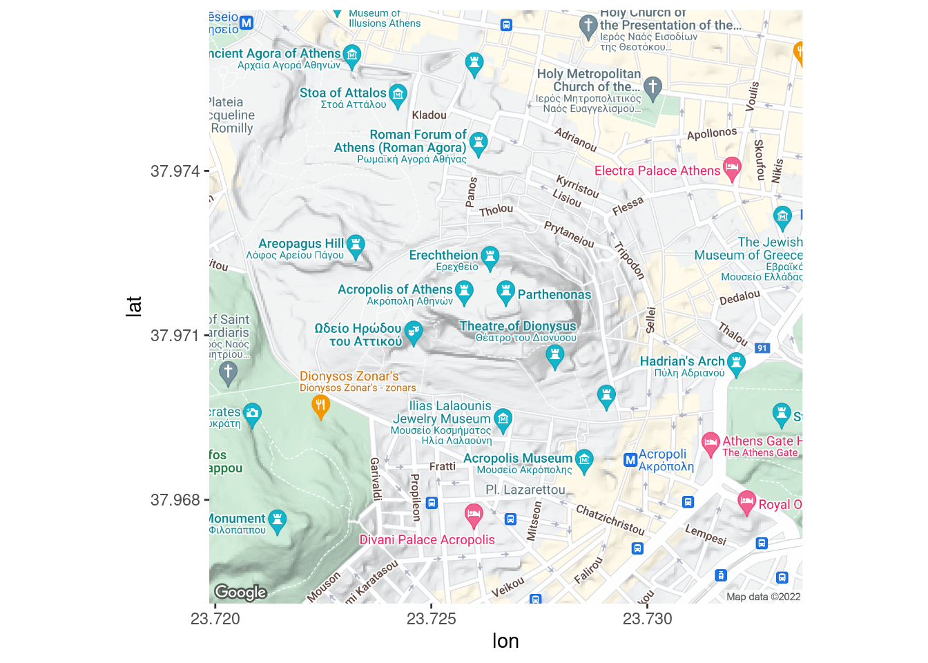
That is better. The style of this map may be a little distracting, but we will show how to change this later.
52.6 Quick Map Plot
In the event that you would like a quick visual plotted, given a set of latitude and longitude points that you would like to superimpose on a map, there is an easy option in the form of qmplot. Here is an example, using our sample dataset:
If you are looking for a quick visual, this may suffice in some cases.
52.7 Plotting by Overlaying ggplot2 Visuals
In most cases, you will want more elaborate visuals, which may be easier to accomplish with ggplot2 and ordinary ggmaps. Here are some examples:
52.7.1 Scatterplot
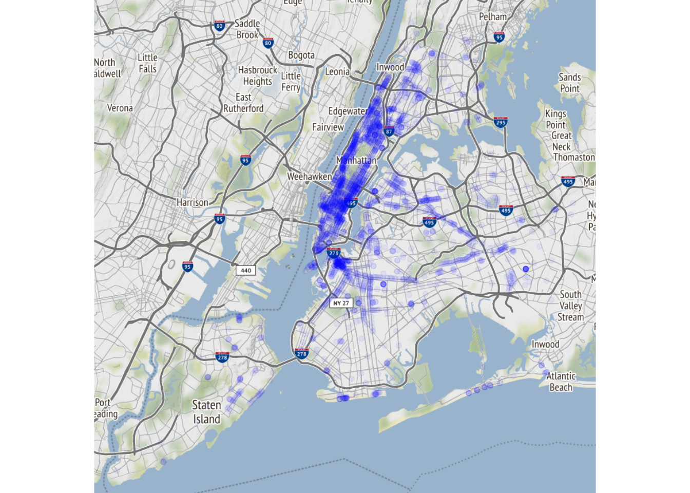
Let us start with a basic plotting. Note that ‘lat’ and ‘lon’ are the expected names of the x and y values.
wifi_data_renamed <- mutate(wifi_data, lat = Latitude, lon = Longitude)

nyc <- get_map(location = "manhattan", zoom = 12)

ggmap(nyc) +
  geom_point(data = wifi_data_renamed, aes(color = Type), alpha=.2)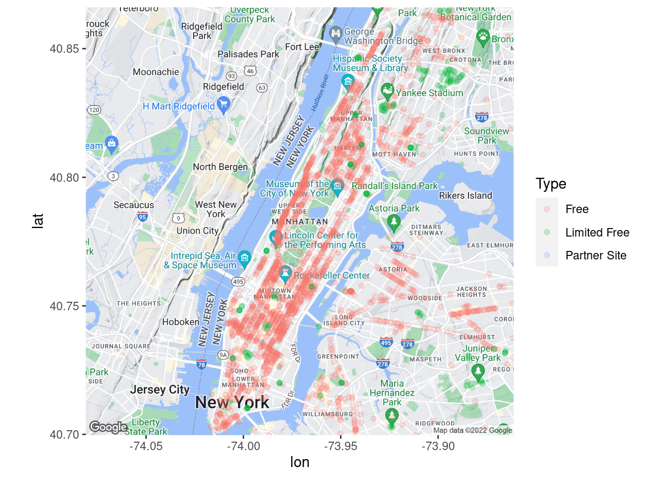
We see two issues. First, the legend could be inset at the top left. This can be modified within our ggmap. Second, our map colors may be confusing, given that parks and water are the same colors as several of our categories. Let us correct these issues:
nyc <- get_map(location = "manhattan", zoom = 12, source = 'stamen', maptype = "toner")

ggmap(nyc, extent = 'device', legend = "topleft") +
  geom_point(data = wifi_data_renamed, aes(color = Type), alpha=.2)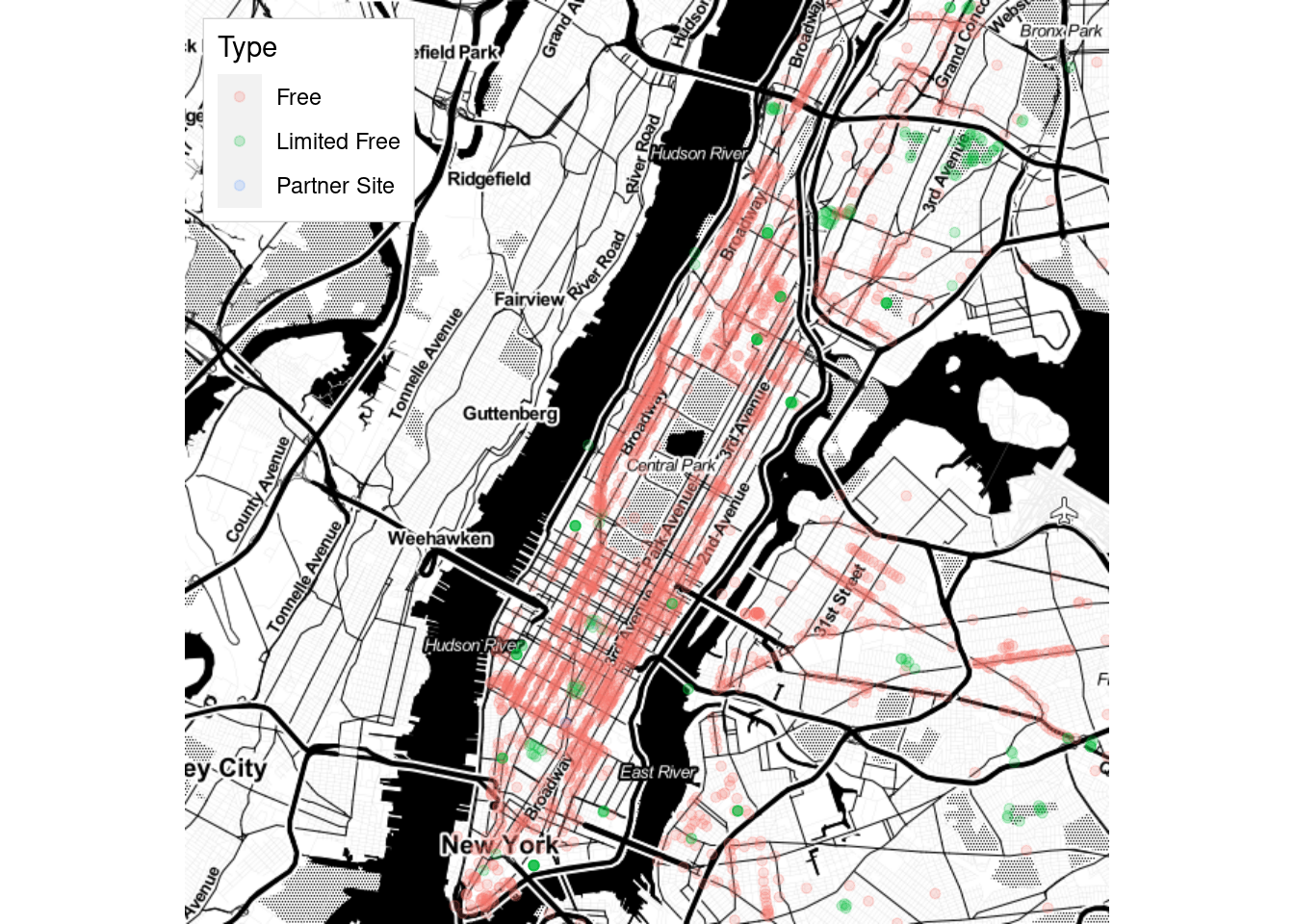
We used arguments extent = ‘device’ and legend = “topleft” to move our legend, and source = ‘stamen’ and maptype = “toner” to adjust our map’s appearance.
52.7.2 Heatmap with Rectangular Bins
In the event of overplotting, a rectangular heatmap can be used. The below graph shows a rectangular heatmap for the area of manhattan north of central park.
nyc <- get_map(location = c(-73.96, 40.8), zoom = 14, source = 'stamen', maptype = "toner")

ggmap(nyc, extent = 'device', legend = "topleft") +
  geom_bin_2d(data = wifi_data_renamed, aes(color = Type, fill = Type), bins = 40, alpha=.7)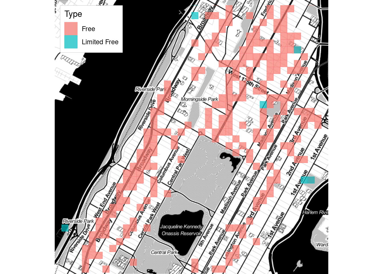
52.7.3 Contour Plots
One final visual of interest is the contour plot. Here is an example of one:
nyc <- get_map(location = "manhattan", zoom = 12, color = 'bw')

ggmap(nyc, extent = 'device', legend = "topleft") +
  geom_density_2d_filled(data = wifi_data_renamed, alpha = 0.3)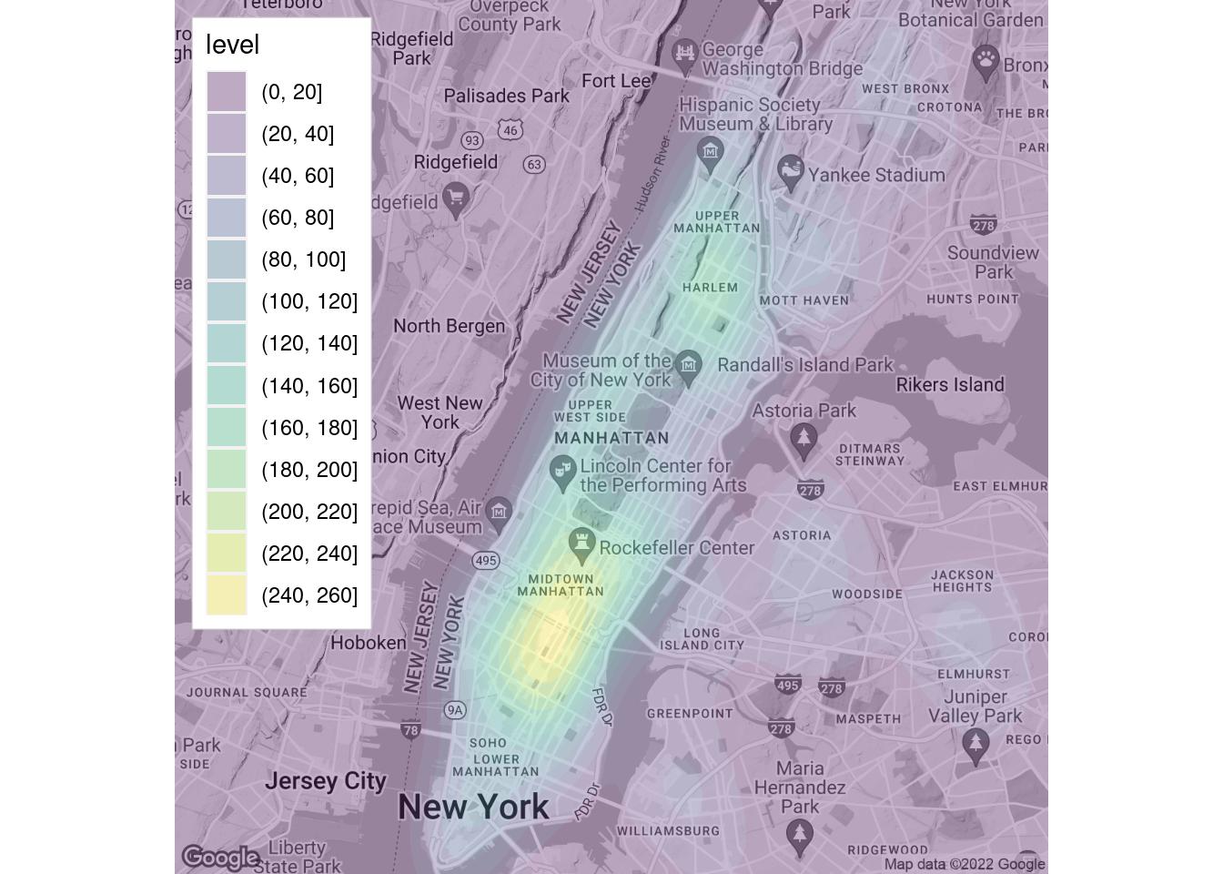
52.7.4 Overlaying Routes
One other neat feature of ggmap is the ability to superimpose routes. Here is a map that shows the available WiFi hotspots near a walking route from Columbia to Central Park:
to_cp <- route(from = 'Columbia University', to = 'Frederick Douglass Circle', mode = 'walking')

nyc <- get_map(location = c(-73.96, 40.803), zoom = 16, color = 'bw')

ggmap(nyc) +
  geom_leg(aes(x = start_lon, y = start_lat, xend = end_lon, yend = end_lat), size = 2, color = 'blue', data=to_cp) +
  geom_point(data = wifi_data_renamed, color = 'red')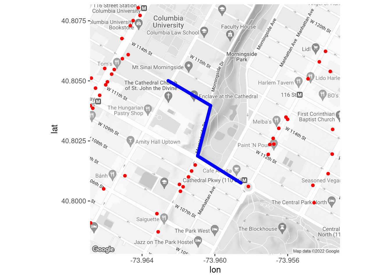
Looks like pickings are pretty slim!
52.8 Recommended Reading
If you’re looking for additional reading on ggmap, I would recommend https://journal.r-project.org/archive/2013-1/kahle-wickham.pdf .
52.9 Sources
L. Ellis. Map Plots Created With R And Ggmap. Little Miss Data. April 15, 2018. URL https://www.littlemissdata.com/blog/maps
D. Kahle and H. Wickham. ggmap: Spatial Visualization with ggplot2. The R Journal, 5(1), 144-161. URL http://journal.r-project.org/archive/2013-1/kahle-wickham.pdf
N. Voevodin. R, Not the Best Practices. April 6, 2020. URL https://bookdown.org/voevodin_nv/R_Not_the_Best_Practices/maps.html