99 Color selection for ggplot graphs
Raphaël Adda and Deepesh Theruvath
How to chose colors in R
When we are a plotting something, the choice of the colors is very important. R offers a huge number of ways to determine the colors that we will use. However, a lot of R users do not really know how to choose them.
This is the motivation behind this cheat sheet which presents the different methods of choosing colors in R.
We will use this histogram to illustrate how to chose colors
ggplot(mtcars,aes(x=mpg))+
  geom_histogram(bins=7)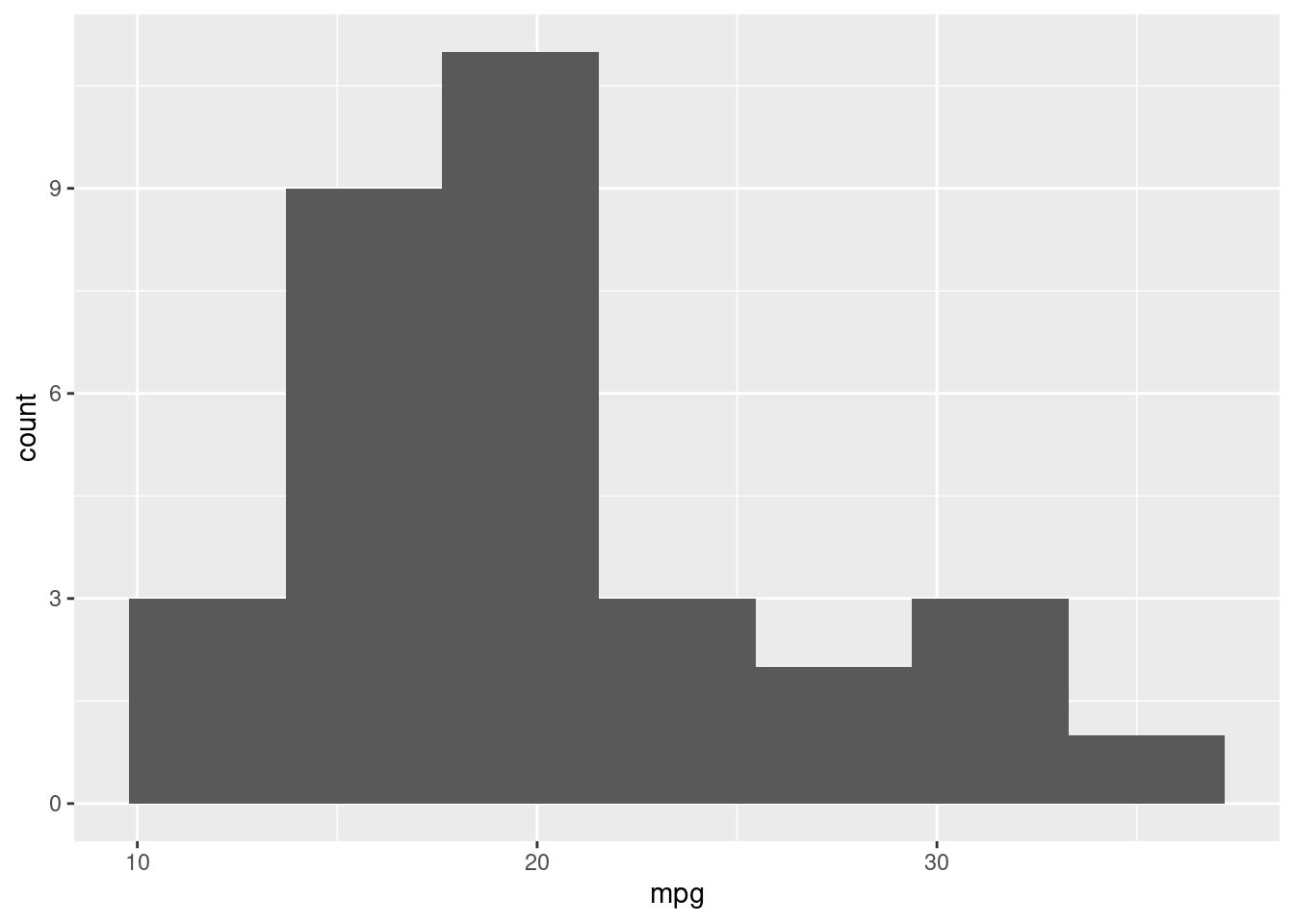
Classic naming of colors The simplest way to determine colors in a plot is to call the color by its name:
Example
ggplot(mtcars,aes(x=mpg))+
  geom_histogram(bins=7,fill = "grey",col ="white")
OR:
OR:
ggplot(mtcars,aes(x=mpg))+
  geom_histogram(bins=7,fill = "black",col ="blue")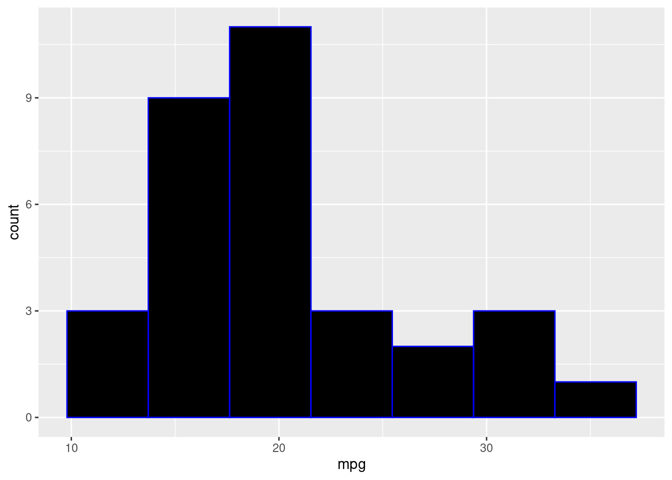
Colors with number In this method we are selecting colors based on the numbers defined in R
ggplot(mtcars,aes(x=mpg))+
  geom_histogram(bins=7,fill = 3,col = 1)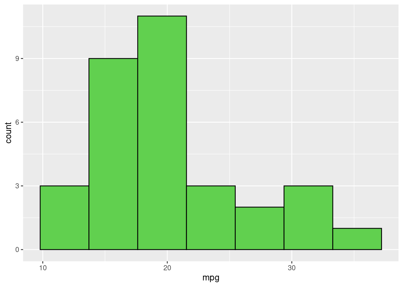
Each number greater than 0 is related to a color: Here is a graph showing the link between some numbers and some colors:
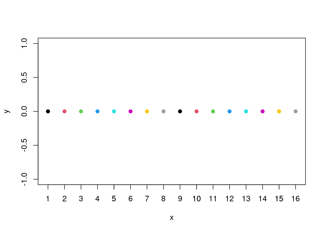
So, each number between 1 and 8 corresponds to a color. When a number is greater than 8, its color is just the color of the rest of the euclidiean division per 8 (if the number is divisible by 8, the color corresponds to the color of 8 (grey)
Using primary colours
The method presented above is relatively easy but too restrictive. We can use 8 colors for our plots, and more sophisticated figures may require more colors. All colors are composed of a mix of three primary colors: red, green, and blue. In all screens, each pixel is characterized by a superposition of these three colors: each one corresponds to a vector of size three, where each vector input is the intensity of the Red, Green, and Blue colors (RGB). For instance, the White color is a superposition of Red, Green, and Blue, so, thanks to the R function RGB, applied to the vector (1,1,1), we will obtain the white color. Then for the vector (1/2,0,1/2), we will obtain a mix of the red and blue colors but not at their maximum intensity: we will thus get a kind of Purple.
ggplot(mtcars,aes(x=mpg))+
  geom_histogram(bins=7,fill = rgb(1,1,1),col = rgb(0.5,0,0.5))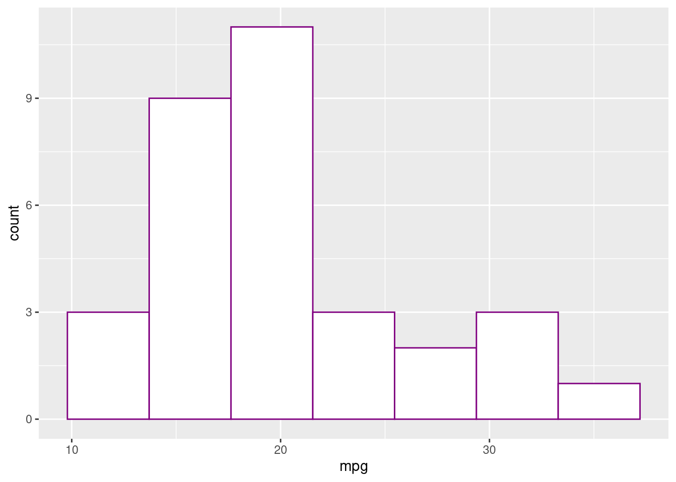
Thus, thanks to the RGB function, we can reproduce any color we want.
Mixing colours The previous section is handy because we can obtain every color. However, some people prefer doing their own mix of color. The function we will present allows us to mix two different colors: colorRamp takes into an argument a vector of two colors and returns a function: this function takes a float argument p between 0 and 1 and returns and return a mix of the two colors (proportion (1-p) of color 1 and p of color 2), coded using RGB colour model. However, each color is coded between 0 and 255 so we need to divide by 255 to obtain the RGB vector with number between 0 and 1 to obtain a vector usable with the rgb function presented above. Here is an example: we want a 90% pink and 10% green mix to fill in the histogram.
##       [,1]  [,2]  [,3]
## [1,] 229.5 198.3 182.7
ggplot(mtcars,aes(x=mpg))+
  geom_histogram(bins=7,fill = rgb(mixed_col/255),col = "white")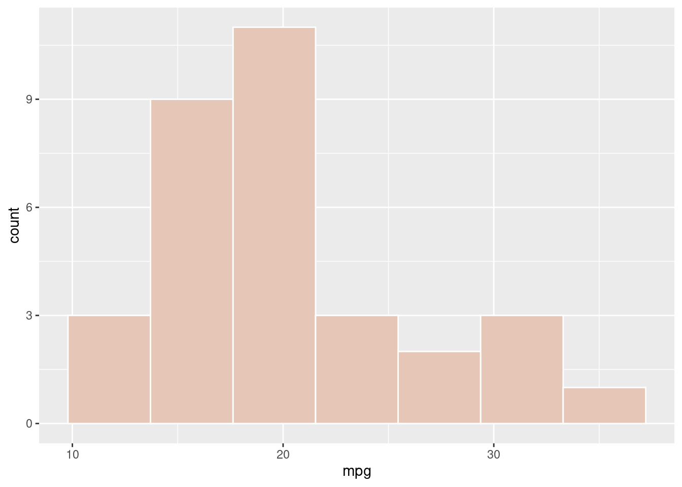
Creating differents shades of a colors
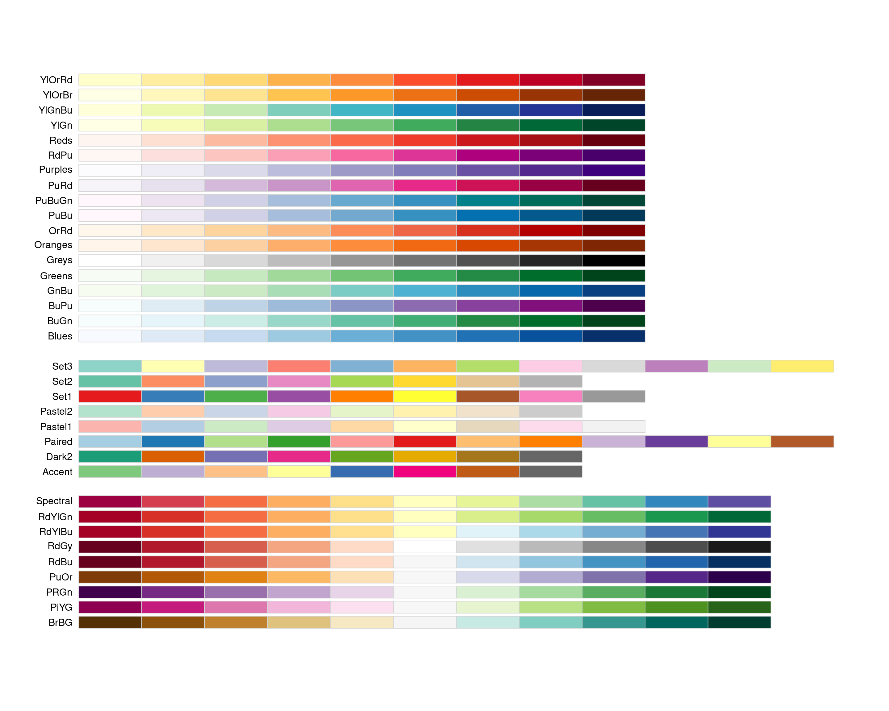
All previous methods help express colors in R. However; they require some knowledge about colors. For people who don’t know how to reproduce colors using the RGB color model or by mixing two colors, a simpler way exists to determine colors. The RColorBrewer allows the creation of different shades of color and visualization of them. The brewer. pal function takes two arguments: an integer n and a set of colors, and it returns a vector of n shades of this set. Here is an example: if we want to use purple in a plot, we just need to display different shades of the set “Purples” and choose which one interests us the most.
display.brewer.pal(9,"Purples")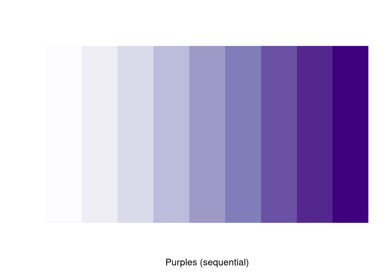
Here, assume that the 5th shades of purple is the one that we want to use. Thus, it correspond to “brewer.pal(10,”Purples“)[5]”.
fill_color = brewer.pal(9,"Purples")[5]
ggplot(mtcars,aes(x=mpg))+
  geom_histogram(bins=7,fill = fill_color,col = "white")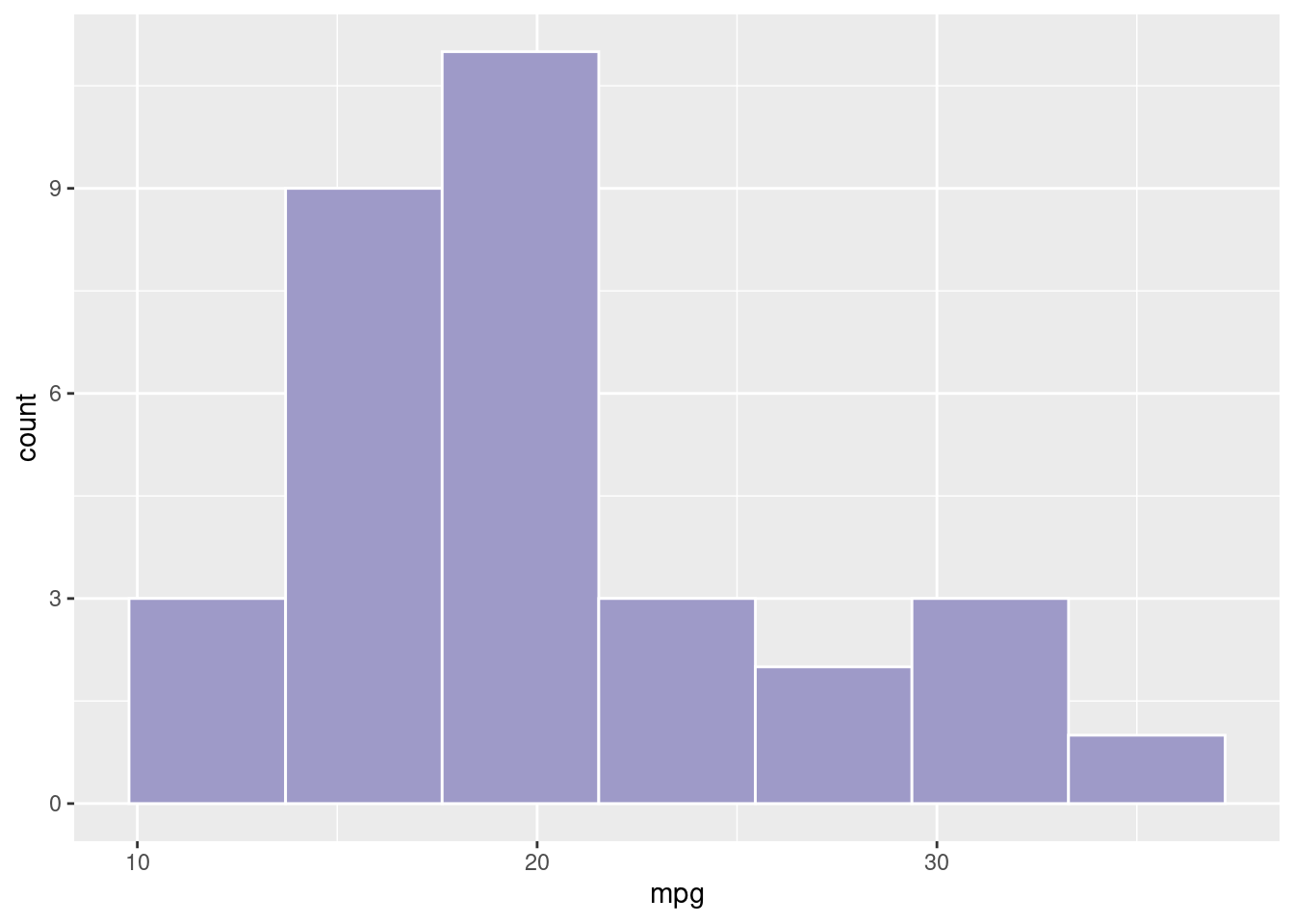
In order to know which set of colors we can use, there is the function “display.brewer.all()” which displays all the set of colors and the different colors we can use.
#Data visualization for ranking in R
Jingyuan Chen and Ling Sun
This tutorial is aimed to help people get a good start with ranking analysis by making use of data visualization tools. By making this tutorial, we hope beginner students can learn how to use some interesting and visually appealing plots other than the conventional bar chart when showing ranking data. We reorganize and simplify existing reference materials, and we add our tips and discussions with the hope of providing a specialized tutorial on ranking visualization. We choose to introduce lollipop charts, circular bar charts, word clouds, radar charts, and heat maps in this discussion.
99.0.1 Lollipop Charts
The lollipop chart is a hybrid form chart between a bar chart and a Cleveland dot plot. A lollipop chart typically contains categorical variables on the y-axis measured against a second (continuous) variable on the x-axis. Similar to the Cleveland dot plot, the emphasis is on the dot to draw the readers attention to the specific x-axis value achieved by each category. The line is meant to be a minimalistic approach to easily tie each category to its relative point without drawing too much attention to the line itself. A lollipop chart is great for comparing multiple categories as it aids the reader in aligning categories to points but minimizes the amount of ink on the graphic.
99.0.1.1 Tutorial - ggplot2
Input data:
A data frame which contains a categorical variable and a continuous variable.
Library:
This tutorial focuses on build lollipop chart with the ggolot2 library, which can be easily used as a substitute of the conventional bar chart.
#Create a data frame as an example
name = letters[1:10]
score = c(40,90,37,39,35,22,28,29,34,21)
df = data.frame(name, score)

ggplot(data=df, aes(x = name, y = score, color=name))+
  geom_point(size=5)+
  theme_bw()+
  labs(title = "Lollipop Chart", x = "Name", y = "score")+
  geom_segment(aes(x=name,xend=name,y=0,yend=score), size = 2)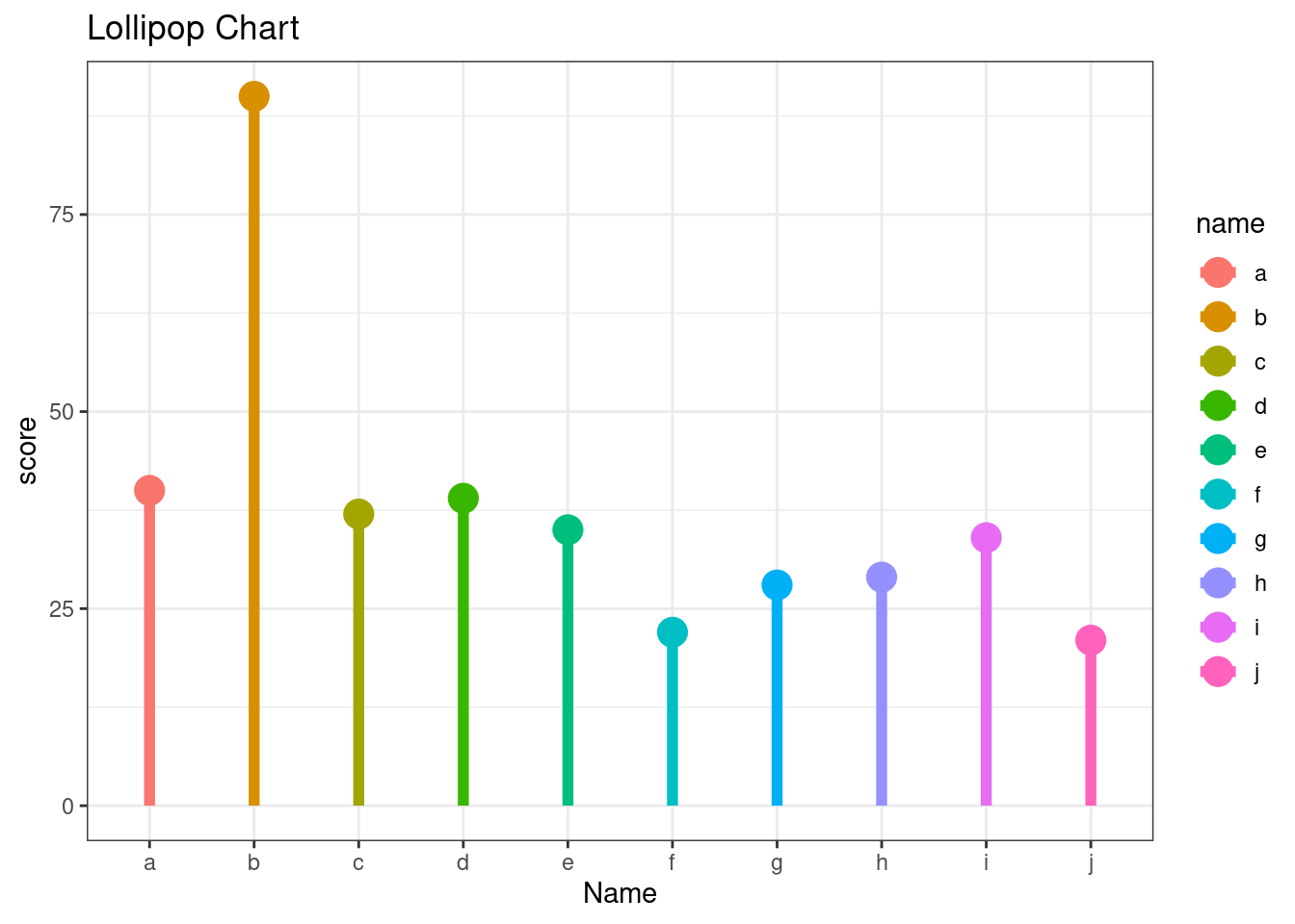
99.0.2 Circular Bar plots
Circular barplot is a variation of the conventional bar chart. As the name suggests, Circular barplot is visually appealing, but it must also be used with extra care because circular barplot uses polar rather than Cartesian coordinates, which means each category does not share the same Y-axis. Circular bar charts are great choice for ranking periodic data.
99.0.2.1 Tutorial - ggplot2
Input data:
A data frame which contains a categorical variable and a continuous variable.
Library:
This tutorial focuses on build a circular barplot with the ggolot2 and ‘tidyverse’ library, which can be easily used as a substitute of the conventional bar chart.
# Create a data frame as an example
data = data.frame(id=seq(1,60),
                  individual=paste( "Candidate", seq(1,60), sep=""),
                  value=sample( seq(10,100), 60, replace=T))

# Then we get the name and the y position of each label
label_data = data

# calculate the ANGLE of each labels
number_of_bar = nrow(label_data)
angle =  90 - 360 * (label_data$id-0.5) /number_of_bar
# Here, we substract 0.5 because the letter must have the angle of the center of the bars so that we can avoid extreme right(1) or extreme left (0).

# calculate the alignment of labels: right or left
# If I am on the left part of the plot, my labels have currently an angle < -90
label_data$hjust = ifelse( angle < -90, 1, 0)

# flip angle BY to make them readable
label_data$angle = ifelse(angle < -90, angle+180, angle)


# Start the plot
plot = ggplot(data, aes(x=as.factor(id), y=value)) +

  # This add the bars with a blue color
  geom_bar(stat="identity", fill=alpha("skyblue", 0.7)) +

  # Limits of the plot = very important. The negative value controls the size of the inner circle, the positive one is useful to add size over each bar
  ylim(-100,120) +

  # Custom the theme: no axis title and no cartesian grid, Adjust the margin to make in sort labels are not truncated!
  theme_minimal() +
  theme(
    axis.text = element_blank(),
    axis.title = element_blank(),
    panel.grid = element_blank(),
    plot.margin = unit(rep(-1,4), "cm")) +

  # This makes the coordinate polar instead of cartesian.
  coord_polar(start = 0) +

geom_text(data=label_data, aes(x=id, y=value+10, label=individual, hjust=hjust), color="black", fontface="bold",alpha=0.6, size=2.5, angle= label_data$angle, inherit.aes = FALSE )

plot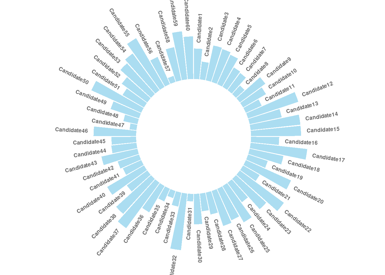
99.0.3 Word cloud
Word cloud is an visualization technique that shows frequent words in a text by letting the size of the words represents their frequency.
99.0.3.1 Tutorial - Wordcloud2
Input data:
A data frame including word and frequency in each column, which can be obtained through text mining via script function.
Library:
This tutorial focuses on build Word Cloud with the Wordcloud2 library, which is more convenient than the other options.
Options:
| Parameters | Explanation |
|---|---|
| data | A data frame including word and freq in each column |
| size | Font size, default is 1. The larger size means the bigger word. |
| fontFamily | Font to use |
| fontWeight | Font weight to use, e.g. normal, bold or 600 |
| minSize | A character string of the subtitle backgroundColor Color of the background. |
| gridSize | Size of the grid in pixels for marking the availability of the canvas the larger the grid size, the bigger the gap between words. |
| minRotation | If the word should rotate, the minimum rotation (in rad) the text should rotate. |
| maxRotation | If the word should rotate, the maximum rotation (in rad) the text should rotate. Set the two value equal to keep all text in one angle. |
| rotateRatio | Probability for the word to rotate. Set the number to 1 to always rotate. |
| shape | The shape of the “cloud” to draw. Can be a keyword present. Available presents are ‘circle’ (default), ‘cardioid’ (apple or heart shape curve, the most known polar equation), ‘diamond’ (alias of square), ‘triangle-forward’, ‘triangle’, ‘pentagon’, and ‘star’. |
| ellipticity | degree of “flatness” of the shape wordcloud2.js should draw. |
| figPath | A fig used for the wordcloud. |
| widgetsize | size of the widgets |
99.0.3.2 Example and Tips
#demoFreq is a data frame whose first column is word and second column shows the corresponding frequency.
head(demoFreq)
## word freq
## oil oil 85
## said said 73
## prices prices 48
## opec opec 42
## mln mln 31
## the the 26
wordcloud2(data = demoFreq,
           size = 2,
           color = "random-light",
           backgroundColor = "grey",
           fontFamily = "Arial",
           fontWeight = 'normal',
           minRotation = -pi/6,
           maxRotation = -pi/6,
           minSize = 10,
           rotateRatio = 0.5,
           shape = "diamond")
Tips: The syntax of Wordcloud2 is not complicated, but it takes a lot of work to create an aesthetically pleasing word cloud with suitable color, font, shape, and other details.
99.0.4 Radar Charts
As we approach to complex ranking tasks, it is more frequently that our rankings are expected to reflect performances from multiple dimensions together. It is not an easy job because there is no ground truth about what weight should be put on each dimension. Radar charts are such a tool that can provide an overview of performances and help us get start with all experiments for producing an ideal ranking. In this section, you will see how we visualize and compare two students’ academic performances with radar charts.
99.0.4.1 Tutorial - fmsb
Input data:
Each row represents an entity. Each column is a quantitative variable. Note that the first 2 rows should provide the minimum and the maximum values that are allowed for each variable.
Library:
In this section, we will be using the fmsb library to build radar charts.
Options:
| Category | Parameters |
|---|---|
| Variable options |
vlabels variable labels; vlcex font sizes of variable labels |
| Polygon options |
pcol line color; pfcol fill color; plwd line width; plty line types from “solid”, “dashed”, “dotted”, “dotdash”, “longdash”, “twodash” and “blank” or 0 ~ 6 |
| Grid options |
cglcol line color; cglty line type; cglwd line width |
| Axis options |
axislabcol color of axis label and numbers; caxislabels labels on the center axis |
#create data - student scores
data <- as.data.frame(matrix( c(89,85,60,66,73,90,64,66,81,72) , ncol=10))
colnames(data) <- c("math" , "english" , "biology" , "music" , "R-coding", "data-viz" , "french" , "physic", "statistic", "sport" )

#add the max and min of each variable
data <- rbind(rep(100,10) , rep(0,10) , data)

#parameters for arranging two plots side by side
par(mfrow = c(1, 2))

#default radar chart
radarchart(data, seg = 5, title = 'default radar chart')

#helper function to produce a customized radar chart
customize_radarchart <- function(data, color = "#00AFBB",
                                        vlabels = colnames(data), vlcex = 1,
                                        caxislabels = NULL, title = NULL, ...){
  radarchart(
    data, axistype = 1, seg = length(caxislabels)-1,
    # Customize the polygon
    pcol = color, pfcol = scales::alpha(color, 0.5), plwd = 2, plty = 1,
    # Customize the grid
    cglcol = "grey", cglty = 1, cglwd = 0.8,
    # Customize the axis
    axislabcol = "grey",
    # Variable labels
    vlcex = vlcex, vlabels = vlabels,
    caxislabels = caxislabels, title = title, ...
  )
}

#customized radar chart
customize_radarchart(data, caxislabels = c(0, 20, 40, 60, 80, 100), title = 'customized radar chart')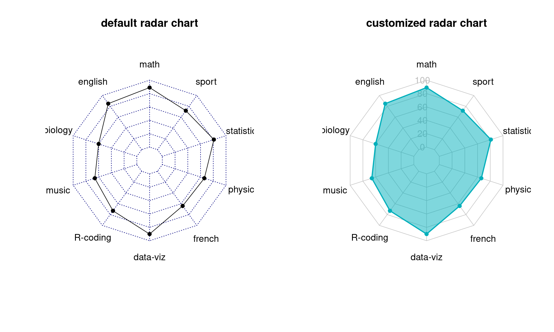
99.0.4.2 Tips for Users
Radar charts are good for comparing the overall performances between multi-dimensional objects, but its circular layout makes it harder to read values exactly. For example, it is not obvious on which subject, math or data-viz, the student achieved the best score. A single vertical or horizontal axis is still the most efficient way to compare quantitative values. One solution could be supplementing radar charts with single axis plots, such as lollipop plots.
Furthermore, radar charts can be misleading. Readers may feel that they are led to focus on the highlighted polygon. However, its shape highly depends on the ordering of categories around the plot. By changing the category ordering, we can produce very different plots.
Comparing areas also gives rise to more over-evaluation of differences, because the area of a ploygon increases quadratically as its edges increase. In another example, one student scored 40 in every subject and another student scored of 80 in each, but the polygon on the right looks four times as large as the left one.
#create data - student scores
data <- as.data.frame(matrix( c(40,40,40,40,40,40,40,40,40,40) , ncol=10))
colnames(data) <- c("math" , "english" , "biology" , "music" , "R-coding", "data-viz" , "french" , "physic", "statistic", "sport" )

#add the max and min of each variable
data <- rbind(rep(100,10) , rep(0,10) , data)

#parameters for arranging two plots side by side
par(mfrow = c(1, 2))

#default radar chart
customize_radarchart(data, caxislabels = c(0, 20, 40, 60, 80, 100), title = 'student 1')

#create data - student scores
data <- as.data.frame(matrix( c(80,80,80,80,80,80,80,80,80,80) , ncol=10))
colnames(data) <- c("math" , "english" , "biology" , "music" , "R-coding", "data-viz" , "french" , "physic", "statistic", "sport" )

#add the max and min of each variable
data <- rbind(rep(100,10) , rep(0,10) , data)

#reordered catogories
customize_radarchart(data, caxislabels = c(0, 20, 40, 60, 80, 100), title = 'student 2')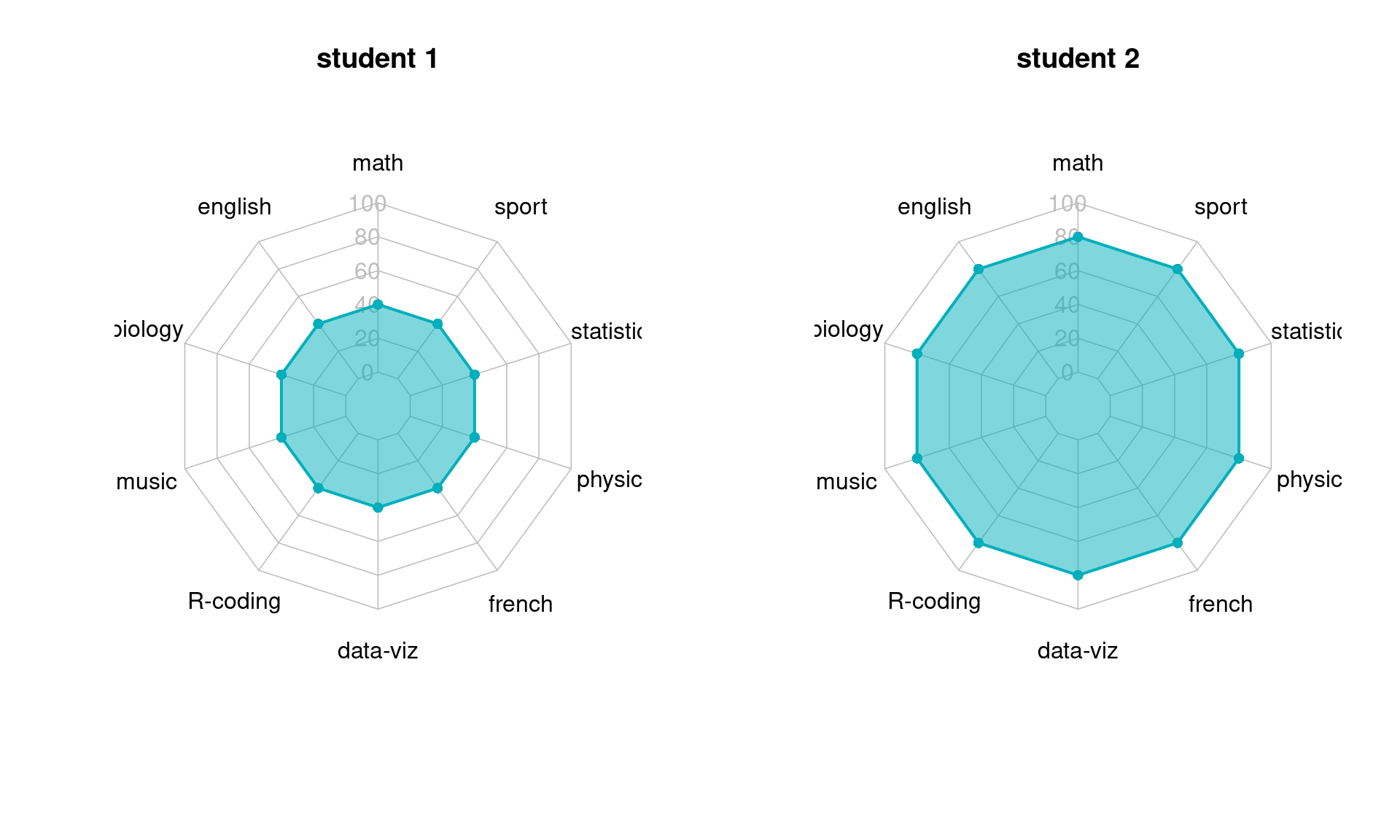
99.0.5 Heat Maps
Rankings are a systematic approach to represent datasets. To take another step closer to this goal, heat map can provide you inspirations. To name a few, heat maps could be useful to detect possible outliers that can mess up our rankings. Clustering analysis based on heat map visualizations are also helpful for ranking adjustment where we move up or move down certain groups of entities to achieve better ranking evaluation results. This section will show you how to perform heat map visualizations to help you boost ranking performances.
99.0.5.1 Tutorial - heatmap()
Input data:
Heatmaps work best with continuous data. Each row represents an entity. Each column is a continuous-valued attribution.
Library:
We would like to introduce base R heatmap() here because it is a handy tool that has simple syntax but supports very useful features for such as hierarchical clustering trees and customized representations, which can be of help in ranking adjustment.
Options:
| Category | Parameters |
|---|---|
| Normalization options |
scale axis along which normalization will be performed, “row”, “column” or “none” |
| Clustering options |
Colv, Rowv NA if clustering over columns/ rows will not be performed; RowSideColors, ColSideColors vectors of colors to represent clustering structures beside heat maps |
| Layout options |
labRow, colRow label names for rows and columns; cexRow , cexCol label sizes |
#import data
cars_data <- as.matrix(mtcars)

#one-line code for producing heatmap
heatmap(cars_data, scale = "column", col = hcl.colors(50), Colv = NA, xlab="Variable", ylab="Car Model", main="base R heatmap", margin = c(5,7)) 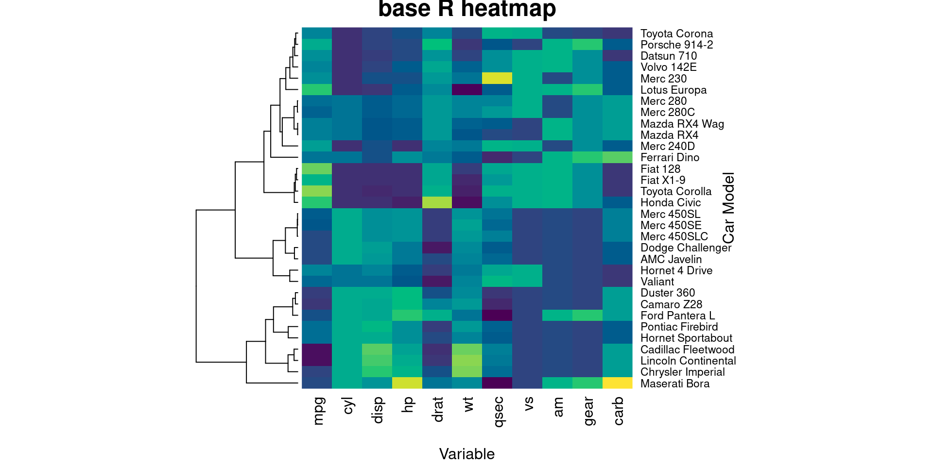
99.0.5.2 Interactive Heat Maps
Library:
In this section, we will show how to use heatmaply, an interactive clustering heat map library built upon plotly. We provide a short piece of example code here. Users are free to explore it beyond this tutorial.
Options:
| Category | Parameters |
|---|---|
| Normalization options |
scale axis along which normalization will be performed, “row”, “column” or “none” |
| Clustering options |
dendrogram axis along which clustering will be performed, “row”, “column”, “none” or “both”; hide_colorbar to show representation of clustering structures beside heat maps or not |
| Layout options |
labRow, labCol label names for rows and columns; label_names label names on interactive cells |
##import data
cars_data <- as.matrix(mtcars)

heatmaply(cars_data,
        dendrogram = "row",
        scale = "column",
        xlab = "Feature", ylab = "Car Model",
        main = "Interactive heatmap",
        margins = c(60,100,40,20),
        grid_color = "white",
        grid_width = 0.00001,
        titleX = FALSE,
        hide_colorbar = TRUE,
        branches_lwd = 0.1,
        label_names = c("Car Model", "Feature", "Value"),
        fontsize_row = 5, fontsize_col = 5,
        labCol = colnames(cars_data),
        labRow = rownames(cars_data),
        heatmap_layers = theme(axis.line=element_blank())
        )
Discussion:
By allowing readers to focus on different parts of their interest, interactive plots are great for enhancing communication and generating new ideas. plotly is also a powerful tool to produce interactive plots, including interactive heat maps, but it does not support some features we have shown above. heatmaply is a more specialized library that maintains all useful features that we have seen in base R heatmap().
99.0.6 References
Dawei Lang and Guan-tin Chien (2018) Wordcloud2 introduction https://cran.r-project.org/web/packages/wordcloud2/vignettes/wordcloud.html
Tal Galili and Alan O’Callaghan (2021) Introduction to heatmaply https://cran.r-project.org/web/packages/heatmaply/vignettes/heatmaply.html
UC R Programming (2016) Lollipop Charts https://uc-r.github.io/lollipop
Yan Holtz (2018) From Data to Viz https://www.data-to-viz.com/