73 Recursive codes and self-organized map with R
Yuki Ikeda
In this article, I introduce (A) how to develop recursive codes with R in order to use R for every phase of our data analyses, (B) how to draw a self-organized map with R, a not well known but interesting way of 2D projection (dimension reduction) of (relatively) high dimensional data, and (C) the three most useful functions in ggplot in practice.
73.1 To conduct all analyses with R – Write recursive code with R
73.1.1 Motivation
In practice, I believe that one of the annoying workflows is to go around and among many pieces of software such as using python for data cleaning, developing statistical analysis using R, visualizing them in Excel, etc. It typically makes the folder messy and bothers a successor once current stuff leaves the role. Hence, if we employ datavis tools in R, we also want to develop other analyses with R. However, in order for us to do so, we have to learn many types of analyses with R. In fact, R is an advanced language and can do many things by their own. Here, I introduce recursive coding in R as an illustration.
We sometimes use recursive functions (we will give one frequent example later). People may think that R is not as good as python to handle a recursive function, so they might conduct recursive programming using python and, after finishing it, move to R for visualization, etc, which makes the workflow messy.
73.1.2 An illustration of recursive code: Levenshtein distance
Here, I introduce how to define a recursive function in R by using an example of the Levenshtein distance. In practice, there is often the case that we want to connect A and B that are supposed to be the same. For example, at a commercial bank, we often have to connect our corporate debtor data and external information of these companies using the company name as the only available key. However, it is also often the case that one data have a company name as “XXX, plc” and the other one has as just “xxx,” or one has as “XXX, plc, YYY brunch” and the other as “XXX, plc.” In such cases, we cannot directly connect the two data. This is where the Levenshtein distance comes in. The Levenshtein distance between any two words is the minimum number of edits (1) insert one character to either one word, (2) delete one character in either one word, or (3) substitute one character in either one word to transform one word into another. In my past job, we used this distance to quantify the difference of words in two company name columns, which enabled us to find the more possible matches between them.
The Levenshtein distance is useful for the reason above, however, computing the distance requires us to define recursive functions for this. Please see [1] or the definition written in https://en.wikipedia.org/wiki/Levenshtein_distance. Hence, we have to define a recursive function in R.
73.1.3 Naive coding
One naive way to do so is just using “recall” function which orders to compute recursively:
LD_naive <- function(x,y) {
  if (nchar(x)==0){
    return( nchar(y) )
  } else if (nchar(y)==0){
    return( nchar(x) )
  } else if (substr(x,nchar(x),nchar(x))==substr(y,nchar(y),nchar(y))){
    return (
      Recall(substr(x,1,nchar(x)-1),substr(y,1,nchar(y)-1))
    )
  } else {
    return(
      1+
      min(
        Recall(substr(x,1,nchar(x)-1),y),
        Recall(x,substr(y,1,nchar(y)-1)),
        Recall(substr(x,1,nchar(x)-1),substr(y,1,nchar(y)-1))
      )
    )
  }
}

## Levenshtein distance between "kitten" and "sitting"

LD_naive("kitten","sitting")
## [1] 3However, this takes much time when the length between strings gets longer since it computes the value of the distance between the same partial strings of x and y again and again.
73.1.4 Better coding using DP table
Therefore, a better coding would be to prepare the Dynamic Programming table to preserve the distance of all partial strings beginning at the first and ending at some point in x and y:
LD0 <- function(x,y) {

  n <- nchar(x)
  m <- nchar(y)

  M <- matrix(NA,n+1,m+1)

  M[1,] <- rep(0,m+1)
  M[,1] <- rep(0,n+1)

  for(i in 1:n){
    for(j in 1:m){

      if(substr(x,i,i)==substr(y,j,j)){
        M[i+1,j+1] <- M[i,j]
      } else {
        M[i+1,j+1] <- 1+min(M[i,j],M[i+1,j],M[i,j+1])
      }

    }
  }

  return(M[n+1,m+1])

}

## Levenshtein distance between "kitten" and "sitting"

LD0("kitten","sitting")
## [1] 3However, even if x and y are identical, this code computes the distance of every pair of partial strings beginning at the first and ending at some point in x and y. Clearly in such a case, we only need to compute \(LD(x[1:i],y[1:i])\) for each \(i\). So, this code is a little redundant.
73.1.5 Recursive coding using global variable
The next code is more efficient in the sense that it only computes distances they need.
LD <- function(x,y) {

  n <- nchar(x)
  m <- nchar(y)

  M <- matrix(NA,n+1,m+1)   ##Global variable

  LDn <- function(x,y,n,m) {

    if (n==0){
      M[1,m+1] <<- m   ##use <<- when input into global variable
      return( m )
    } else if (m==0){
      M[n+1,1] <<- n
      return( n )
    } else if (substr(x,n,n)==substr(y,m,m)){

      ## first get values from global variable
      itm1 <- M[n,m]

      ## if global variable does not have the value,
      ## then get instead from the function which we very define,
      ## passing the value to global variable
      if(is.na(itm1)){
        itm1 <- LDn(x,y,n-1,m-1)
        M[n,m] <<- itm1   ##use <<- when input into global variable
      }

      return ( itm1 )

    } else {

      itm2 <- M[n,m+1]
      itm3 <- M[n+1,m]
      itm4 <- M[n,m]


      if(is.na(itm2)){
        itm2 <- LDn(x,y,n-1,m)
        M[n,m+1] <<- itm2   ##use <<- when input into global variable
      }


      if(is.na(itm3)){
        itm3 <- LDn(x,y,n,m-1)
        M[n+1,m] <<- itm3   ##use <<- when input into global variable
      }


      if(is.na(itm4)){
        itm4 <- LDn(x,y,n-1,m-1)
        M[n,m] <<- itm4   ##use <<- when input into global variable
      }

      return( 1+min( itm2, itm3, itm4 ) )
    }

  }

  return( LDn(x,y,n,m) )

}

## Levenshtein distance between "kitten" and "sitting"

LD("kitten","sitting")
## [1] 3Specifically, when the two strings are identical, it only computes the \(LD(x[1:i],y[1:i])\) for each \(i\).
As seen from this example, the key point is to prepare the global variable \(M\) to preserve the distance between partial strings, and call it when computing the distance between longer strings by at most one character. Note that we need to use <<- when we input a value in a global variable.
This way of coding can be applied to any other recursive programming with R.
73.2 Self-organized map with R
In this chapter, we introduce a self-organized map and how to draw it using R package kohonen, discussing both its merits and the possible limits.
When we conduct a multivariate exploratory analysis, we first want to briefly look into what typical patterns the data have. However, we can only easily visually interpret at most 2-dimensional scatter patterns. Hence, it is useful to somehow project the data points to a 2-dimensional plane.
A popular way to do so is using a principal component analysis (PCR), however, even for relatively moderate dimension like three or four, non-specialist might feel PCA biplots with three or four principal component vectors are not easy to see.
This is where the self-organized map comes in. It employs a simple neural net with only one input layer (data points) and one output layer. Once we specify the 2D(Dimensional)-shape of the output layer, it searches the optimal projection to (fairly informally) minimize the distance from each point to its nearest unit in the 2D-output layer by iterating the minimization with respect current unit in the output layer and then updating those units based on data points that belong to each unit. In that sense, it is similar to the k-means method. The difference is that since the k mean vectors are not located in a 2D-plane, we still cannot visualize the result of a k-means classification directly, while in a self-organized map, since the units (corresponding k mean vectors) are squeezed in 2D plane, we can visualize them.
73.2.1 Iris data
The code below is the elementary tutorial to draw a self-organized map with R using the well-known iris data. We can see that (1) there is a group with large sepal width but small all other three lengths (setosa), (2) there is a group with small to medium all four lengths (versicolor) and (3) there is a group with large all four lengths (virginica).
  set.seed(5702)

  ##"som" function needs to have matrix data (not data.frame) as data.
  iris.mx <- as.matrix(iris[,1:4])

  ## We first have to specify the shape of the output layer
  ## "topo" specifies the shape of 2D-output layer
  ## "xdim" and "ydim" specifies the dimension of the output layer
  g1 <- somgrid(topo="hexagonal",xdim=4,ydim=4)

  ## Then we train the self-organized map by our iris data
  ## "rlen" specifies the number of iteration of the minimization of distances
  iris.som <- som(iris.mx,g1,rlen=200)

  ## When we visualize the distribution of values in some other column in each output unit, we have to make the column as integer.
  ## Here, we take iris species as label.code (1=setosa,2=versicolor, and 3=virginica)
  label.code <- as.integer(iris[,5])

  par(mfrow=c(1,2))
  ## plot the each unit and their typical relative value of each variable
  plot(iris.som, type='codes')
  ## plot the distribution of iris species in each output unit
  plot(iris.som,type="mapping",labels=label.code,col=label.code)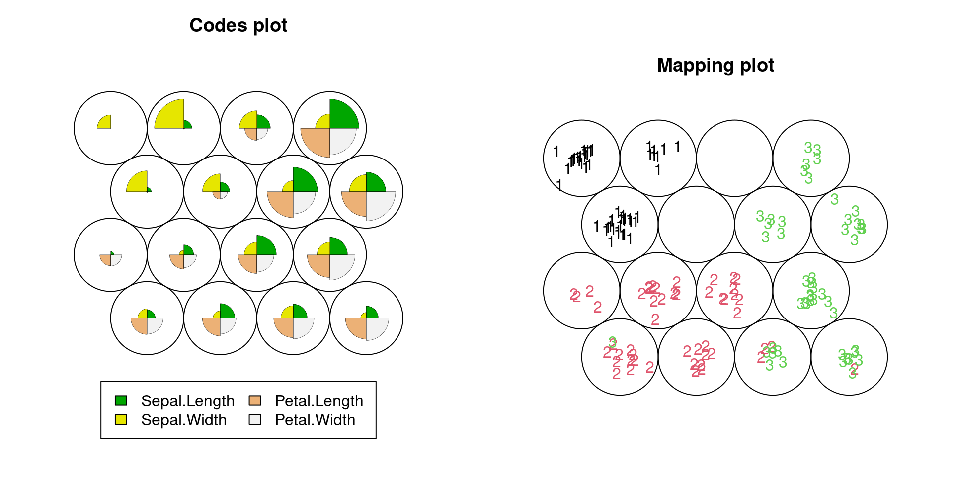
The plots clearly show simultaneously that (1) what kind of patterns of multiple variables appear in the data, or what kind of clusters (output layer) seem to be in the data set, and (2) how the characteristic of each cluster is related to the third variable, iris spices. Hence, it is helpful no matter we only understand the data visually or further proceed to train a classification model.
We can check the convergence of the iteration of the minimization of distance by plotting the path of the average distance to the closest output layer unit.
plot(iris.som, type='change')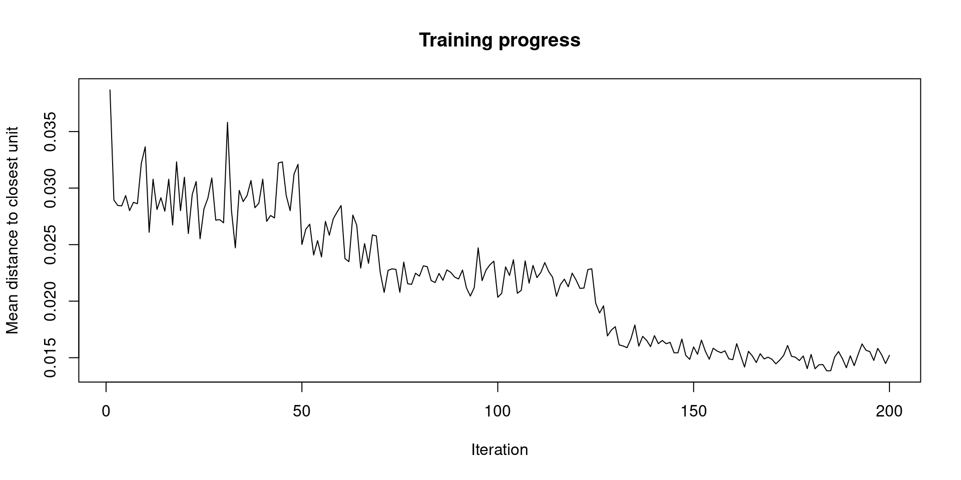
We can also plot the counts of data points that belong to each output unit.
plot(iris.som, type='counts', palette.name = cm.colors)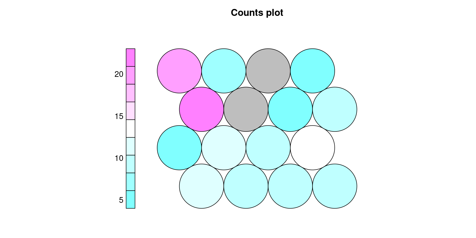
73.2.2 Titanic data
This method can be applied to non-numeric data if we convert discrete variables into integers. The illustration below is for the Titanic data. It clearly shows that the most effective variable to predict the survival rate would be sex. Note that we set sex as 1:man, 2:woman, and survival as 1:survived and 2:not survived.
  set.seed(5702)

  d1 <- as.data.frame(Titanic)

  Tita <- d1[rep(seq_len(nrow(d1)), d1$Freq),1:4]

  row.names(Tita) <- NULL

  Tita_n <- Tita %>%
    mutate(class_n=ifelse(Class=="3rd",3,ifelse(Class=="2nd",2,ifelse(Class=="1st",1,4)))) %>%
    mutate(sex_n=ifelse(Sex=="Male",1,2)) %>%
    mutate(Age_n=ifelse(Age=="Adult",2,1)) %>%
    mutate(Survived_n=ifelse(Survived=="Yes",1,2))

  g2 <- somgrid(topo="hexagonal",xdim=5,ydim=5)

  Tita.som <- som(as.matrix(Tita_n[,5:7]),g2,rlen=500)

  par(mfrow=c(1,2))
  plot(Tita.som, type='codes')
  plot(Tita.som,type="mapping",labels=Tita_n[,8],col=Tita_n[,8])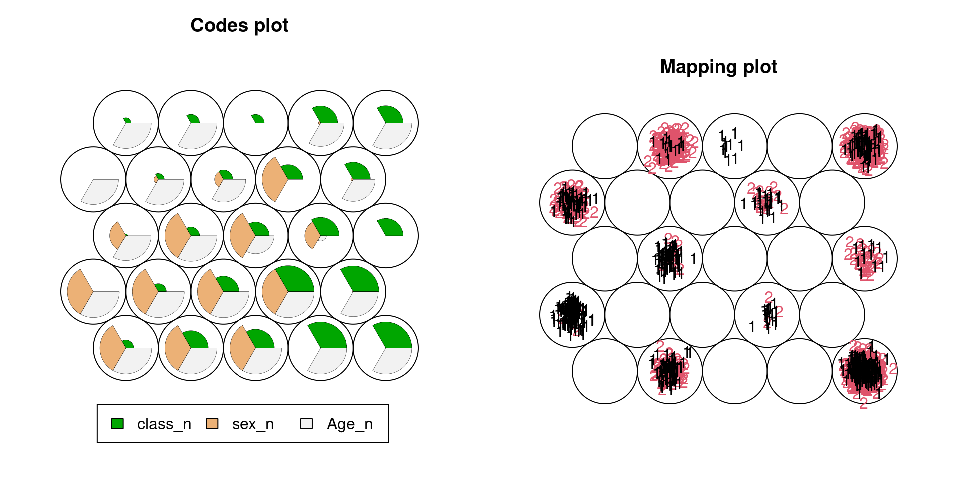
73.2.3 Limitation in Mapping plot
The third example is for lending data in openintro package. From the plots below, one can see as the sample size increases, the mapping plot becomes hard to see, which is a limit of package kohonen. For large sample data, We should randomly sample from the data first, and then plot the self-organized map.
  set.seed(5702)

  Lend <- loans_full_schema %>%
    select(annual_income,total_credit_limit,interest_rate,balance,num_historical_failed_to_pay)

  g3 <- somgrid(topo="hexagonal",xdim=5,ydim=7)

  Lend.som <- som(as.matrix(Lend[,1:4]),g3,rlen=2000)

  par(mfrow=c(1,2))
  plot(Lend.som, type='codes')
  plot(Lend.som,type="mapping",labels=as.matrix(Lend[,5]),col=as.matrix(Lend[,5]))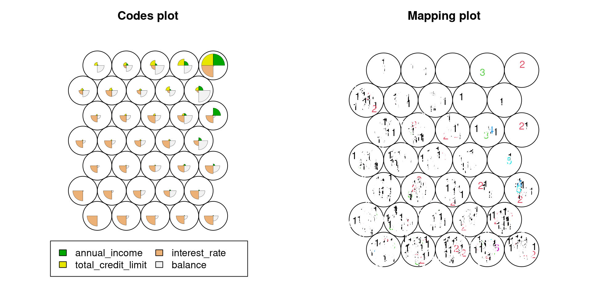
73.2.4 Limitation in Codes plot
The last example is for data of fifty states in USA from datasets package.
Generally, as the number of variables increases, the codes plot is also getting hard to see.
  set.seed(5702)

  States <- state.x77

  g4 <- somgrid(topo="hexagonal",xdim=3,ydim=3)

  Lend.som <- som(States,g4,rlen=200)

  par(mfrow=c(1,2))
  plot(Lend.som, type='codes',palette.name = rainbow)
  plot(Lend.som,type="mapping",labels=as.matrix(rownames(States)))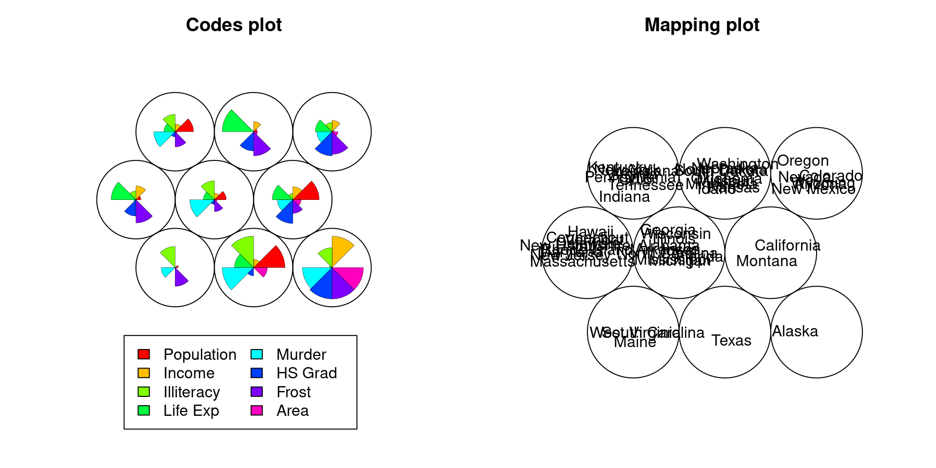
73.3 Three situations that I think “ggplot” is the most useful in practice:
73.3.1 Motivation
In this chapter, based on my six-year experience as a credit risk manager in a commercial bank, I introduce three situations that I think “ggplot” is very useful in real work even for non-specialists in data science.
In practice, I used Excel most of the time, because there were very few people who could use “ggplot” or any other datavis tools requiring some coding. This is because it is most important that when one worker moves to another department or quits his/her job and therefore hands it to a successor, the successor who does not necessarily a specialist in Data Science can stably handle the tools, too. Specifically, if some datavis job has been done in 2021 and been reported to general managers, it is often the case that it needs to be done again in the next year or month to keep tracking the relevant changes. So, if the original contributor leaves his/her role by the next year, the role has to be accomplished by a successor. Therefore, I believe that in normal companies, most of our datavis job will remain to be done by Excel for the time being.
That been said, I also believe that blending some uses of “ggplot” or other suitable datavis tools with Excel would be undoubtedly better because it is often difficult and time-consuming to do some datavis manipulation through Excel. Hereafter, I introduce such datavis manipulations (which we already learned in the class) that we should use “ggplot” as a partial supportive tool. This may ignite non-specialist workers’ interest in “ggplot” and spread its use in our office.
73.3.2 Situation 1. Attaching labels in scatter plot/bubble chart not to overlap with each other
In practice, there are tons of situations that we use scatter plots and bubble charts. Typically, there are many data points in scatter plots and bubbles in bubble charts. Hence, when we attach labels to all points/bubbles in the plot/chart, they often overlap with each other, making it difficult to read.
I believe Excel cannot automatically manipulate so that they do not overlap.
Hence, this is where “ggplot” comes in.
As introduced in our class, we should use geom_text_repel function in ggrepel package.
73.3.3 Situation 2. Cleveland dot plots
In practice, we often want to make comparisons for multiple indices simultaneously, which Cleveland dot plots are most good at. I think in such a situation, non-specialist workers typically use multiple bar charts or multiple line graphs. However, as pointed out in the class, multiple bar charts are difficult to read in general, and the multiple line graphs often become redundant and hard to read especially if lines are crossing with each other. Even though We can draw a “Cleveland dot plots”-like plot using the scatter plots function in Excel, it is time-consuming to set x/y-axis values multiple legends/colors properly.
73.3.4 Situation 3. Multivariate plots
In practice, we often want to observe how the relationship between X and Y is affected by a third variable Z. Among many datavis tools introduced in the class such as mosaic plots and alluvial plots, I believe few can be drawn by Excel at the best of my knowledge. Hence, in this point of view, I feel much possibilities of “ggplot” to spread into our daily office.
73.4 References
[1] Bruno Woltzenlogel Paleo, Levenshtein Distance: Two Applications in Database Record Linkage and Natural Language Processing, LAP LAMBERT Academic Publishing
[2] Package “kohonen”: https://cran.r-project.org/web/packages/kohonen/kohonen.pdf
[3] Examples of self-organized map with R, Doshisha University: https://www1.doshisha.ac.jp/~mjin/R/Chap_30/30.html