81 R based data organization and visualization
Tengteng Tao
81.1 Introduction
In this cheat sheet, I conclude all the important functions we have used in the past two graded homeworks. The whole cheat sheet has two sections. In the first section, all functions related to plotting will be listed. In the second section, all functions which are helpful in organizing data will be mentioned.
81.2 Plots and their corresponding codes
81.2.1 Box plots
To create box plots, we use the function geom_boxplot() from the ggplot2. The basic function is
ggplot(dataframe, aes(y = TheColumnForYaxis , x = TheColumnForXaxis ))+ geom_boxplot()
The example used data fastfood from the openintro package. I used the data calories and restaurant to make the box plot. In addition,to make sure the plot is intuitive enough, the plot is ordered by the mean value from high to low.
df <- openintro::fastfood
ggplot(df, aes(x = reorder(restaurant, calories, median), y = calories))+
geom_boxplot()+
coord_flip()+
xlab("")+
theme_grey(14)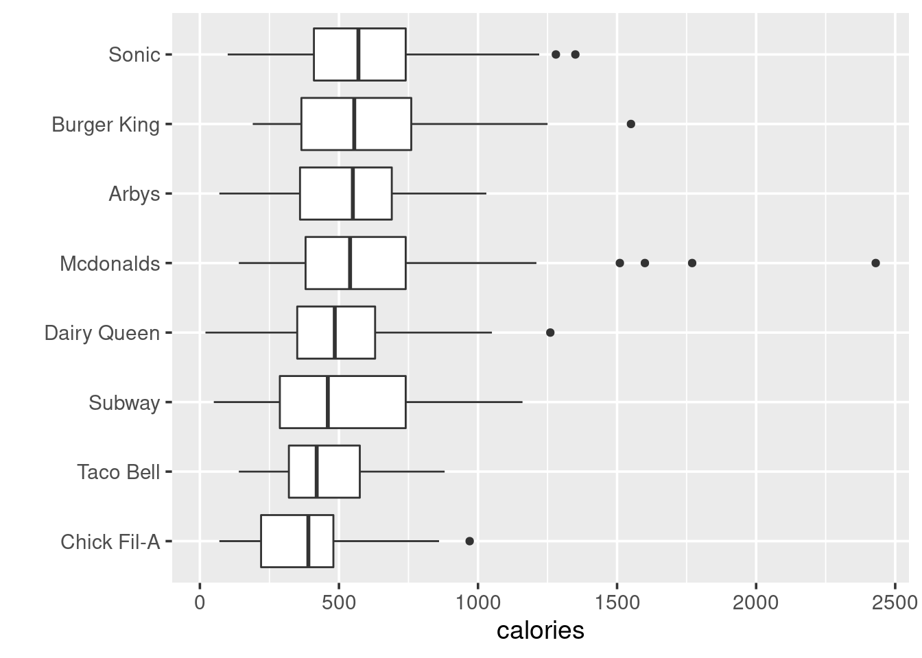
81.2.2 Histograms
In this section, I will introduce the two ways to make histograms. Examples used data mtl from package openintro The first way is plotting with base R. We can simply use function hist() like
hist(datafram$TheColumnYouWantToPlot)
df <- openintro::mtl
hist(df$asubic, col = "lightblue", xlab = "asubic", main = "Histogram of asubic based on R")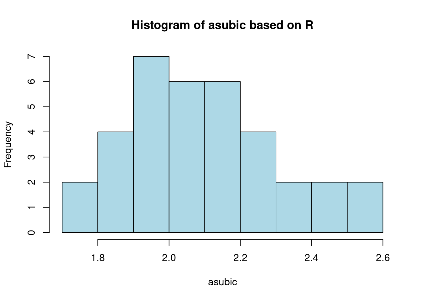 The second way is using ggplot2. The thing needed to be noticed is that the bin number is default on 30 for any data set. Acoordingly, for a more intuitive plot, we always need to change the bins’ number.
The basic function is:
The second way is using ggplot2. The thing needed to be noticed is that the bin number is default on 30 for any data set. Acoordingly, for a more intuitive plot, we always need to change the bins’ number.
The basic function is:ggplot(datafram, aes(TheColumnYouWantToPlot))+ geom_hist()
ggplot(df, aes(asubic))+
  geom_histogram()+stat_bin(bins = 9)+
  ggtitle("Histogram of asubic based on ggplot")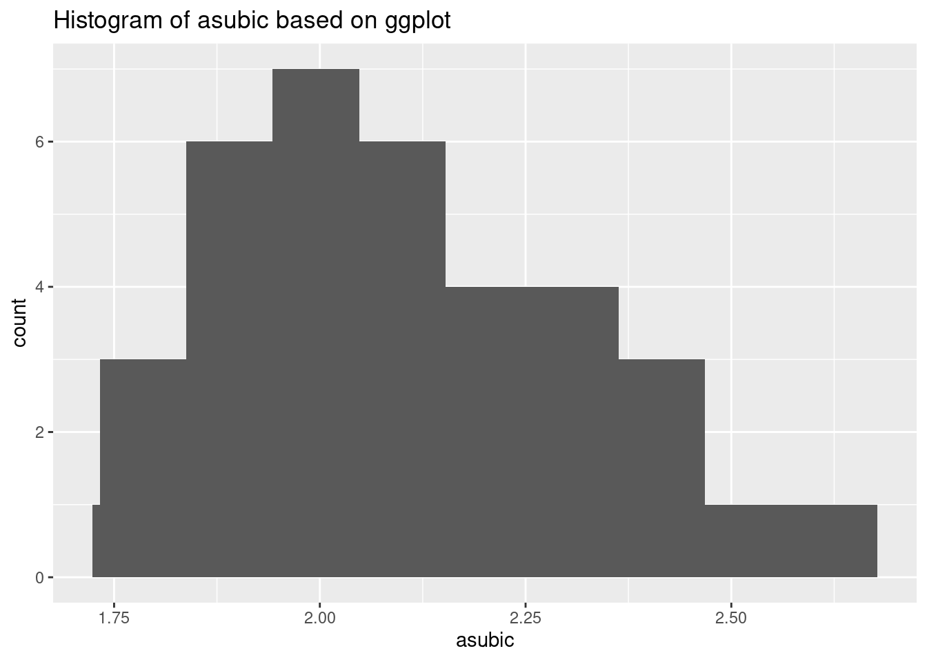
81.2.3 Density curves
To create density curves, we use geom_density from ggplot2. Basic function is:
ggplot(dataframe, aes(x=TheColumnYouWantToPlot))+ geom_density()
The data we used for example here is the astralia soybean from the agridat package.
df <- agridat::australia.soybean
ggplot(df, aes(x = yield))+
  geom_density(alpha = .2, color = "blue")+
  theme_grey(14)
81.2.4 Normal curves
To create normal curves, we need use stat_function(fun = dnorm, args = list(mean, sd)). The basic function is:
ggplot(dataframe, aes(x=TheColumnYouWantToPlot))+ stat_function(fun = dnorm, args = list(mean = mean(TheColumnYouWantToPlot), sd = sd(TheColumnYouWantToPlot)))
The data we used for example here is the astralia soybean from the agridat package.
df <- agridat::australia.soybean
ggplot(df, aes(x = yield))+
  stat_function(fun = dnorm, args = list(mean = mean(df$yield), sd = sd(df$yield)), color = "red")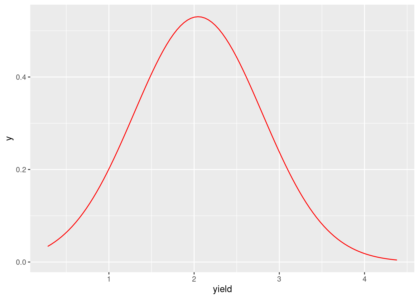
81.2.5 Ridgeline plot
To create a ridgeline plot, we need to use geom_density_ridges() from the package ggridges. The basic function is:
ggplot(df, aes(y = TheColumnForYaxis , x = TheColumnForXaxis ))+ geom_density_ridges()+
The example used data loans_full_schema from package openintro. In addition,to make sure the plot is intuitive enough, the plot is ordered by the mean value from high to low.
df <- openintro::loans_full_schema
ggplot(df, aes(y = reorder(loan_purpose, loan_amount, median),
               x = loan_amount))+
  geom_density_ridges(fill = "blue", alpha = .5, scale = 1)+
  theme_ridges()+
  theme(legend.position = "none")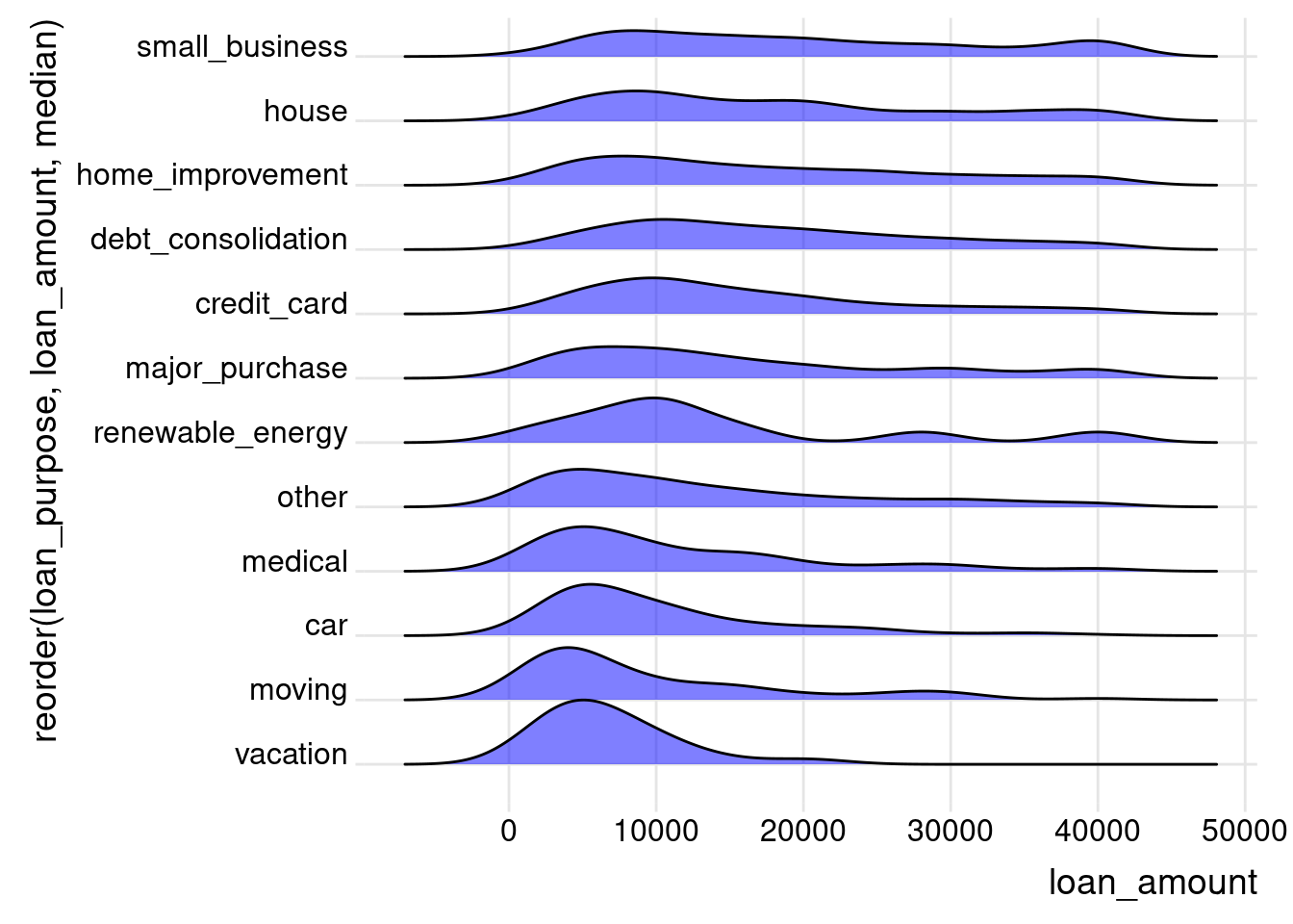
81.2.6 Frequency Bar Chart
To create a frequency bar chart, we need to use geom_bar() from ggplot2. Here is the basic function:
ggplot(dataframe, aes(x = TheColumnYouWantToPlot))+ geom_bar(aes(y = ..count..))
Data used here is Roof.Style from ames in the package openintro. In addition,to make sure the plot is intuitive enough, the plot is ordered in ascending order.
df <- openintro::ames

ggplot(df,  aes(x = fct_rev(fct_infreq(Roof.Style)))) +
  geom_bar( aes(y = ..count..), color = "blue", fill = "lightblue") +
  xlab("") +
  ylab("Frequency") +
  ggtitle("Frequency bar chart for the roof styles of the properties")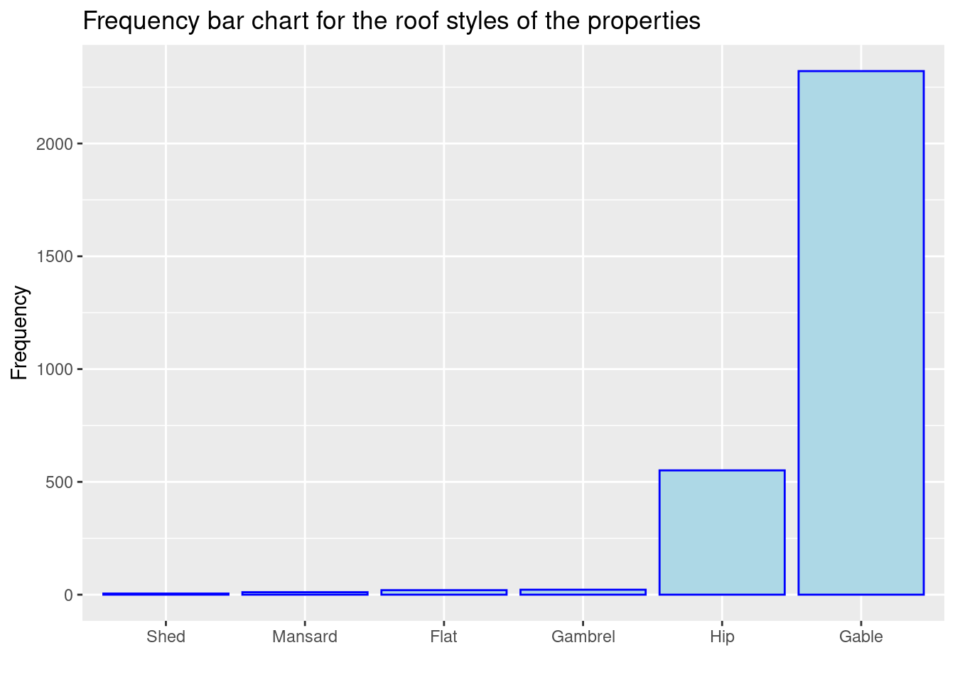
81.2.7 Cleveland dot plots
To create a cleveland dot plots, we need to geom_point from ggplot2. The basic function is
ggplot(dataframe, aes(y =reorder(TheColumnForYaxis, TheColumnForXaxis) , x = TheColumnForXaxis))+ geom_point()
Data used here is seattlepets from package openintro. I plotted the most popular 30 names.
df <- openintro::seattlepets %>% dplyr::count(animal_name, sort = TRUE) %>% drop_na()

ggplot(df[1:30,], aes(x = n, y = reorder(animal_name, n)))+
  geom_point()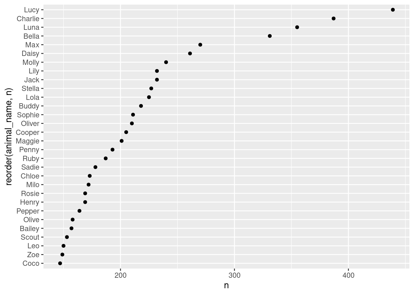
81.2.8 Scatter plot
To create a scatter plot, we also use geom_point(). The basic function is
ggplot(dataframe, aes(y = TheColumnForYaxis , x = TheColumnForXaxis))+ geom_point()
Data used here is ames from the package openintro
df <- openintro::ames
ggplot(df, aes(area, price))+
  geom_point( alpha = .15, stroke = 0,size = 1.5)+
  ggtitle("Scatter plot of price vs. area")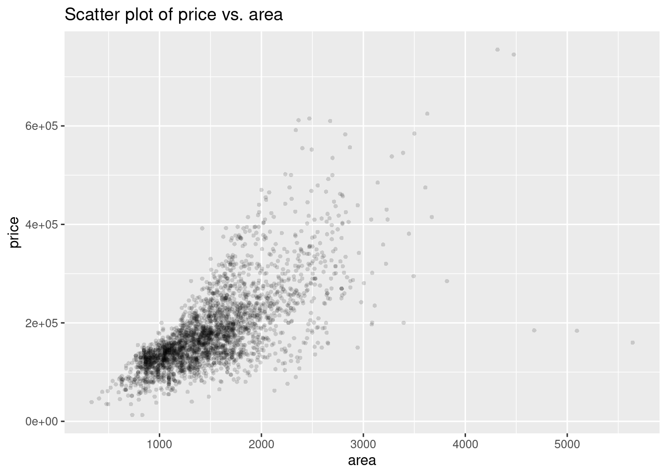
81.2.9 Density contour lines
To create density contour lines, we need to use geom_density_2d(). Here is the basic function:
ggplot(dataframe, aes(y = TheColumnForYaxis , x = TheColumnForXaxis))+ geom_density_2d()
Data used here is ames from the package openintro.
ggplot(df,aes(area, price)) +
  geom_density_2d(aes(colour=..level..)) +
  scale_colour_gradient(low="green",high="red") +
  ggtitle("Density contour lines of price vs. area")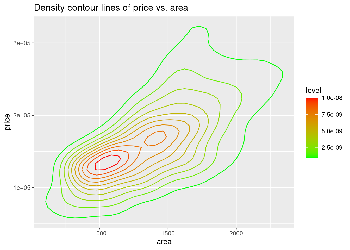
81.2.10 Hexagonal heatmap
To create hexagonal heatmap, we need to use geom_hex(). Here is the basic function:
ggplot(dataframe, aes(y = TheColumnForYaxis , x = TheColumnForXaxis))+ geom_hex()
Data used here is ames from the package openintro.
ggplot(df,aes(area, price)) +
  geom_hex(bins = 30) +
  scale_fill_gradient(low = "#F2F0F7", high = "#08519C" ) +
  theme_bw() +
  ggtitle("Hexagonal heatmap of price vs. area")
81.2.11 Square heatmap
To create hexagonal heatmap, we need to use geom_bin_2d(). Here is the basic function:
ggplot(dataframe, aes(y = TheColumnForYaxis , x = TheColumnForXaxis))+ geom_bin_2d()
Data used here is ames from the package openintro.
ggplot(df, aes(area, price)) +
 geom_bin_2d(bins = 20) +
  scale_fill_gradient(low = "#F2F0F7", high = "#08519C" ) +
  theme_bw() +
ggtitle("Square heatmap of price vs. area") 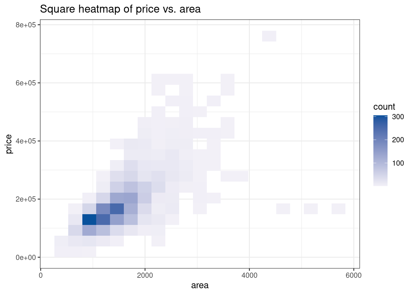
81.3 Data organization functions
81.3.1 Pipe(%>%) Operator
Pipe operator can be used to simplified your code. It can be simple interpreted as “and then” For example: filter(data, variable == numeric_value) and data %>% filter(variable == numeric_value) will yield same result.
By using this operator properly, we can make our code clean and brief. ### facet_warp() facet_warp() allow us to combine multiple plots, which can give us a more directly view of comparison between those type of plots.
The data we used for example here is the astralia soybean from the agridat package.
df <- agridat::australia.soybean
ggplot(df, aes(x = yield, color = loc, fill = loc))+
  geom_histogram(aes(y = ..density..),  fill = NA) +
  facet_wrap(~loc, nrow = 2, strip.position = "right")+
  theme_grey(14)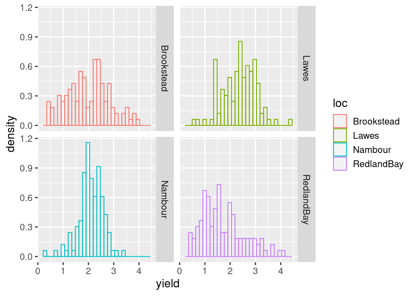
81.3.2 filter()
filter() function allows us to select those variable with specific values. For example, in the data seattlepets from the package openintro, we can use filter to find all dogs’ name:
df <- openintro::seattlepets %>% filter(species == "Dog")
df
## # A tibble: 35,181 × 7
## license_issue_date license_number animal_name species prima…¹ secon…² zip_c…³
## <date> <chr> <chr> <chr> <chr> <chr> <chr>
## 1 2018-11-16 8002756 Wall-E Dog Mixed … Mix 98108
## 2 2018-11-11 S124529 Andre Dog Terrie… Dachsh… 98117
## 3 2018-11-21 903793 Mac Dog Retrie… <NA> 98136
## 4 2018-12-16 S138529 Cody Dog Retrie… <NA> 98103
## 5 2017-10-04 580652 Millie Dog Terrie… <NA> 98115
## 6 2018-12-23 961052 Sabre Dog Terrier <NA> 98126
## 7 2018-12-07 S125461 Thomas Dog Chihua… Mix 98177
## 8 2018-11-07 8002543 Lulu Dog Vizsla… Mix 98105
## 9 2018-12-15 S138838 Milo Dog Boxer Retrie… 98109
## 10 2018-11-27 S123980 Anubis Dog Poodle… <NA> 98112
## # … with 35,171 more rows, and abbreviated variable names ¹primary_breed,
## # ²secondary_breed, ³zip_code81.3.3 group_by()
group_by()function allow us to group the data by some variables.
For example, we want to group the data that crimes in 2020 by county and region, we can do this
df <- read.csv("https://data.ny.gov/api/views/ca8h-8gjq/rows.csv")
df %>% filter(Year == 2020) %>% group_by(County, Region)
## # A tibble: 628 × 15
## # Groups: County, Region [62]
## County Agency Year Month…¹ Index…² Viole…³ Murder Rape Robbery Aggra…⁴
## <chr> <chr> <int> <int> <int> <int> <int> <int> <int> <int>
## 1 Albany Albany Cit… 2020 12 3571 881 18 61 166 636
## 2 Albany Albany Cou… 2020 12 2 0 0 0 0 0
## 3 Albany Albany Cou… 2020 12 131 13 0 4 0 9
## 4 Albany Albany Cou… 2020 12 103 26 0 18 2 6
## 5 Albany Altamont V… 2020 12 6 2 0 0 0 2
## 6 Albany Bethlehem … 2020 12 407 25 1 7 3 14
## 7 Albany Coeymans T… 2020 12 49 8 0 0 1 7
## 8 Albany Cohoes Cit… 2020 12 138 26 0 3 4 19
## 9 Albany Colonie To… 2020 12 1936 83 0 4 28 51
## 10 Albany County Tot… 2020 NA 7450 1127 19 109 215 784
## # … with 618 more rows, 5 more variables: Property.Total <int>, Burglary <int>,
## # Larceny <int>, Motor.Vehicle.Theft <int>, Region <chr>, and abbreviated
## # variable names ¹Months.Reported, ²Index.Total, ³Violent.Total,
## # ⁴Aggravated.Assault81.3.4 summarise()
We can use summarise() to measure some value for a certain group. For example, in data set ames from openintro, we want to know the average price and area for each Neighborhood, we can do this:
df <-openintro::ames %>%
  group_by(Neighborhood) %>%
  summarise(price = mean(price), area = mean(area))

df
## # A tibble: 28 × 3
## Neighborhood price area
## <fct> <dbl> <dbl>
## 1 Blmngtn 196662. 1405.
## 2 Blueste 143590 1160.
## 3 BrDale 105608. 1115.
## 4 BrkSide 124756. 1235.
## 5 ClearCr 208662. 1744.
## 6 CollgCr 201803. 1496.
## 7 Crawfor 207551. 1723.
## 8 Edwards 130843. 1338.
## 9 Gilbert 190647. 1621.
## 10 Greens 193531. 1157.
## # … with 18 more rows81.3.5 summarise_at()
For some specific situation, we need to summaries many variables. Writing them one by one will be time comsuming and we can do this by using summarise_at().
For Example, we want to know for year 2020, the total number of each type of crime happened in every county. We can write something like this:
df2020 <- read.csv("https://data.ny.gov/api/views/ca8h-8gjq/rows.csv") %>%
  filter(Year == 2020)
df2020$Property.Total = NULL
df2020 %>%
  group_by(County) %>%
  summarise_at(.vars = names(.)[7:13], .funs = c(sum = "sum"))
## # A tibble: 62 × 8
## County Murder_sum Rape_sum Robbery_sum Aggrava…¹ Burgl…² Larce…³ Motor…⁴
## <chr> <int> <int> <int> <int> <int> <int> <int>
## 1 Albany 38 218 430 1568 1446 10338 862
## 2 Allegany 6 76 6 58 172 430 56
## 3 Bronx 111 523 3519 8976 2230 18728 2130
## 4 Broome 10 252 156 902 1338 7268 434
## 5 Cattaraugus 2 76 12 162 274 1112 112
## 6 Cayuga 4 136 36 250 334 1706 124
## 7 Chautauqua 2 166 72 556 1084 3838 154
## 8 Chemung 4 64 56 220 262 2266 134
## 9 Chenango 2 104 14 106 292 1002 50
## 10 Clinton 2 118 6 132 246 1724 52
## # … with 52 more rows, and abbreviated variable names ¹Aggravated.Assault_sum,
## # ²Burglary_sum, ³Larceny_sum, ⁴Motor.Vehicle.Theft_sum