39 ggplot_matplotlib_cheatsheet
Binghong Yu
For starters, it would be a struggle to learn a new language at first. However, if you happen to have some experience with other programming languages such as python or R, and there is a guide for comparing the two languages who have similar functions side by side, it would be much easier to become familiar with that new language. Thus, I create a cheat sheet for visualization functions and for transformation between most used visualization packages in R (i.e. ggplot) and in python (i.e. Matplotlib).
I spent time searching for documentation about similar plot functions in both languages. Through that process, I become more and more familiar with these plot functions and functions for adjusting scales. In the meantime, through learning these examples, I also learned their differences of the results plotted by different languages and different functions, and their difference in adjusting parameters.
Due to the space restriction, I did not add much details on how to use these functions. Next time, I might add more details about differences between them and parameters we could adjust inside these parentheses.
Click the following link to check out the cheatsheet
<!--chapter:end:ggplot_matplotlib_cheatsheet.Rmd-->

# Scatterplots cheatsheet

Shangzhi Liu

Check the link to see the scatterplots cheatsheet pdf file:

https://github.com/ShangzhiLiu2021/cc21fall2/blob/scatterplots_cheatsheet/resources/scatterplots_cheatsheet/scatterplots.pdf


```r
# package used
library(ggplot2)
library(scatterplot3d)
library(car) #use data mtcars in package car

# Sample scatterplot 1:
set.seed(1234)
x <- rnorm(100,mean = 2, sd = 3)
y <- -1.5 + 2*x + rnorm(100)
df <- data.frame(x = x, y = y)
ggplot(data = df, aes(x = x, y = y)) + geom_point()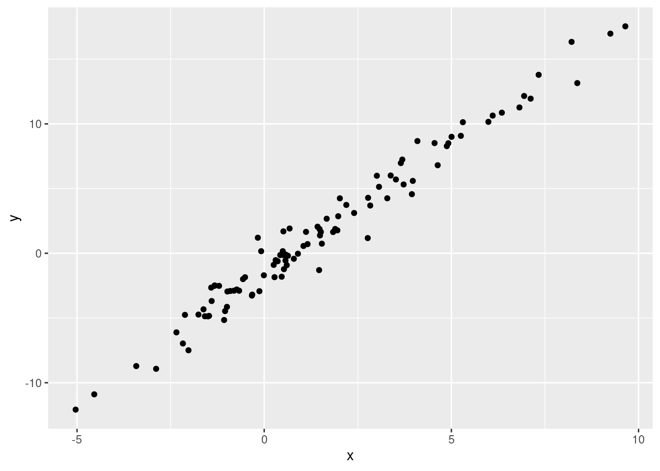
# Sample scatterplot 2:
ggplot(data = df, aes(x = x, y = y)) + geom_point(size = 3, alpha = 0.3, shape = 15, color = "blue", stroke = 0.3)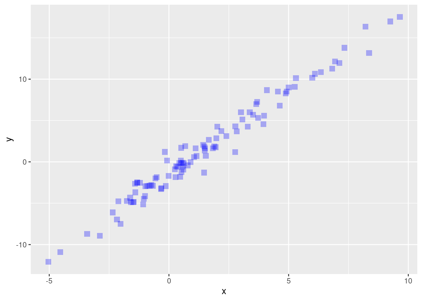
# 3D scatterplot:
scatterplot3d(mtcars$wt, mtcars$disp, mtcars$mpg, main="3D Scatterplot")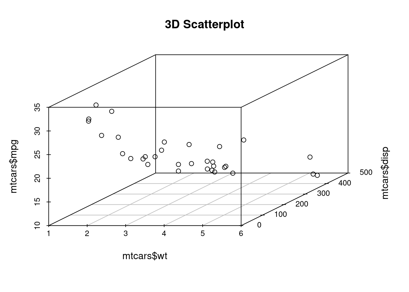
# 3D scatterplot example:
scatterplot3d(mtcars$wt, mtcars$disp, mtcars$mpg, highlight.3d=TRUE, type="h", main="3D Scatterplot")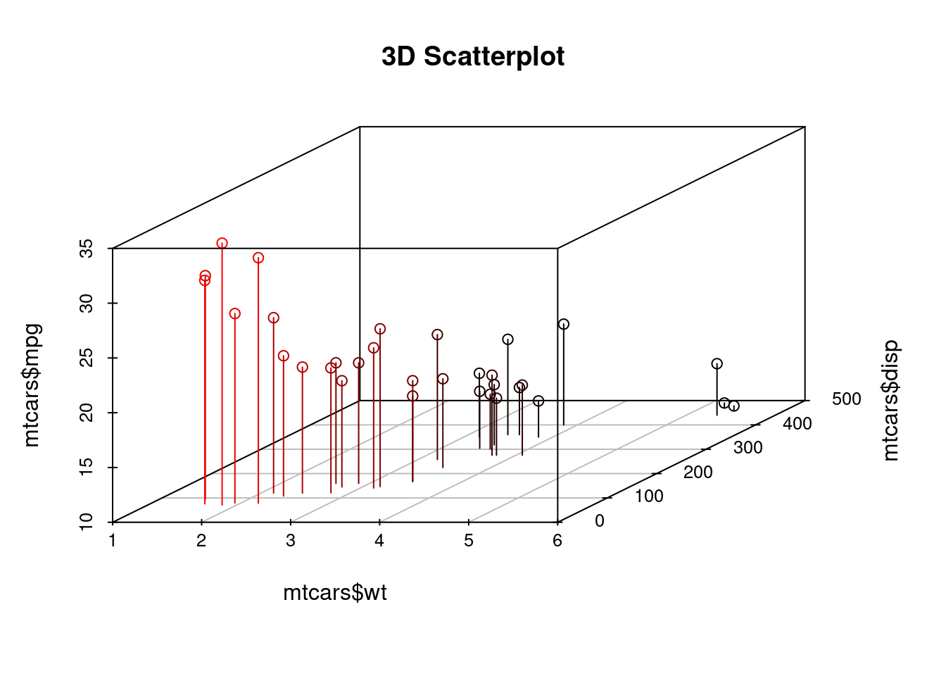
# Density contour lines, Hexagonal and Square heatmap
ggplot(data = df, aes(x = x, y = y)) + geom_point() + geom_density2d(color = "red")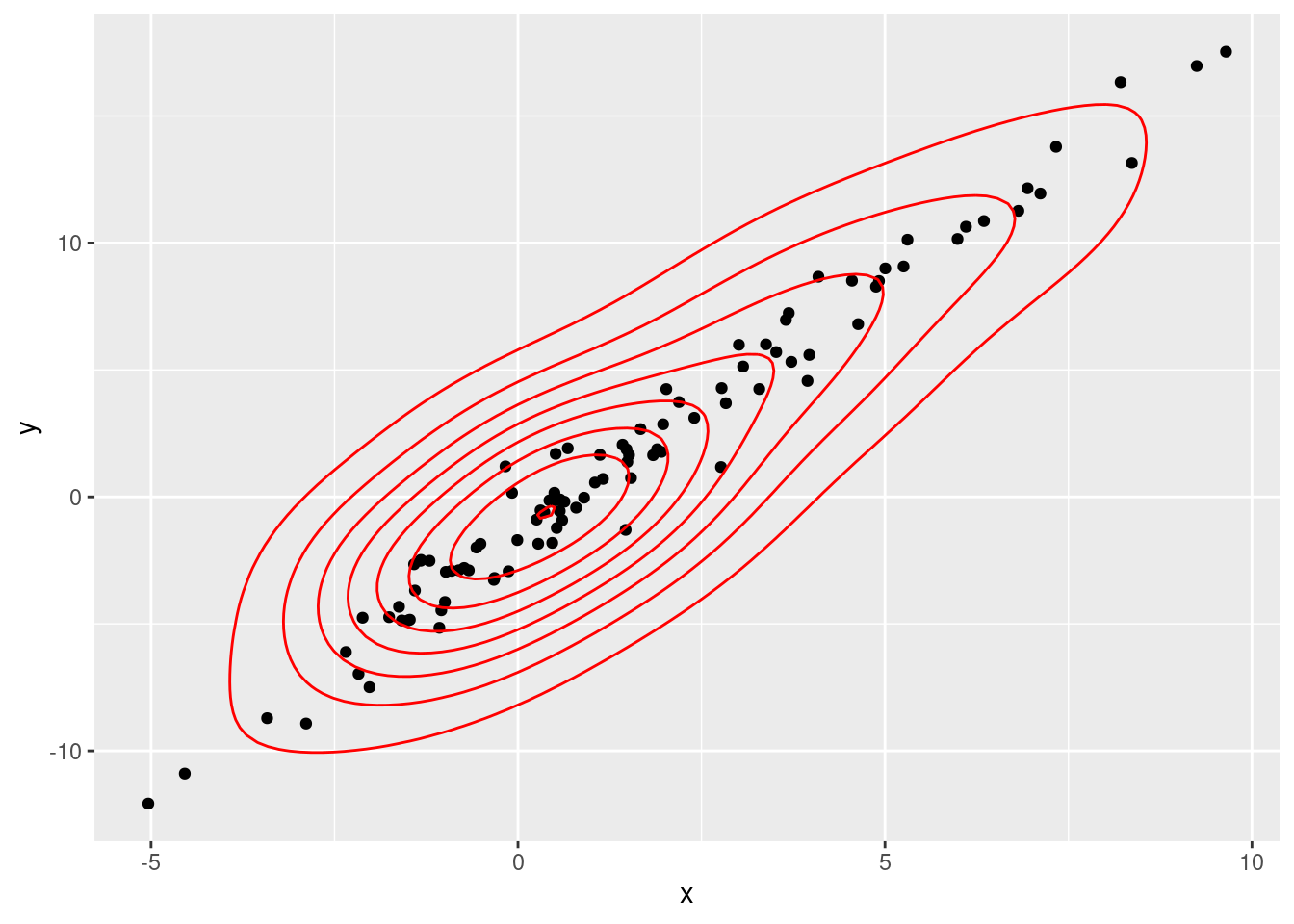
ggplot(data = df, aes(x = x, y = y)) + geom_point() + geom_hex(color = "red", bins = 30)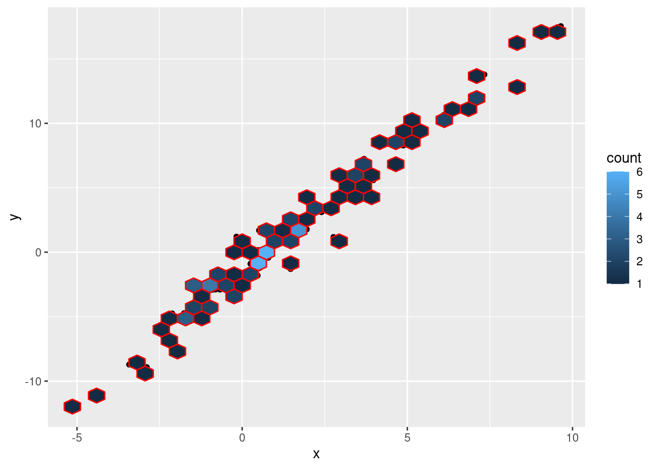
ggplot(data = df, aes(x = x, y = y)) + geom_point() + geom_bin_2d(color = "red", bins = 30)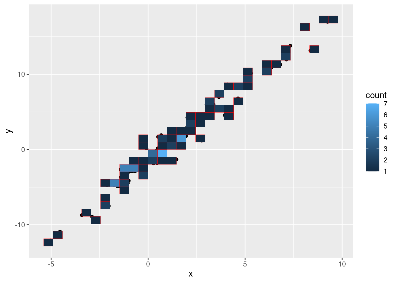
# text
ggplot(mtcars, aes(wt, mpg)) + geom_point(color = 'red') + geom_text(aes(wt, mpg, label = rownames(mtcars)))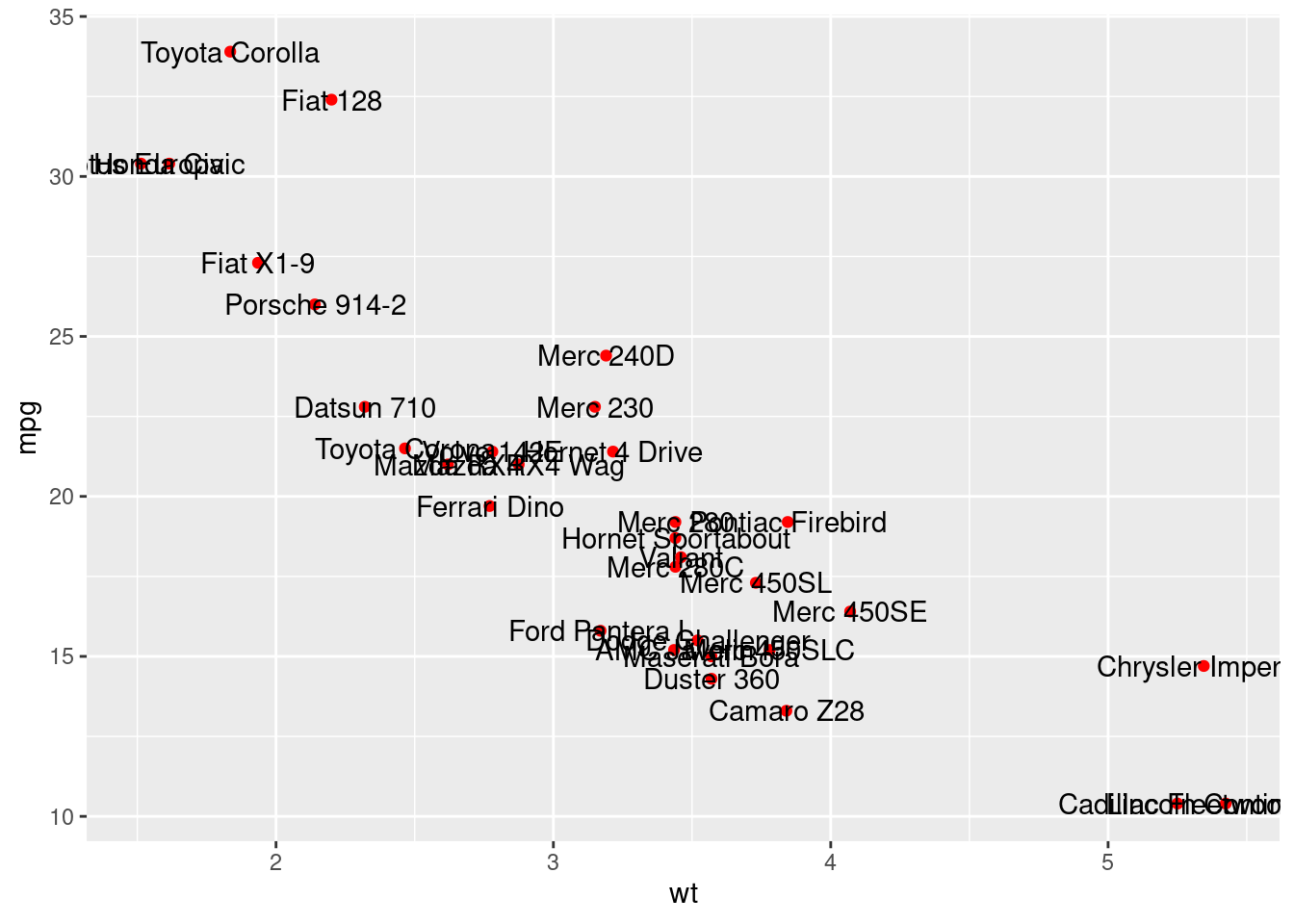
ggplot(mtcars, aes(wt, mpg)) + geom_point(color = 'red') + annotate("text", x = 3.840, y = 13.3, label = "Camaro Z28") + annotate("text", x = 1.935, y = 27.3, label = "Fiat X1-9")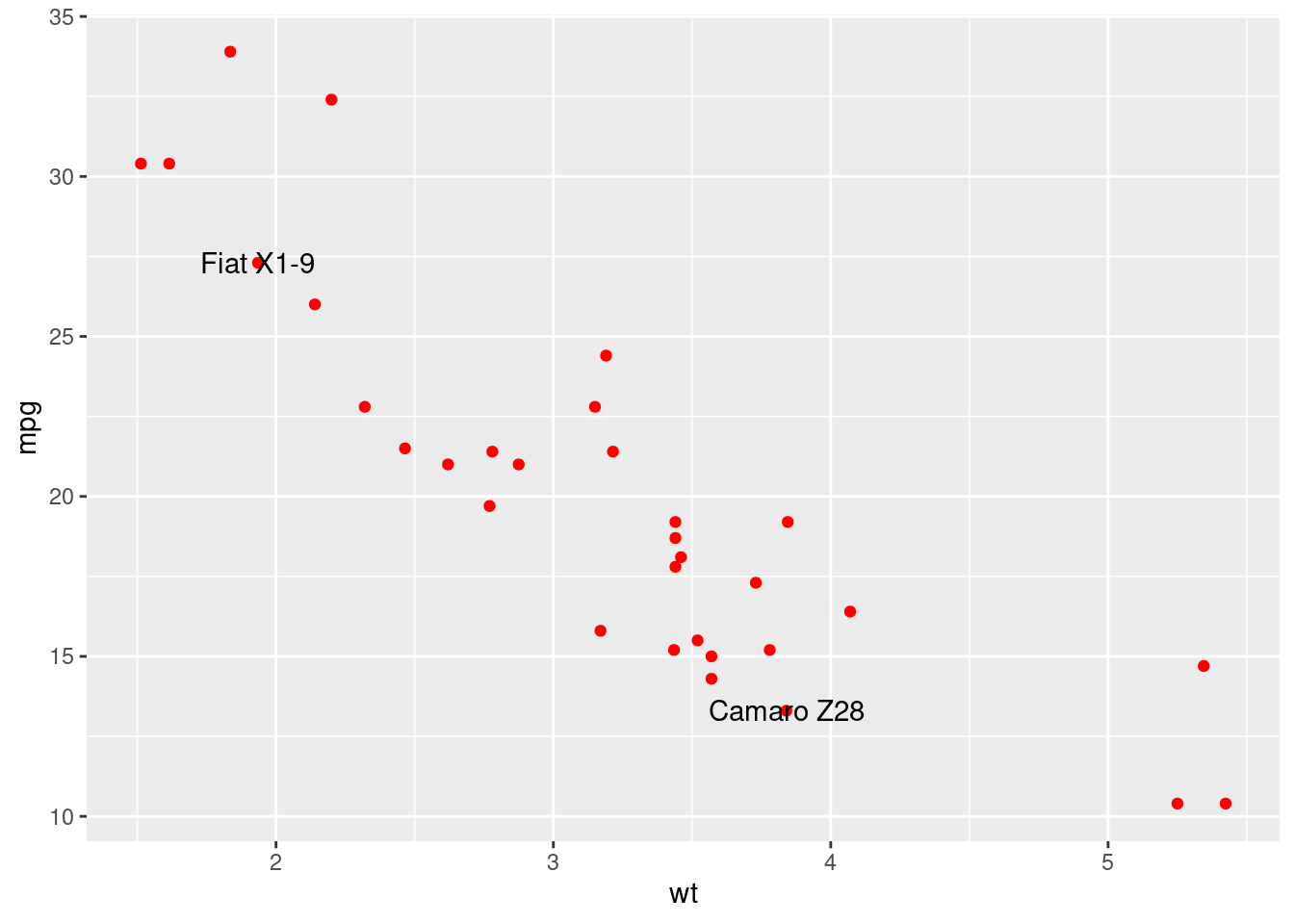
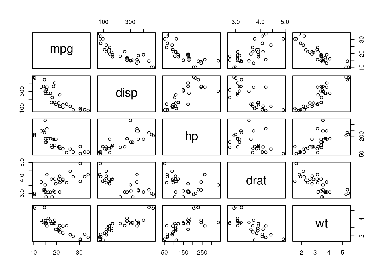
#matrix
pairs(~mpg+disp+hp+drat+wt,data=mtcars)