46 Plot and Analyze Stock Data with R
Yue Zhang and Yue Xiong
46.1 Motivation
The idea of this tutorial arise when we did research for our final project which involves a lot of interactions with stock prices. We need to plot the stock prices, analyze the data to convey the financial information behind the data. Therefore, we gathered all the useful resources we found and our thoughts into this tutorial.
46.2 Plot stock data
46.2.1 Using ggplot2 to plot time series
Let’s first look at what we can do with basic R and ggplot2. Stock data are essentially time series, so with the bare minimum, we can plot stock data as time series withe the techniques we learned from class. Let’s use Pfizer data as an illustration of this function. We downloaded 2-year historical data of Pfizer from Yahoo Finance and saved them in a csv file.
pfe_df <- read_csv("resources/stock_analysis/PFE.csv")

pfe_df %>%
  ggplot(aes(Date, Close)) +
  geom_line() +
  ggtitle("Pfizer 2-Year Stock price")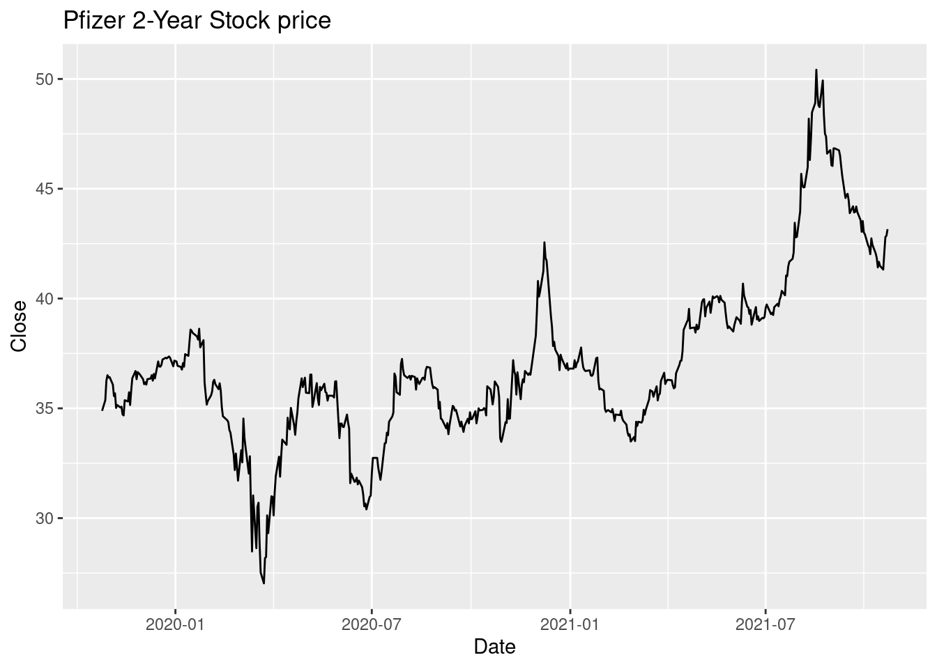
With this plot, we can clearly see the stock’s trend over the past two year. However, this time series plot only encapsulates the close price which misses many other information (open, high, low etc). There exists other commonly used financial charts that describe price movements better, such as candlestick chart.
46.2.2 Candlestick Chart
46.2.2.1 Background History
Candlestick charts are thought to have been developed in the 18th century by Munehisa Homma, a Japanese rice trader.[4] They were introduced to the Western world by Steve Nison in his book, Japanese Candlestick Charting Techniques. They are often used today in stock analysis along with other analytical tools.
46.2.2.2 Description
Each “candlestick” typically shows one day. It is similar to a bar chart in that each candlestick represents all four important pieces of information for that day: open and close in the thick body; high and low in the “candle wick”. If the asset closed higher than it opened, the body is hollow or green colored, with the opening price at the bottom of the body and the closing price at the top. If the asset closed lower than it opened, the body is solid or red colored, with the opening price at the top and the closing price at the bottom. Thus, the color of the candle represents the price movement relative to the prior period’s close and the “fill” (solid or hollow/green or red) of the candle represents the price direction of the period in isolation (solid/red for a higher open and lower close; hollow/green for a lower open and a higher close).
46.2.2.3 Draw Candlestick Chart in R
We are going to use the package quantmod to draw the Candlestick Chart. Quantmod stands for quantitative financial modelling framework. It has three main functions: download data, charting, and technical indicator.
Instead of going to search each stock’s price in Yahoo Finance and download it into csv files and then read into R, there is a easier way to do that with quantmod, which is to use function getSymbols. This function can help to download the specific stock price directly in r. The default source is ‘finance.yahoo.com’, you can switch to other sources by changing src.
We need to know the ticker of the stock and then we can specify the interested date range in argument ‘from’. Here, we want to download the past 2 years’ of data. It gives you the open price, close price, daily highest price, daily lowest price, daily trading volumes and the adjusted price.
PFE <- getSymbols("PFE", src="yahoo", from = "2019-10-25", to = "2021-10-25", auto.assign = FALSE)We first plot the time series in line style, which looks exactly like the one we plotted with ggplot2.
chartSeries(PFE,
            type="line",
            theme=chartTheme('white'))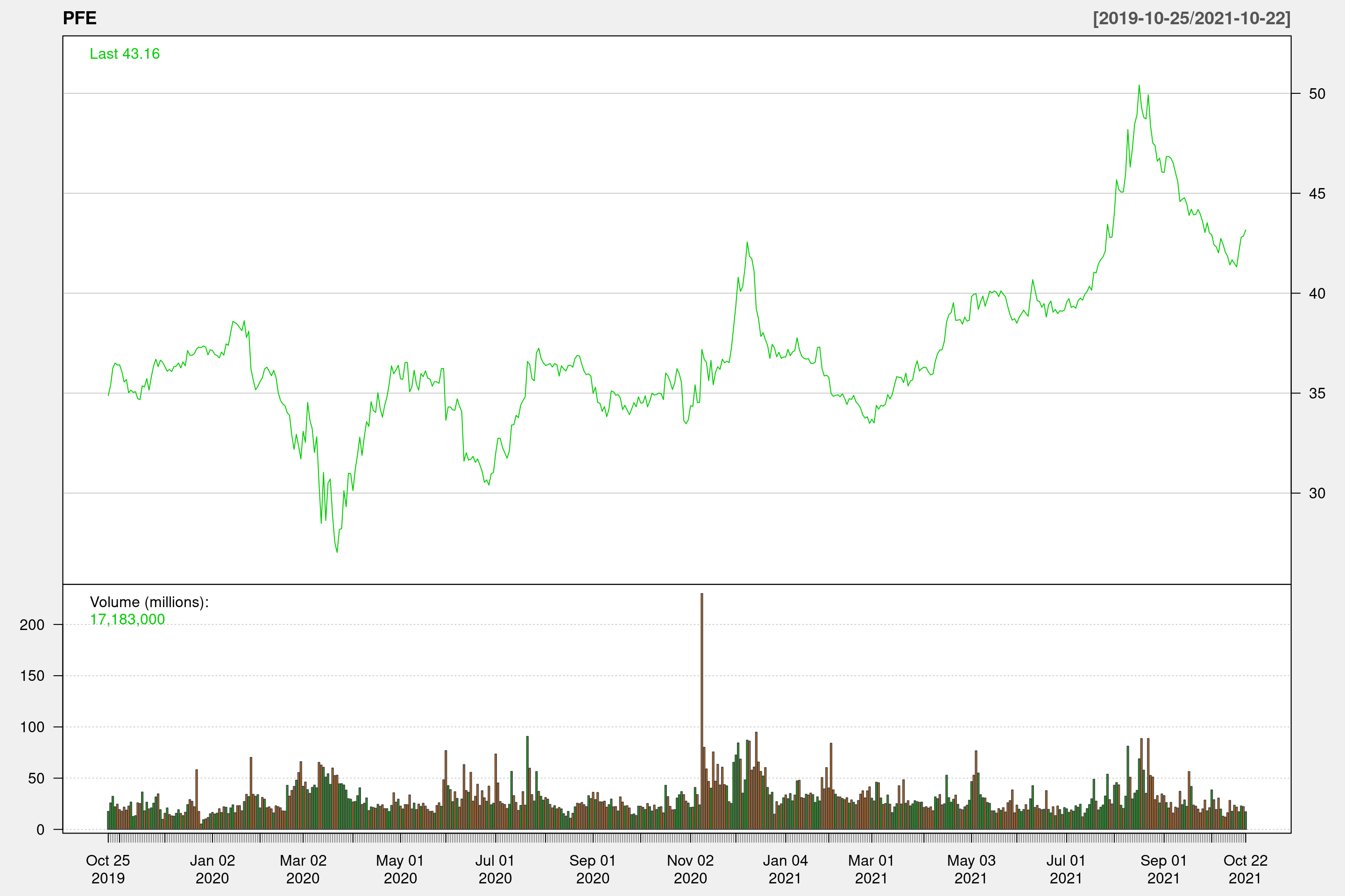
We then try to plot the same data in candlestick style.
chartSeries(PFE,
type="candlesticks",
theme=chartTheme('white'))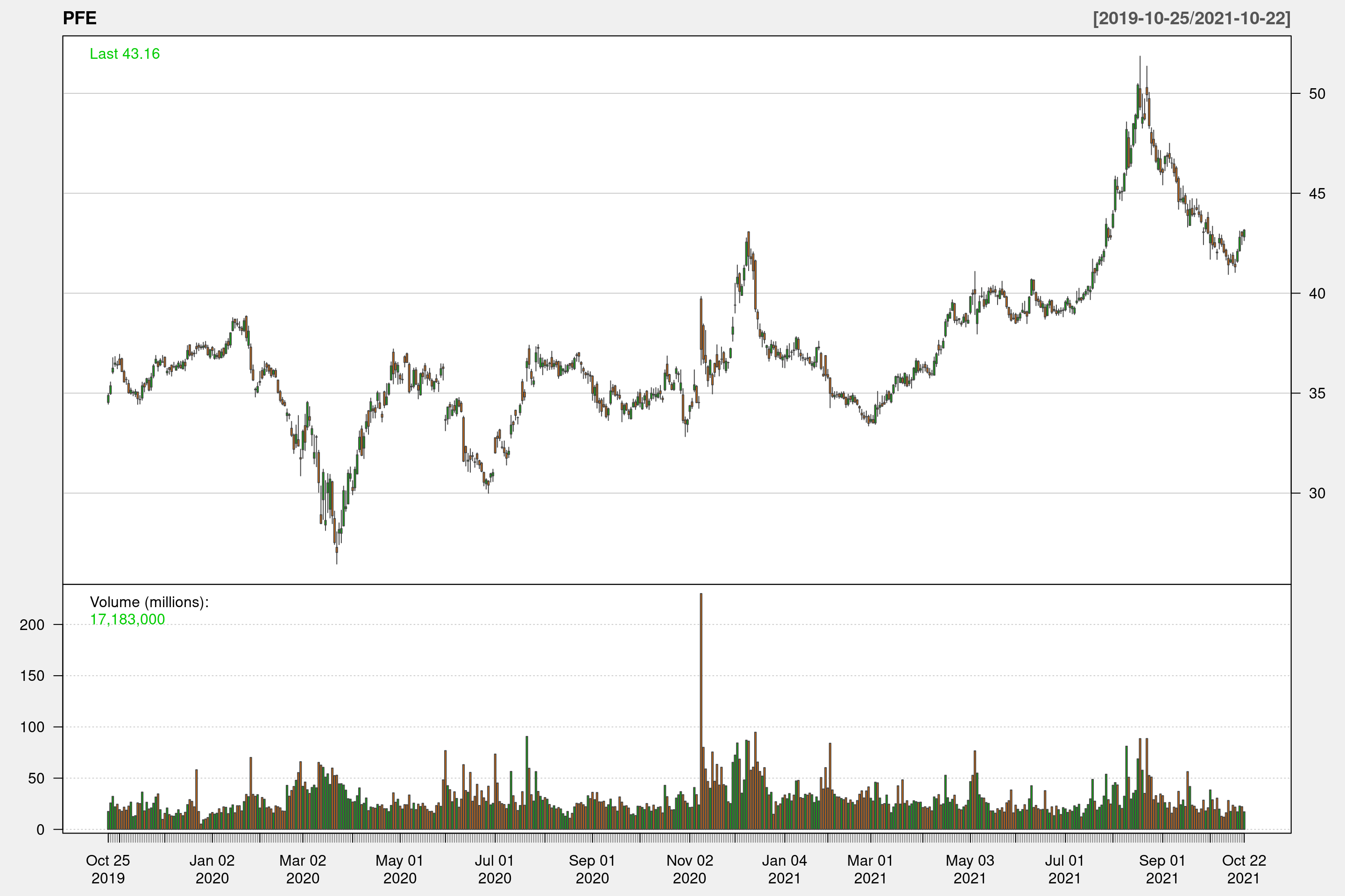 Because we are plotting two year’s data in one chart, we cannot see each candlestick clearly. However, with the color coding of the price bars and thicker real bodies, it highlights the difference between the open and the close. If we zoom in to a shorter time frame, we can look at each candlestick closer.
chartSeries(PFE,
            type="candlesticks",
            subset='2021-09-25::2021-10-25',
            theme=chartTheme('white'))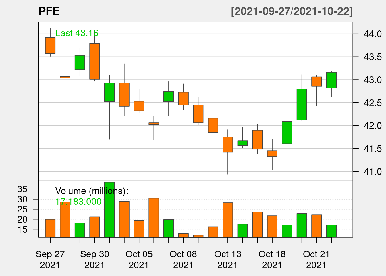
46.2.2.4 Interactive Plot
As we see in previous examples, date range deeply impacts the information displayed in the graph. Sometimes we’d like to look at stock’s trend over a long period; sometimes we need to zoom in to focus on a shorter period of time or look at one specific day. It’s hard to accomplish these with the static charts graphed with quantmod. So we are going to introduce plotly to graph interactive plots.
df <- data.frame(Date=index(PFE),coredata(PFE))

df %>%
  plot_ly(x = ~Date,
          type="candlestick",
          open = ~PFE.Open,
          close = ~PFE.Close,
          high = ~PFE.High,
          low = ~PFE.Low) %>%
  layout(title = "Basic Candlestick Chart")
46.3 Analyze stock data
46.3.1 Simple Moving Average
A simple moving average (SMA) calculates the average of a selected range of prices, usually closing prices, by the number of periods in that range. In stock market, simple moving average allows us to ignore the noise of daily price moving but rather focus on the relatively long term trajectory of the stock. We choose n = 5, 30, 200 to represent the average price of short, medium and long term respectively. For example, in the below graph, around March 2021, we can see the 200-day SMA of PFE rose above 30-day SMA, this is an bullish indicator, that suggests the price of PFE will increase. Indeed, we see PFE’s price rises afterwards.
chartSeries(PFE, theme=chartTheme('white'))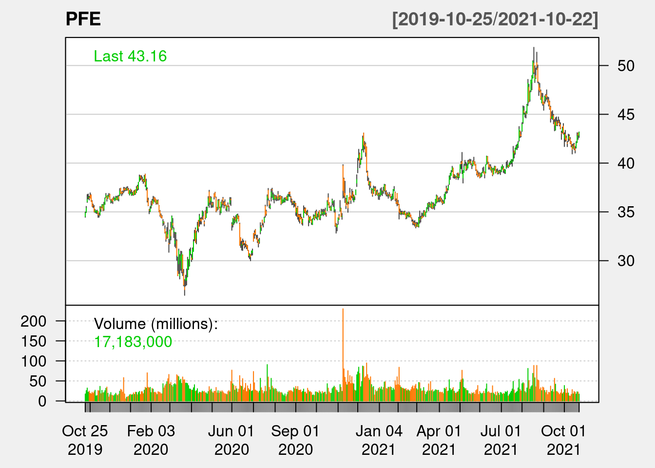
addSMA(n = 5, on = 1, col = "purple")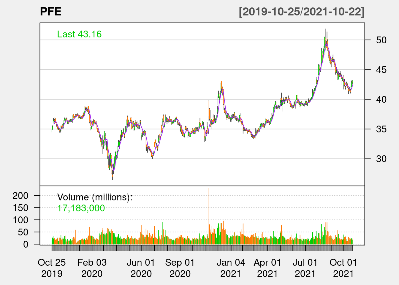
addSMA(n = 30, on = 1, col = "blue")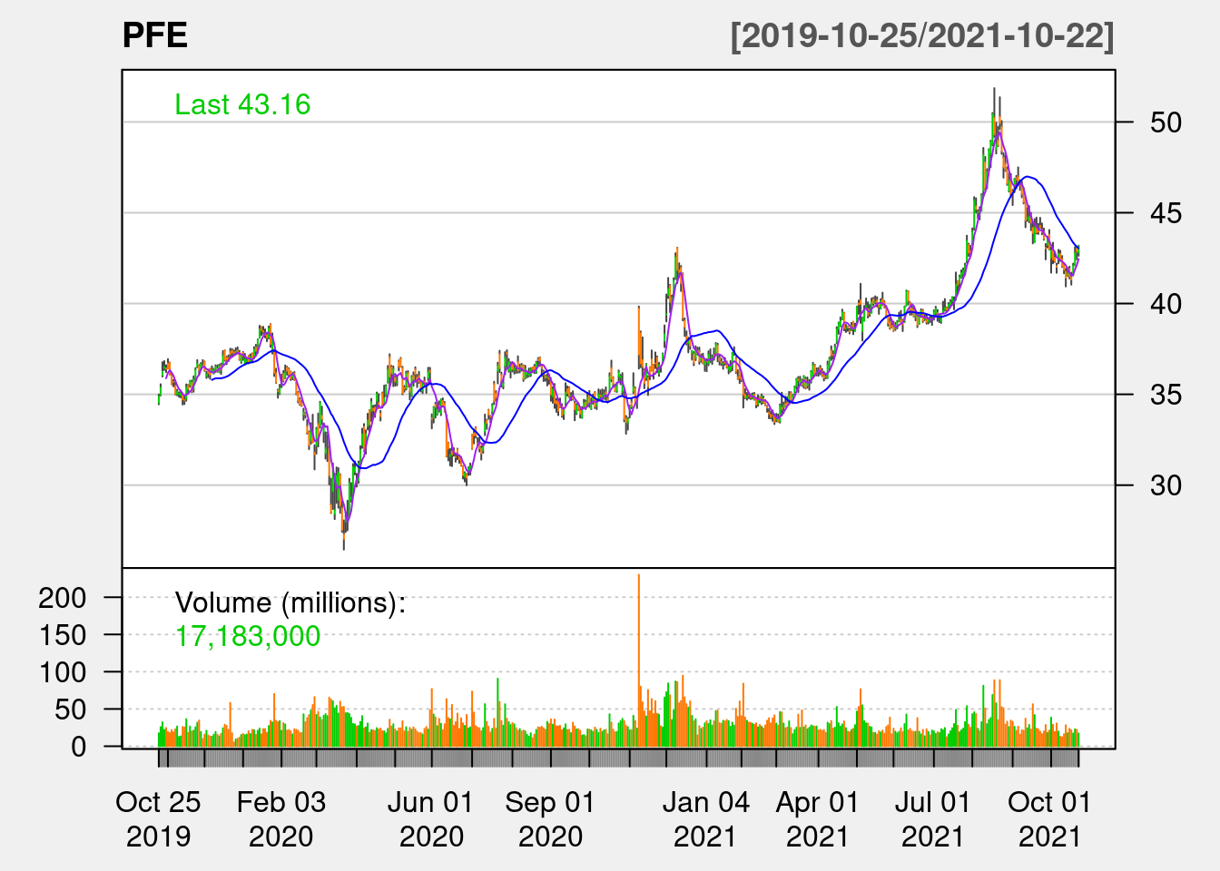
addSMA(n = 200, on = 1, col = "red")
46.3.2 Bolinger Band
A Bollinger Band is a technical analysis tool defined by a set of trendlines plotted x standard deviations (positively and negatively) away from a simple moving average (SMA) of a security’s price. The upper and lower bands are typically 2 standard deviations +/- from a 20-day simple moving average, but can be modified. As the prices move closer to the upper band, the market is more overbought and the price is likely to fall, which is a good time to sell; as the prices move closer to the lower band, the market is more oversold and the price is likely to rise, which is a good time to buy. The below PFE 20-day SMA and 2 standard deviation Bolinger Band during mid May 2021 and mid June 2021 perfectly follows this trend.
chartSeries(PFE,
            subset='2021-04-25::2021-10-25',
            theme=chartTheme('white'))
addBBands(n=20,sd=2)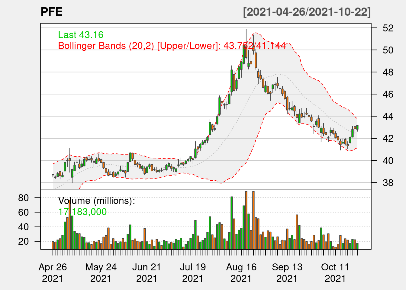
46.3.3 Relative Strength Index
The relative strength index (RSI) is a momentum indicator that measures the magnitude of recent price changes to evaluate overbought or oversold conditions in the price of a stock or other asset. The standard is to use 14 periods to calculate the initial RSI value. The RSI value ranges from 0 to 100, normally values above 70 indicate the stock is overbought, which is a good time to sell; values below 30 indicate the stock is oversold, which is a good chance to buy.
chartSeries(PFE,
            subset='2021-04-25::2021-10-25',
            theme=chartTheme('white'))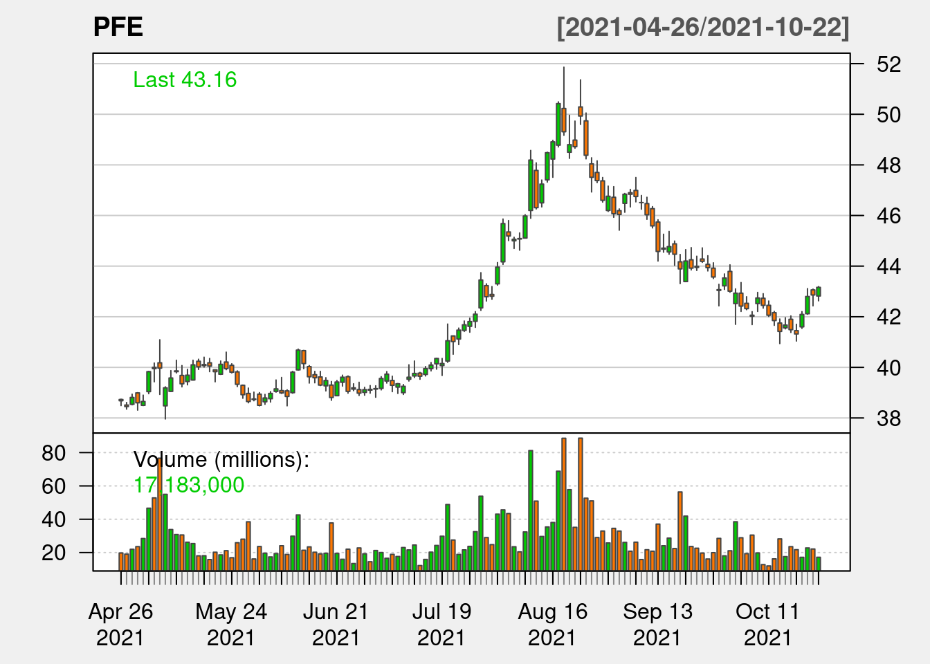
addRSI(n=14, maType = "SMA")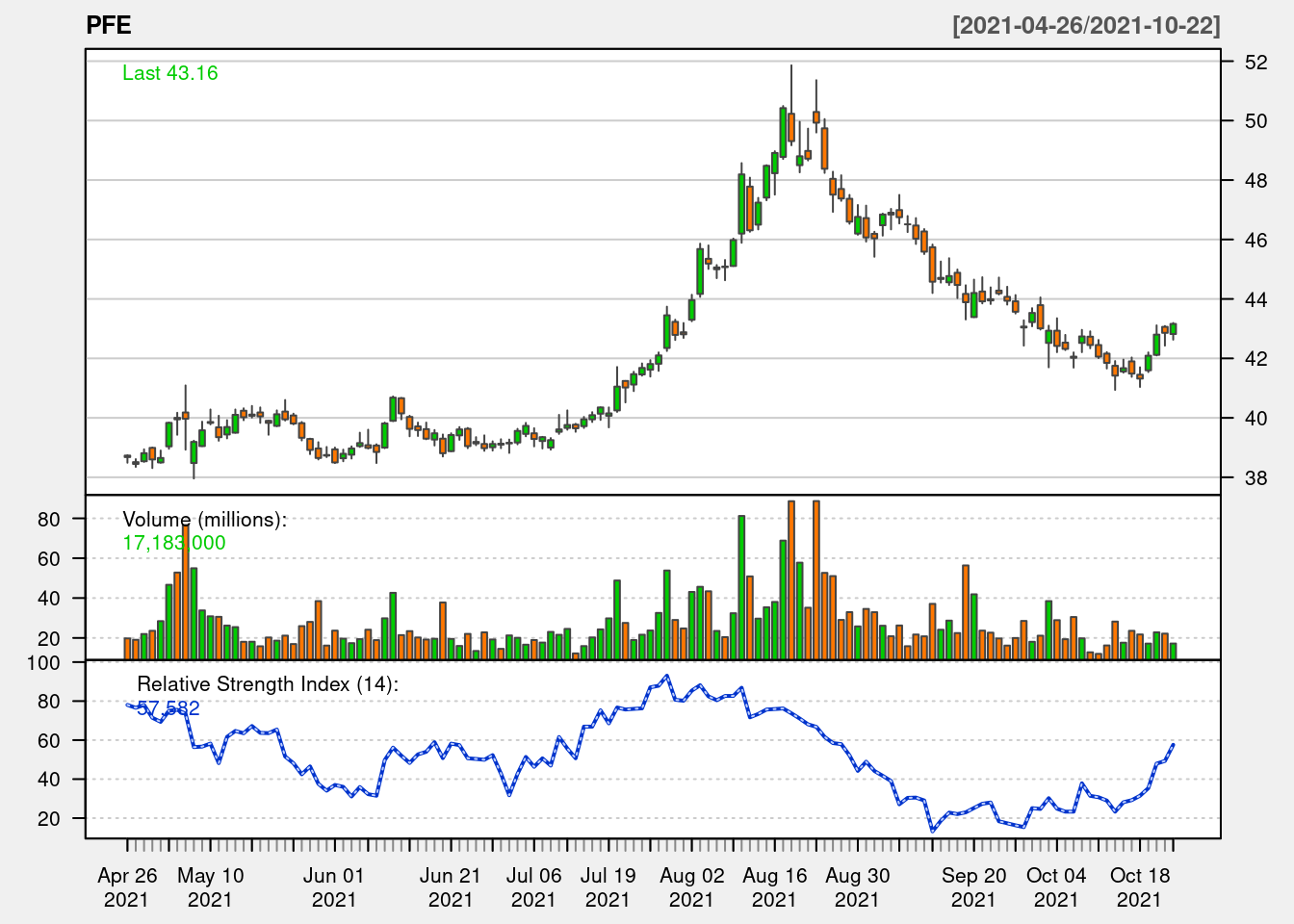
46.3.4 SMA and Bolinger Band in interactive graph
We can also add SMA and Bolinger Band on top of the interactive graph.
bbands <- BBands(PFE[,c("PFE.High","PFE.Low","PFE.Close")])
df <- cbind(df, data.frame(bbands[,1:3]))

df %>%
  plot_ly(x = ~Date, type="candlestick",
          open = ~PFE.Open, close = ~PFE.Close,
          high = ~PFE.High, low = ~PFE.Low, name = "PFE") %>%
  add_lines(x = ~Date, y = ~up , name = "B Bands",
            line = list(color = 'grey', width = 0.5),
            legendgroup = "Bollinger Bands",
            hoverinfo = "none", inherit = F) %>%
  add_lines(x = ~Date, y = ~dn, name = "B Bands",
            line = list(color = 'grey', width = 0.5),
            legendgroup = "Bollinger Bands", inherit = F,
            showlegend = FALSE, hoverinfo = "none") %>%
  add_lines(x = ~Date, y = ~mavg, name = "Mv Avg",
            line = list(color = 'pink', width = 0.5),
            hoverinfo = "none", inherit = F) %>%
  layout(yaxis = list(title = "Price"))
46.3.5 Calendar Heatmap
We can calculate the aggregated return in percentage by using function periodReturn. The aggregate level can be specified by changing argument period. Here we set the aggregate level to be daily, we can also set to monthly, yearly and etc.
PFE_ret <- na.omit(periodReturn(PFE, period="daily", type = "arithmetic"))Now, if want to know how the daily return looks like across the year, we can use Calendar Heatmap. We need to first construct a dataframe, containing the information about which week in the year it is and which day in the week it is. Function as.POSIXlt is used to convert the date to the number of week in the year and the number of day in the week respectively.
PFE_ret <- transform(PFE_ret,
                     week = as.POSIXlt(index(PFE_ret))$yday %/% 7 +1,
                     wday = as.POSIXlt(index(PFE_ret))$wday,
                     year = as.POSIXlt(index(PFE_ret))$year + 1900
                    )
With that dataframe, we can know using ggplot to plot out the calendar and color the calender by the daily return of the stock. Since in stock market, green represents increasing in price and red represents decreasing in price, we follow the same color pattern in this Calendar Heatmap.
ggplot(PFE_ret, aes(week, wday, fill = daily.returns)) +
  geom_tile(color = "white") +
  scale_fill_gradientn('PFE return', colors= c('red', 'white', 'green')) +
  facet_wrap(~ year, ncol = 1) +
  ggtitle("PFE weekly return heatmap")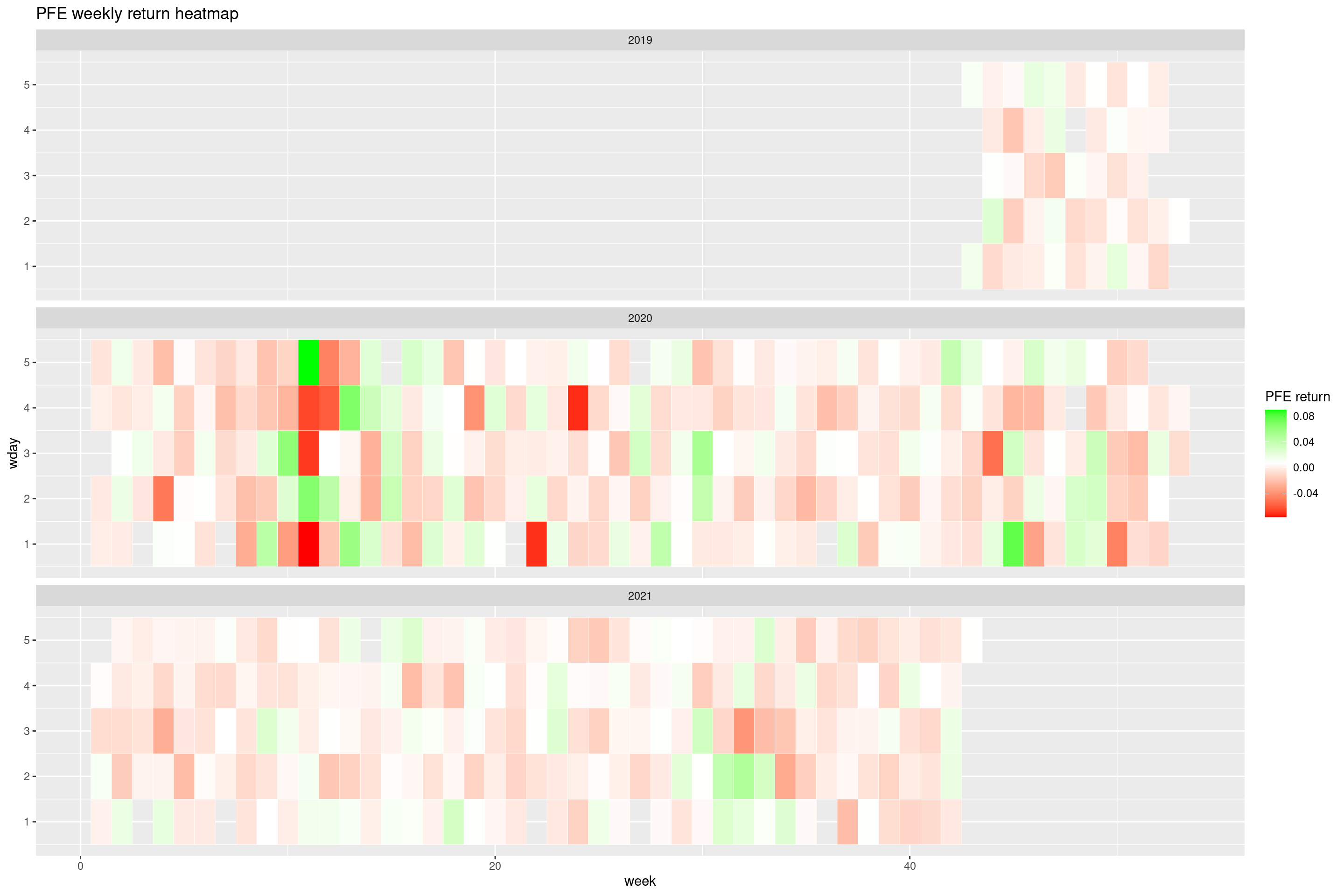
However, this graph does not contain any monthly information, so we need another way to include month into the Calendar Heatmap.
*Take note, while the idea keeps the same as previous method, here we use stock price data since 2015 to include more data for better demonstration purpose.
PFE_2015 <- getSymbols("PFE", src="yahoo", from = "2015-01-01", auto.assign = FALSE)
PFE_2015_ret <- na.omit(periodReturn(PFE_2015, period="daily", type = "arithmetic"))
dat <- data.frame(date=index(PFE_2015_ret), PFE_2015_ret$daily.returns)
dat %>%
# calculate all date related columns
mutate(year = as.numeric(as.POSIXlt(date)$year + 1900),
month = as.numeric(as.POSIXlt(date)$mon + 1),
monthf = factor(month,
levels = as.character(1:12),
labels = c("Jan","Feb","Mar","Apr","May","Jun","Jul","Aug","Sep","Oct","Nov","Dec"),
order=TRUE),
weekday = as.POSIXlt(date)$wday,
weekdayf = factor(weekday,
levels = rev(1:7),
labels=rev(c("Mon","Tue","Wed","Thu","Fri","Sat","Sun")),
ordered=TRUE),
yearmonth = as.yearmon(date),
yearmonthf = factor(yearmonth),
week = as.numeric(format(date,"%W"))
) %>%
ddply(.(yearmonthf), transform, monthweek = 1 + week - min(week)) %>%
# Plot the heatmap
ggplot(aes(monthweek, weekdayf, fill = daily.returns)) +
geom_tile(color = "White") +
facet_grid(year~monthf) +
scale_fill_gradientn('PFE Returns', colors= c('red', 'white', 'green')) +
ggtitle("PFE weekly return heatmap") +
xlab("week of Month")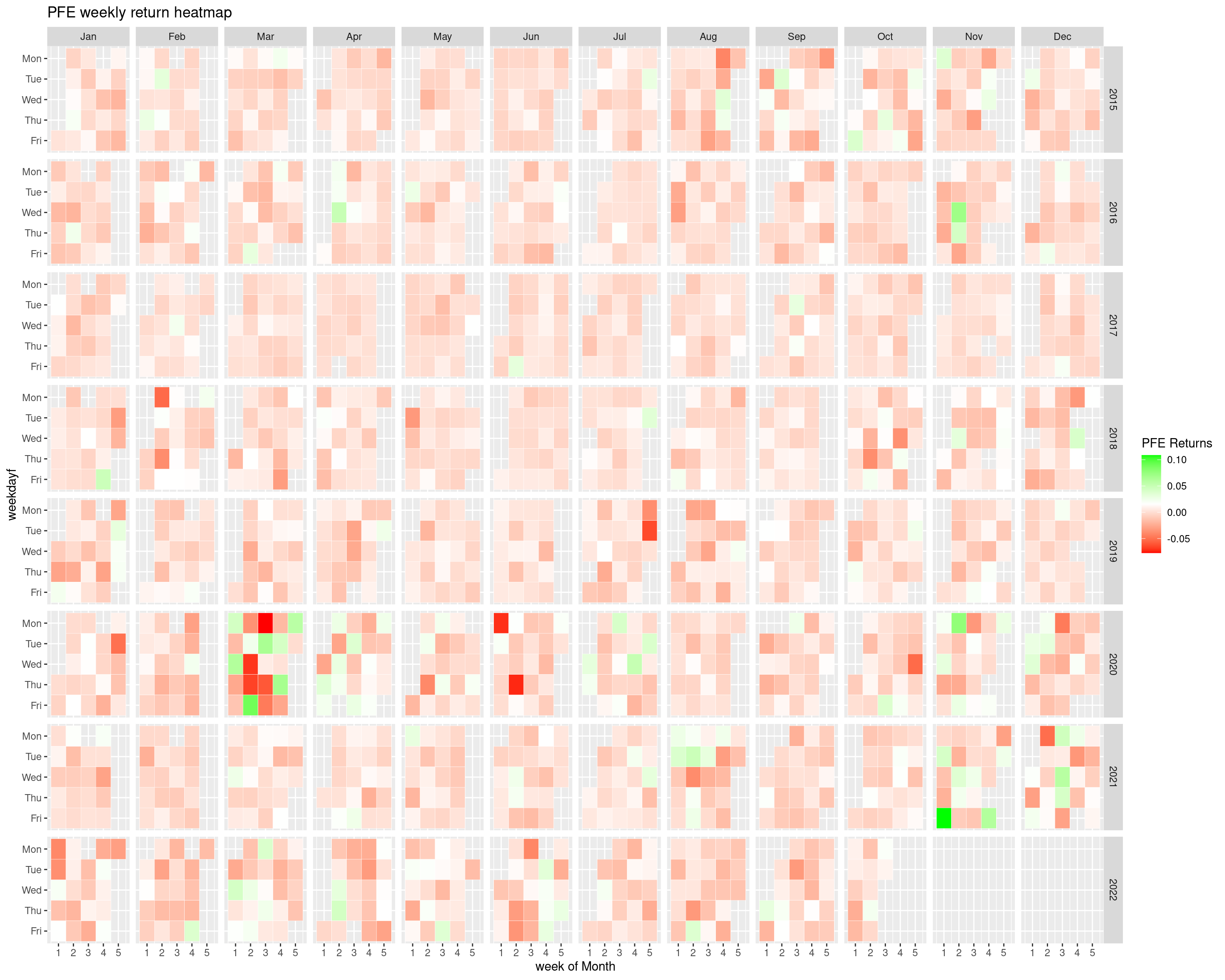 This graph break down the Pfizer’s daily return within each year, month and weekdays. This kind of graph is called Calendar HeatMap. From this graph, we can observe the general trend of the price change of Pfizer in different time.
46.3.6 Correlation Graph
Now, we will introduce a new useful package trying to plot the correlation graph in r, which is ggcorrplot. Here we are going to examine whether there is correlation between different stock price. Correlation concept is important in finance, one application of the correlation in trading strategy is that by observing the price of correlated stocks in one stock market in different time zone, we can infer the price change of the stock in other stock markets in other time zone.
We will firstly choose the list of stocks that we would like to find the correlation and get their stock price data since 2015 from Yahoo Finance. Here we store the price of each stock as one column in a dataframe, called tickerPrices. For each row, it shows the closing price of the stock in particular trading day. Here is how the tickerPrice looks like.
tickers <- c("PFE","MRNA","JNJ","SVA","^GSPC","AAPL","AMZN","META","GS","JPM")

tickerPrices <- NULL
for (ticker in tickers)
  tickerPrices <- cbind(tickerPrices, getSymbols(ticker, src = "yahoo", from = "2015-01-01", auto.assign=FALSE)[,4])

drop_na <- apply(tickerPrices,1,function(x) all(!is.na(x)))
tickerPrices <- tickerPrices[drop_na]
colnames(tickerPrices) <- tickers
Now, we need to construct the correlation matrix between each pair of stocks in the list of tickers by using function cor and then convert the correlation matrix into molten dataframe so that it can be used to draw the correlation graph using ggplot2. Below shows the normal correlation matrix and the molten format of the correlation matrix respectively.
Now, since we know that the correlation matrix is symmetric along the diagonal line, there are information repetition in the whole correlation matrix, therefore, only half of the correlation matrix is required to show the correlation between all different pairs. So, we can choose either to maintain the upper triangle or the lower triangle by specify ‘upper’ or ‘lower’ in the argument of ‘type’.
This type of graph is called Correlogram. The stronger the correlation is, the darker the color of the circle it is. If there is no correlation at all, then the color of the circle is white. If there is a strong positive correlation, the color of the circle is approaching dark green, while if there is a strong negative correlation, the color of the circle is approaching dark red.
Also, the size of the circle is also affected by the correlation coefficient. The larger the absolute value of the correlation it is, the larger the circlw it is.
This actually helps to quickly identify those pairs with strong correlation, such as FB and ^GSPC, which are FaceBook and S&P 500 respectively.
ggcorrplot(corr,
           type = 'upper',
           lab = TRUE,
           lab_size = 3,
           method = 'circle',
           colors = c("red", "white", "green"),
           title="Correlogram of Stocks",
           legend.title = "Correlation")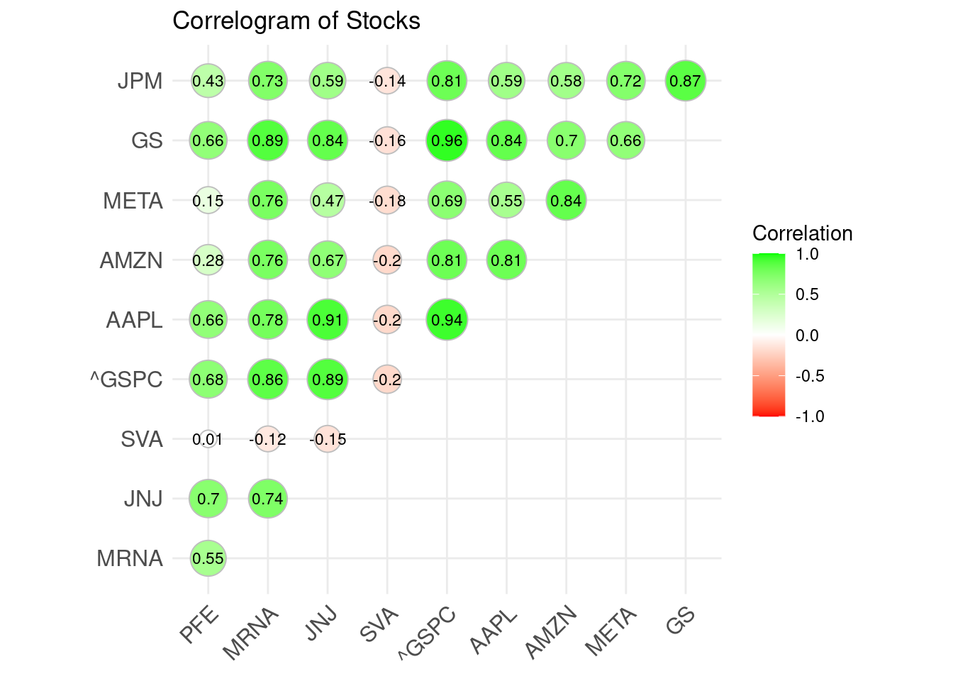
46.3.7 Violin Chart
One more graph that is useful in determine the trading strategy is Violin Chart. This graph shows the distribution of the returns of the stock in the past. By understanding what the normal profit range of the particular stock is, we can know if there exists one particular month or two that the stock performs better than usual. For example, there are a concept call Santa Relay and January Effect in trading, which tells us that the stock price usually goes up during Dec and January. Violin Chart allows us to check whether the particular stock follows the above 2 concepts. Again, we will use Pfizer as an example for demonstration.
Since we want to know the monthly return distribution, for each year, every month only have 1 data point, to make the distribution more reliable, we need to get more historical data to plot the violin chart. The first Initial Public Offering (IPO) of Pfizer was made in 1972, so we try to retrieve the stock price data from 1972.
We first need to calculate out the monthly return of Pfizer since 1972 and stored the returns into a dataframe called cal_rets as show below. Take note, function table.CalendarReturns can return a table of returns containing the monthly return and yearly return of the stock. We can also modify the number of decimal place we want to keep by changing the value of argument digits. Besides, all the values in the below dataframe is percentage since the argument as.perc is set to be true.
PFE_1972 <- getSymbols("PFE", src="yahoo", from = "1972-01-01", auto.assign = FALSE)[,4]
PFE_1972_ret <- na.omit(periodReturn(PFE_1972, period="monthly", type = "arithmetic"))
cal_rets <- table.CalendarReturns(PFE_1972_ret, digits = 2, as.perc = TRUE)
Then, we remove the monthly.returns column since we do not care about the overall performance of Pfizer in the whole year. Then transpose the dataframe to make the aggregated level by month and melt the transposed dataframe to make the ggplot understand about the data and plot out the violin chart.
Here is the code for plotting the violin chart in r. The x axis is the month, while the y axis is the monthly return of the stock. The wider the violin chart is, the more monthly return concentrate on the wider part. Here, we can see that in Dec and Jan, the monthly return are not the highest, and in Jan, the widest part of violin chart actually located in negative area. This shows that Pfizer does not follow the 2 rules mentioned above, so we cannot simply buy Pfizer in Dec and Jan.
ggplot(cal_rets_t, aes(x=Var1,y=value)) +
  geom_violin(aes(fill = Var1)) +
  geom_boxplot(width=0.1) +
  ggtitle("PFE Monthly Returns") +
  xlab("Month") +
  ylab("return(%)") +
  theme_classic() +
  theme(legend.position = "none")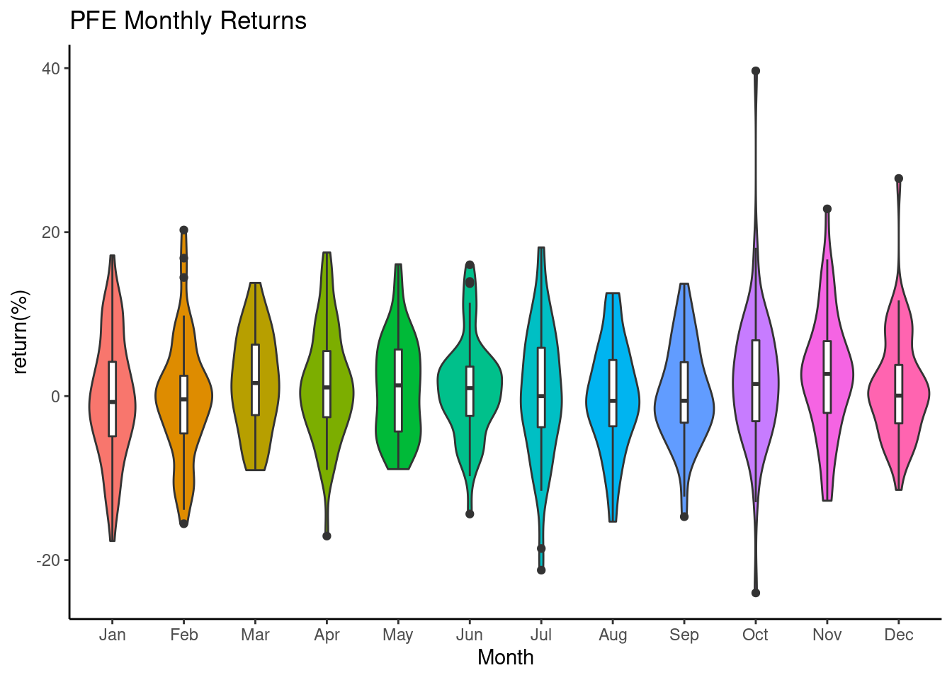
46.4 Citations
https://www.quantmod.com/examples/intro/
https://plotly.com/r/candlestick-charts/
https://www.investopedia.com/terms/s/sma.asp
https://www.investopedia.com/terms/b/bollingerbands.asp
https://www.investopedia.com/terms/r/rsi.asp
http://www.sthda.com/english/wiki/ggcorrplot-visualization-of-a-correlation-matrix-using-ggplot2